
This site contains affiliate links you can use to support Tale of Painters. As Amazon Associates, eBay partners, and partners of our partner shops we earn from qualifying purchases. Thanks :)
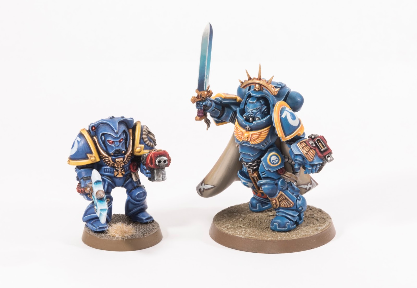
Looks like it’s bring your kid to work at the Ultramarines Chapter today! Look at this vintage Terminator Librarian standing next to the new Captain in Gravis armour! He’s so cute! After the jump some close ups of the Gravis Armour Captain.
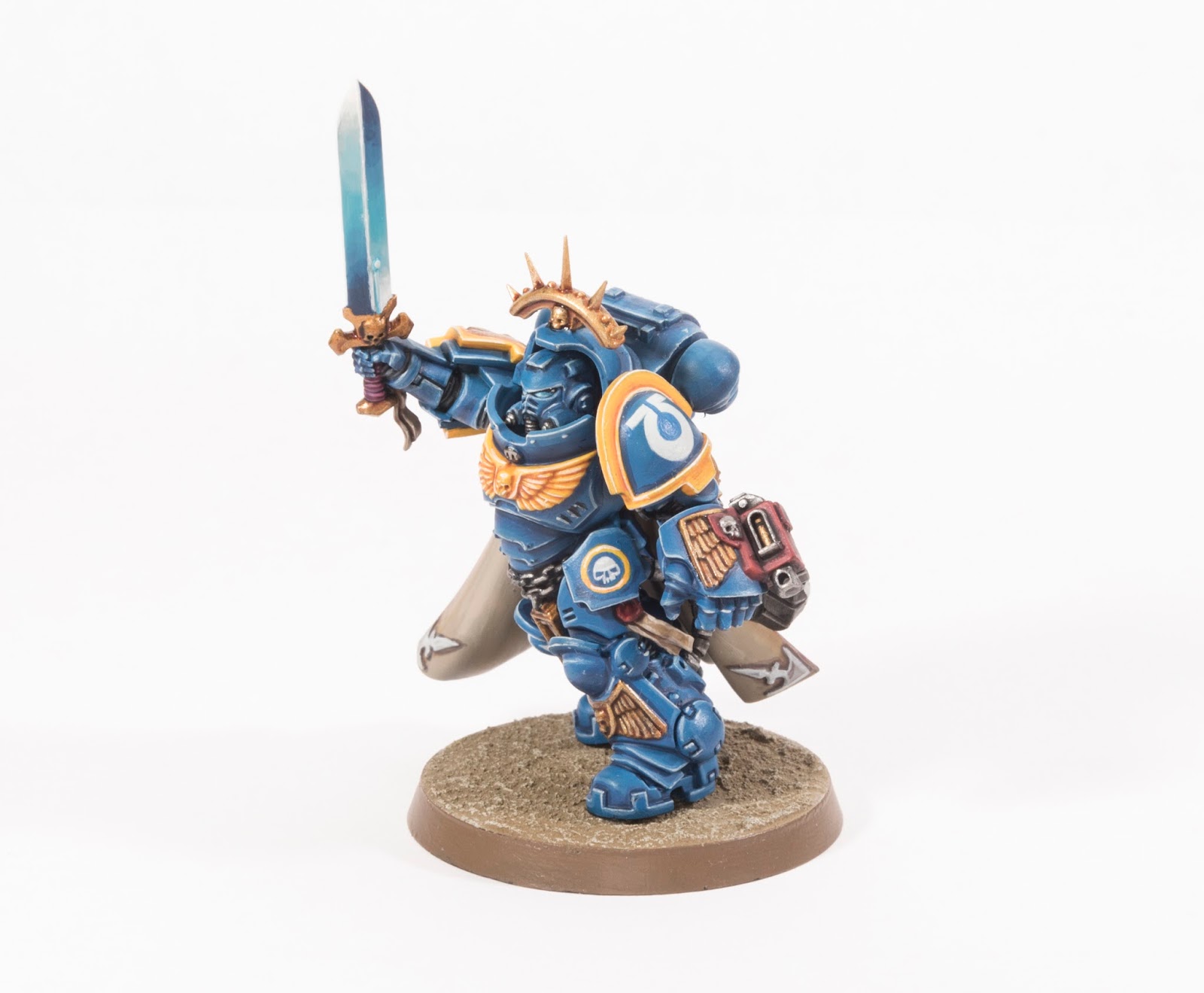
I wasn’t sure about this model at first. I thought the belly looked weird like he’s missing a belt. He’s really grown on me now and I really like it.
Check back real soon to see a group shot of all my Army of the Imperium Commanders.
1
9 Comments
Leave a Reply
Tale of Painters is the unofficial Warhammer hobby magazine run by hobbyists like you. Support our work by using the affiliate links from our 🇺🇸 / 🇨🇦 partner stores for your next orders so we can continue to bring you fantastic FREE content every day:


Or support us directly:


Really nice work, times and scale sizes certainly have changed over the past 26 years!
A modeling inspiration. I know how my 8th edition Ultras will look.
I love seeing these two painted side-by-side. More of this kind of thing
I totally agree with you about the weird guts – I always thought they looked a bit like a bloated bodybuilder:
https://www.t-nation.com/system/publishing/articles/10002934/original/Fail-Pro-Bodybuilding-and-Big-Guts.jpg?1432240126
I'm just painting mine now though, and I'm not noticing it as much whilst I work on him.
Also, I always loved those old Librarians, mostly for the novelty paint jobs we all did on them as kids…my favourite one was a ghastly purple colour.
Your one spoils the nostalgia a bit though by looking really nice. Beautiful work on an old figure there.
The model looks great, but the head is a little lost inside that suit of armor- especially with the eye lenses being so close in color to the armor. Have you considered changing them to red for a bit more contrast, or something more drastic like changing the color of the helmet itself?
I changed the lenses from red to blue. I agree there is less contrast but lenses/lights/power are represented by blue on my models. It's one of the key elements to help unify my army of the imperium. My hands are tied by my own rules.
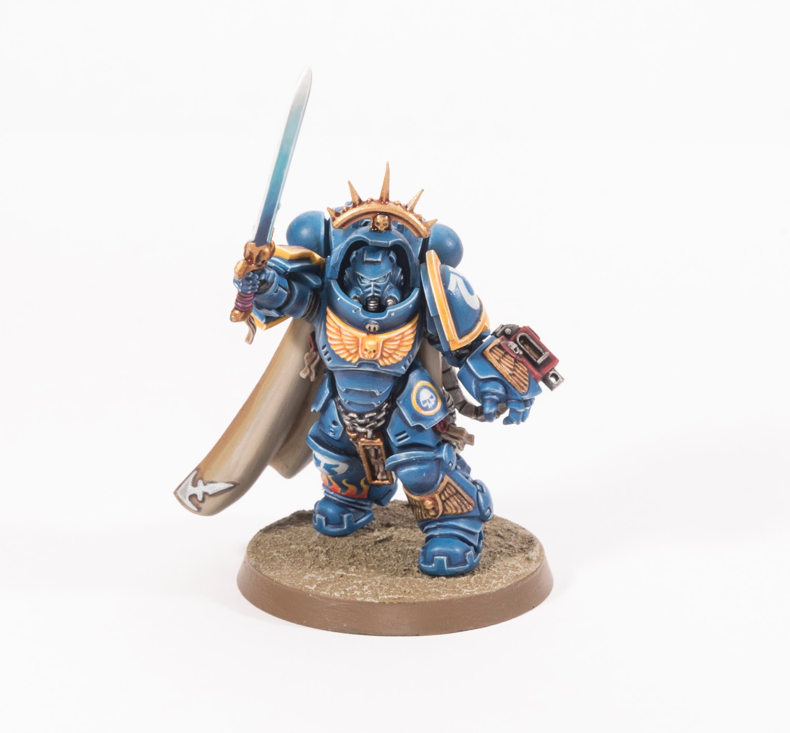
As for changing the helmet colour, I hadn't considered it. I don't think I would change it. This model is finished.If I ever paint another I think the solution to both your problems is use a bare head.
Can't fault the paintwork. Especially the use of yellow like the good old days. Only thing is the blue isn't as nice as the shade on the older model. Not as ultramarine
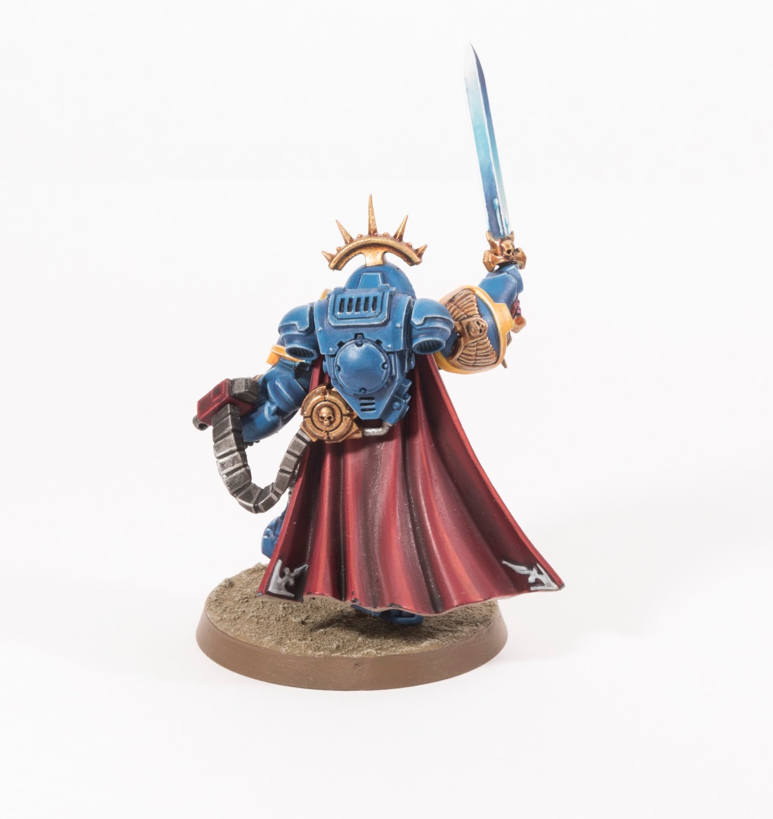
Ah, I prefer this blue to the old one. It's a touch lighter which allows me to shade darker. I always felt the official blue for Ultramarines was too close to Crimson Fist colour. I prefer the lighter more vibrant colours of second edition. That'l be my nostalgia.