I tested all 126 colours in the Pro Acryl range, including the brand-new Signature Series sets from Flameon Miniatures and Louise from Rogue Hobbies. In this video, I reveal what I think are the must-haves and explain why Bold Titanium White didn’t make the cut. Whether you’re already familiar with Pro Acryl or have only experience with paints from say Games Workshop or The Army Painter, this post will help you find the perfect addition to your paint collection.
The Pro Acryl range from Monument Hobbies is popular among many competition-level painters, and the Signature Series is endorsed by well-known creators like Ninjon, Vince Venturella, and Louise from Rogue Hobbies. And I also enjoy working with Pro Acryl. Although the twist caps take some getting used to, the paint has a velvety consistency, flows well off the brush, is highly pigmented, and dries very matte. Identifying the top 10 colours was quite a challenge since they’re all pretty good, but after testing and experimenting with all 126 colours, I came up with a shortlist in this video:
Stahly’s Top 10 Pro Acryl paints
Number 1 – Ivory
And the first colour on my list is an off-white. Good off-whites are a staple for every paint collection. They are incredibly useful to brighten colours, as they produce a more natural and warmer result than mixing in pure white. However, off-whites from other ranges, like Vallejo Game and Model Color or Screaming Skull from Games Workshop, often have too much of a yellow tint for my liking. This is why I prefer Pro Acryl Ivory because it balances yellow AND red undertones. The main reason Ivory made it to this list, though, is that it is a perfect match for Citadel’s Wraithbone. I use it to paint bone, teeth and claws in my Soulblight Gravelords collection when I don’t use Wraithbone primer. Despite being a Base paint, Wraithbone has poor coverage and a thick, clumpy texture. Ivory offers better covering power and a much smoother consistency, making it the superior replacement for Wraithbone in my collection, and possibly yours, too.
Number 2 – Orange Red
Second place on my list goes to a colour from the brand new Signature Series Set by Louise. Her Rogue Hobbies paint set is truly something else. It includes six ultra-saturated colours that are almost as vibrant as neon paints. For regular paint jobs, they can be a bit too garish for my taste. But Louise has a great video on her channel explaining how to get the best out of her set, and I think they’re fantastic for glow effects. But there is one colour that will make it into my daily rotation, and that’s the Orange Red. It reminds me of the orange-red used to paint Blood Angels in the 1st and 2nd editions of Warhammer 40.000, but amplified to 11. In the video, the camera can’t fully capture its vividness, but Orange Red is so highly pigmented that even the very similar Wild Rider Red from Citadel looks like a sad tomato. On the flipside, coverage is somewhat below average for a red, as the high, pure pigmentation means it contains almost no opaque pigments. Nonetheless, it’s excellent for highlighting, layering, and blending warm bright reds.

Number 3 – Bold Pyrrole Red
This brings us to my next favourite, which is the perfect companion for Orange Red and vice versa, though it’s also a great primary red on its own. I’m talking about a colour commonly known as Ferrari Red, which is Bold Pyrrole Red. Pyrrole Red is perhaps the most intense red pigment available, and it hasn’t been discovered before the 1970s. Pro Acryl’s take on this colour boasts extremely high saturation. Again, the camera can’t fully catch this, but in the video I think you can get a hint of how the usually vibrant Evil Sunz Scarlet appears dull in comparison. Not only does Bold Pyrrole Red apply very smoothly and streak-free with a matte finish its covering power is also surprisingly good. Typically, 2 to 3 thin layers are enough to achieve an opaque result. It’s an absolute must-have and complements Orange Red from Louise’s set very nicely.
Number 4 – Tan Flesh
Number 4 on this list is a flesh tone. Finding a good Caucasian skin tone is a science in itself. I don’t really like the skin tones from the Citadel range. Cadian Fleshtone is alright but its coverage is pretty poor, and Kislev Flesh and Flayed One Flesh are too ochre for my taste. Warpaints Fanatic has a large selection of skin tones, but most of them are too pink for me. I used Tallarn Flesh from Games Workshop’s old Foundation range a lot – does anyone remember that? It was a bit dark and thick but had excellent covering power. But now, I’ve found a fair skin tone that I like even better: Tan Flesh. It’s relatively bright but not too pink, not too ochre, and not too unnatural. The coverage is excellent; Tan Flesh covers in two thin layers over black. Need a quick skin recipe? Two layers of Tan Flesh, the flesh wash of your choice, some optional highlights, and you’re done! Tan Flesh is an absolute must-have for Caucasian skin.
Stahly’s Pro Acryl paint swatch
My goal is to map all paint ranges, and I’ve already created swatches for Citadel, AK, Vallejo Game and Model Color, Two Thin Coats, and Warpaints Fanatic, all compatible with each other so you can compare colours across different paint ranges. You can find them on my Patreon along with my masterclass painting tutorials. I really appreciate your support with this endeavour — I want to create the ultimate colour resource and many more swatches are planned.

This hand-painted swatch is available in my Patreon shop for a small donation (or by becoming an Autarch tier member). I also have swatches for Vallejo Game & Model Color, Citadel Colour, AK 3rd Gen, Warpaints Fanatic, and Two Thin Coats – all cross-compatible with each other so you can compare colours across different brands. Check out my shop for details.
Numbers 5 & 6 – Blue Black and Dark Grey Blue
Alright, here are the next top contenders in my Top 10. I fell in love with the following two colours while painting this Genestealer for the Pro Acryl range review. These two colours get often overlooked and are not easily found in other paint ranges. They are Blue Black and Dark Grey Blue. Most other dark blues are often quite saturated, leaning towards Royal Blue or Prussian Blue pigments, but Blue Black is more like a very dark denim blue, somewhat more faded. Compared to the Citadel range, it’s comparable to Dark Reaper but darker. I find Blue Black very versatile; you can use it to shade denim blues, to highlight black, or you can combine it with a blue grey.
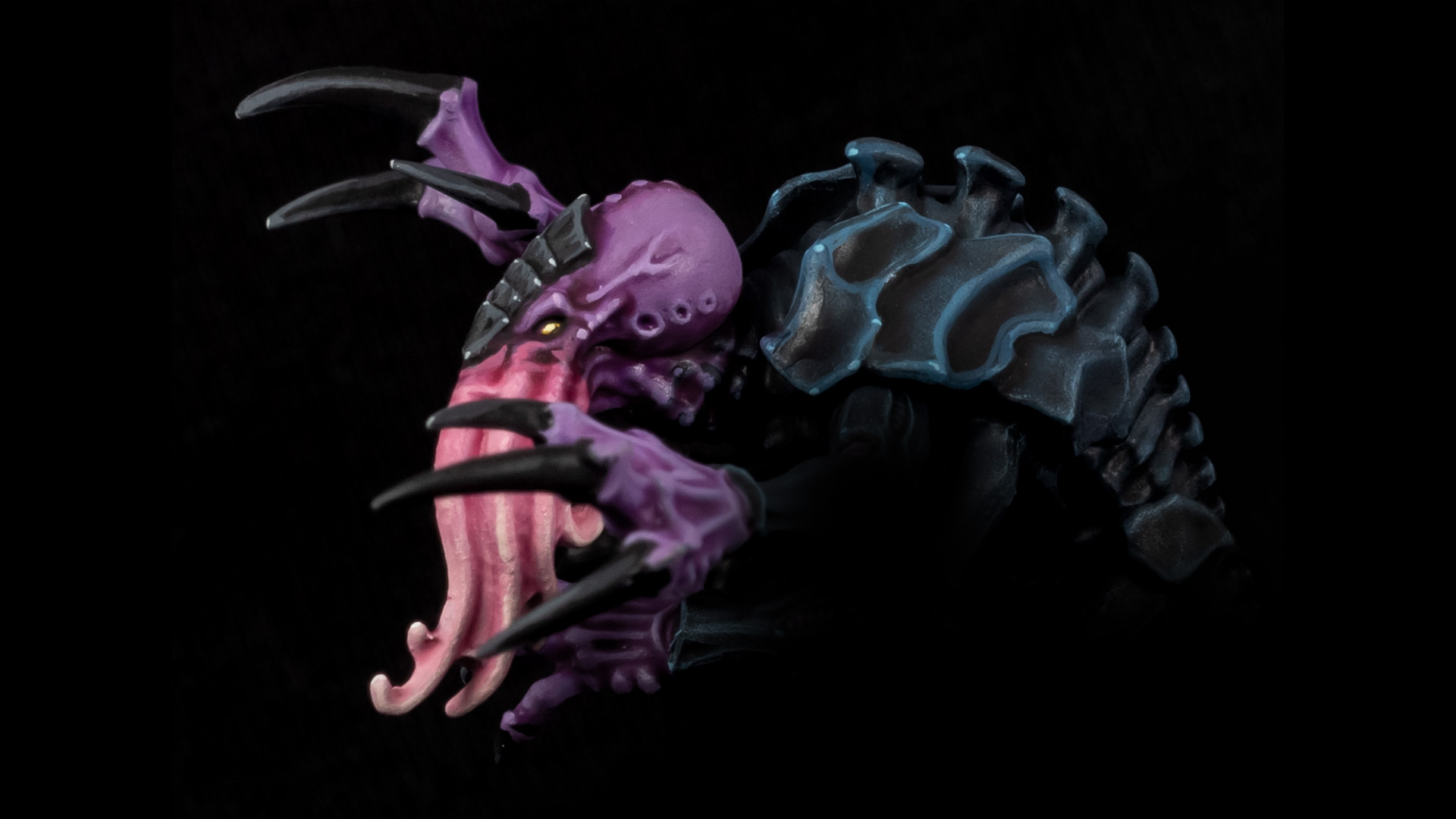
And that’s where Dark Grey Blue comes into play. Personally, I’m not a big fan of The Fang from the Citadel range; I find its shade of blue-grey too violet-tinted and not quite fitting in with Russ Grey and Fenrisian Grey. Pro Acryl’s Dark Grey Blue has, in my opinion, a more neutral blue-grey hue. Additionally, its covering power is just as good, but the consistency is much smoother. So, for me, Dark Grey Blue is the better The Fang and the perfect medium grey-blue, harmonising wonderfully with Blue Black, as you can see on the carapace of my Genestealer. By the way, I used Pro Acryl Grey Blue for the highlights, which is also an excellent colour, but I have to limit myself to 10 paints in this post.
Number 7 – Bright Pale Green
When it comes to green tones, you can’t do much wrong with Pro Acryl. However, one colour stands out for me, again due to its similarity with the Citadel Colour range. I know I talk a lot about Games Workshop paints in this video, but I simply love their colour palette, just not the paint itself, if that makes sense, or the pots. Let me know in the comments if you feel the same. Anyway, for number 7, I’ve picked a mint green: Bright Pale Green. Teal and jade greens are some of my favourite colours and frequently appear in my painting projects, and Bright Pale Green is great for extreme edge highlights or glow effects. And, you probably guessed it, yes, it’s a pretty close match to a colour from the Citadel range, namely Gauss Blaster Green. However, it has the smoother consistency, better opacity, and comes in a dropper bottle.
Number 8 – Bright Gold
Next up, we have some metallics. Pro Acryl’s metallic paints are all really good, so it’s hard to make a choice. But there is one gold tone I keep coming back to, and I also used it to highlight the golden armour of this Sister of Battle.
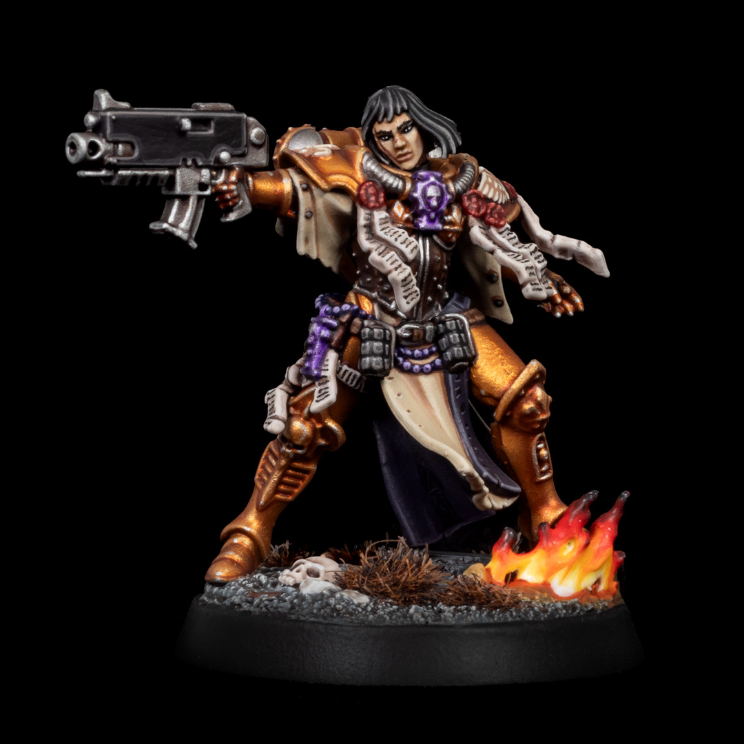
For the basecoat, I sprayed the armour with Greedy Gold from the Warpaints Air range, which is very similar to Retributor Armour. However, the Citadel and Army Painter ranges don’t have any light gold tones that I’m truly in love with. Auric Armour Gold is too yellow for me, and Liberator Gold is too flat and tends to separate a lot. Enter Bright Gold from Pro Acryl. I used to always mix Retributor Armour with silver, but now I prefer this lovely warm light gold tone. The covering power isn’t outstanding, but for a gold, it’s pretty decent. I love the colour, and thanks to the fine metallic particles, the finish is really nice.
Number 9 – Dark Bronze
The penultimate colour and second metallic tone in my Top 10 is another paint from one of the Signature Series sets. There is a muted dark bronze tone in the Citadel Colour range that I really adore. And admittedly, it’s one of the better metallic paints from Games Workshop, so you wouldn’t necessarily need a replacement for it. However, I’m a wet palette user, and for that, dropper bottles are just so much more convenient. I’m of course talking about Castallax Bronze. Fortunately, there is now an almost identical shade from Pro Acryl: Dark Bronze from Matt Cexwish’s Signature Set. This colour is available individually like all Signature paints, so you don’t have to get the full set. By the way, the other bronze metallics from Pro Acryl are also very good, but if I had to choose one, it would be Dark Bronze.
Why Bold Titanium White didn’t make the cut
Now if you remember the beginning of the post, I still owe you an explanation as to why Bold Titanium White didn’t make the list. You often read online that it’s apparently THE best white. And yes, it is a pretty good white, but I only happen to use it rarely. See, the consistency is rather thin and the pigmentation high, which is great for edge highlighting. However, I find that when basecoating and applying multiple layers, the finish can become a bit chalky. Additionally, I feel that Bold Titanium White tends to yellow relatively quickly. Have you noticed that too, or am I the only one?
Well, instead, I currently prefer the white from the Vallejo Game and Model Color series, and White Star from Two Thin Coats. Their consistency isn’t as thin as Bold Titanium White, but still silky smooth, and I get a smoother finish when layering. Especially for drybrushing, I prefer the slightly thicker consistency. So, while Bold Titanium White is a good white, Vallejo and Two Thin Coats are, in my opinion, better all-rounders. Bold Titanium White fans, please tell me in the comments why I’m wrong.
Before I get to the last colour on this list, I’d like to know if you enjoy this type of video and if I should also pick out the best colours for other paint brands. I’m constantly testing the latest paint ranges on my YouTube channel and on Tale of Painters and have a huge archive of paints, so I think I can make some good calls. Of course, it’s all highly subjective, and the Pro Acryl range doesn’t really have any duds. I’d love to know what your favourite Pro Acryl colours are, drop them below, I read every comment.
Number 10 – Black Wash
Okay, last but not least, we have a wash. Strangely, Pro Acryl washes don’t seem to be well-known, even though they are brilliant. While I still like Nuln Oil and its new formula has improved the flow properties, its tinting power has weakened and Shade paints in general sometimes dry a bit glossy. Dark Tone Wash from The Army Painter isn’t bad, but at the moment, my favourite black wash is Pro Acryl’s Black Wash. Not too heavy, not too weak, it finds its way very nicely into recesses. And while it dries not super matte, the finish is also not too satin or too glossy. Number 10 on the Top 10 Pro Acryl list is therefore Black Wash, but all three washes are great; the Brown Wash for example has a very nice dark brown tone. Monument Hobbies, if you’re reading this, please release more washes!

And if this list has piqued your interest, be sure to check out my in-depth review of the Pro Acryl range:
You can find the latest hobby products at our 🇬🇧/🇪🇺 partner stores Wayland Games, Element Games, and Firestorm Games, at 🇩🇪 Taschengelddieb and PK-Pro, and at 🇺🇸 Noble Knight Games with a welcome discount of up to 10 – 15% over RRP. Using our links helps to support Tale of Painters at no additional cost to you, so thank you very much for using them!
I hope you found this review helpful, feel free to leave a reaction or comment below, or post your questions here or discuss on our Discord channel.
Tale of Painters is the unofficial Warhammer hobby magazine run by hobbyists like you. Support our work by using the affiliate links from our partner stores for your next orders so we can continue to bring you fantastic FREE content every day:


![]()
![]()
Or support us directly: