


A lot has already been said about Warhammer Tone Pro, but I think it’s time for a more nuanced review that really gets to the bottom of GW’s newest paint range. A review for painters of every level, with no agenda to please anyone. I’ve tested every hobby paint brand in the industry over the last few years, and in this video I’ll put Tone Pro’s performance against the competition into proper context.
You can say what you like about Games Workshop, but they’ve always tried to make painting more accessible. Think of the high-opacity Foundation paints, the first set of good acrylic washes, then the introduction of the Base/Shade/Layer/Dry system in 2012, and of course, Contrast. Now, the next step is Tone Pro. These 150 new colours and 2 mediums don’t replace the recently rebranded Warhammer Colour range, but complement it. At least for now. Who knows what things look like in a few years.
150 paints, 30 colours, 5 tones each: what I tested
30 colours, each with 5 numbered tones from dark to light, 150 paints in total. GW aren’t the first to come up with a system like this, but more on that later. First, I want to test whether the coverage, self-levelling, and saturation are really as revolutionary as claimed, or whether GW has merely caught-up to the competition. Second, I’ll share my thoughts on the quintet system and compare it against Warpaints Fanatic. And third, you’ll get my honest verdict, my take on which types of painters and techniques I’d recommend Tone Pro for – and which I wouldn’t, and if I think Tone Pro is worth the price they’re asking for:
Full disclosure: samples, bias, and creator events
And speaking of bias, there was quite a bit of buzz around the Tone Pro Creator Event. I wasn’t part of that, but I am part of the Warhammer Creator Programme and received a sample pack like many others. That said, almost every paint brand sends me their products to test, which means I don’t have to favour anyone and can essentially pit them against each other. This channel is funded through affiliate links and Patreon, where I offer my popular hand-painted colour swatches that are now covering pretty much every brand. That means I owe good reviews to you, not to any industry player. And if you know my videos, you’ll know I’m always constructive, but I don’t shy away from exposing any shortcomings.
And I promise you, this review doesn’t pull any punches, because my expectations have skyrocketed by this point.
Pots, consistency, and first impressions
Right, Warhammer Tone Pro comes in the same pots as Warhammer Colour, with the same 12 ml capacity. So the problem of paint collecting in the tops is the same. I’m really not a fan of pots; my guess is that the reason for them is that Tone Pro needs to fit into existing retail display racks.
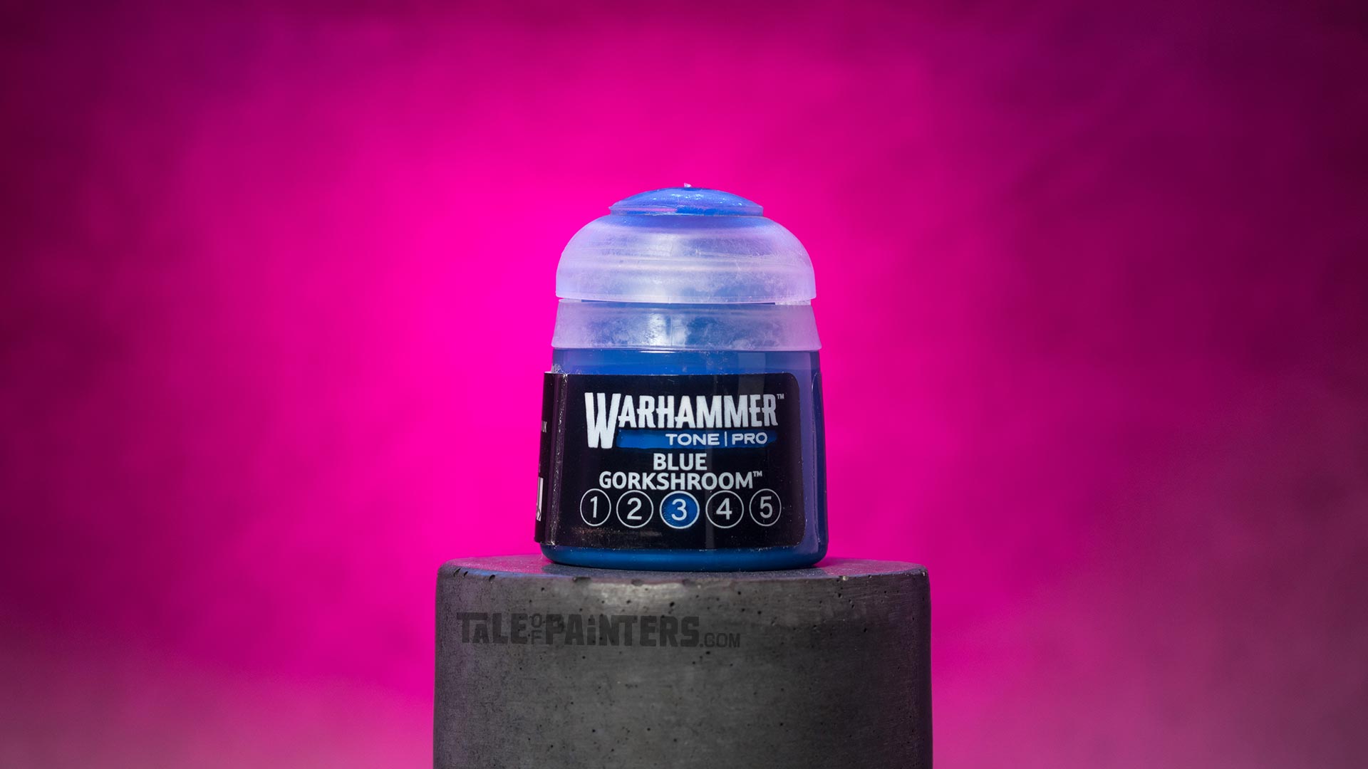
The first big difference from regular Citadel aka Warhammer Colour is the consistency. These paints are thinner than even Layer paints and many other ranges like Warpaints Fanatic. Despite that, they’re supposed to have high covering power. That often comes at the cost of saturation, but Tone Pro colours are said to be very vibrant. More on the colour palette later, first let’s get them on some test models.
Covering power test: bright colours over black primer
I’m starting with a tough one: Chotec Orange 4 straight over black primer. Bright orange is just as difficult to paint as yellow, and I apply the paint undiluted from the pot with just a little extra moisture from my wet palette. As you can see in the video, the consistency is super silky and smooth, and the flow is incredible. Just a little on the brush goes a long way, and on the wet palette, the paints stay stable for quite a long time before they separate. The covering power also looks remarkable at first glance – one coat over black and the result is almost perfect. The key word there is “almost.” My experience with pretty much all current-gen mini paints is that all the bright colours like white, bone, yellow, orange, red, and light green, seem to cover surprisingly well on the first coat, even over black. Warpaints Fanatic made a big deal of that aspect (see my review here). The trade-off can be saturation, because these paints often rely on filler pigments like white to boost the opacity. But to get a truly opaque and even result I found you’d still need a second, third, and sometimes fourth coat, even when that first coat looked so promising, and even over a midtone like brown or grey. And that’s exactly when all those filler pigments can make the finish go chalky.

The Tone Pro whites, yellows, reds, and light greens also cover excellently. But as you can see in this comparison, you also need three coats or more for a perfect result. With just one or two coats, the primer still shows through on raised areas, as the downside of the fluid consistency is that pigments tend to settle into the recesses. That said, Tone Pro paints stay beautifully smooth even after multiple coats. There are no visible brushstrokes, bubbles, or chalkiness.
Self-levelling, drying time, and finish
Part of that is down to the extended drying and working time, and the self-levelling properties. You’ve probably seen all the reels of people dropping a blob of paint onto a Space Marine helmet with the details still surviving underneath. That looks impressive in a reel, but I’ll be honest: many current-gen paints can do the same thing, Two Thin Coats being one example. So GW is catching up here rather than breaking new ground. Speaking of drying time, it’s a bit longer than with regular Warhammer Colour or Warpaints Fanatic, but not as long as say Two Thin Coats. Thin coats dry faster, but a thick coat of Blackstone Void 5 White can take up to 20 minutes to cure.
The smoothness also comes from the finish. It varies a bit from colour to colour; the blues are a bit of a glossy satin, similar to P3 (review here), while other colours are more of a satin-matte, like regular Warhammer Colours and Fanatic. Glossy and satin paints generally dry smoother than matte ones. Whether you prefer matte or satin comes down to personal taste. I prefer matte, like most display painters do. It’s easier on the eyes and photographs better, but it also makes colours look slightly flatter and is less durable. Keep in mind you can always adjust the finish with a varnish at the end.
What’s genuinely new: the binder and brush feel
Right, so two of the biggest claims (covering power and self-levelling) have been put into perspective. For me, what’s genuinely novel about Tone Pro is the binder, which creates this incredible smoothness and fluid consistency. Incidentally, the consistency is the same for every colour, whether dark or light. That’s what makes Tone Pro so wonderfully predictable, because every colour works in exactly the same way.
Painting techniques deep dive
Now I want to go deeper into the strengths and weaknesses by testing every painting technique, and then I’ll tell you how well the saturation and the 1-2-3-4-5 system compares against something like Warpaints Fanatic.
Glazing and shading: Shade Medium put to the test
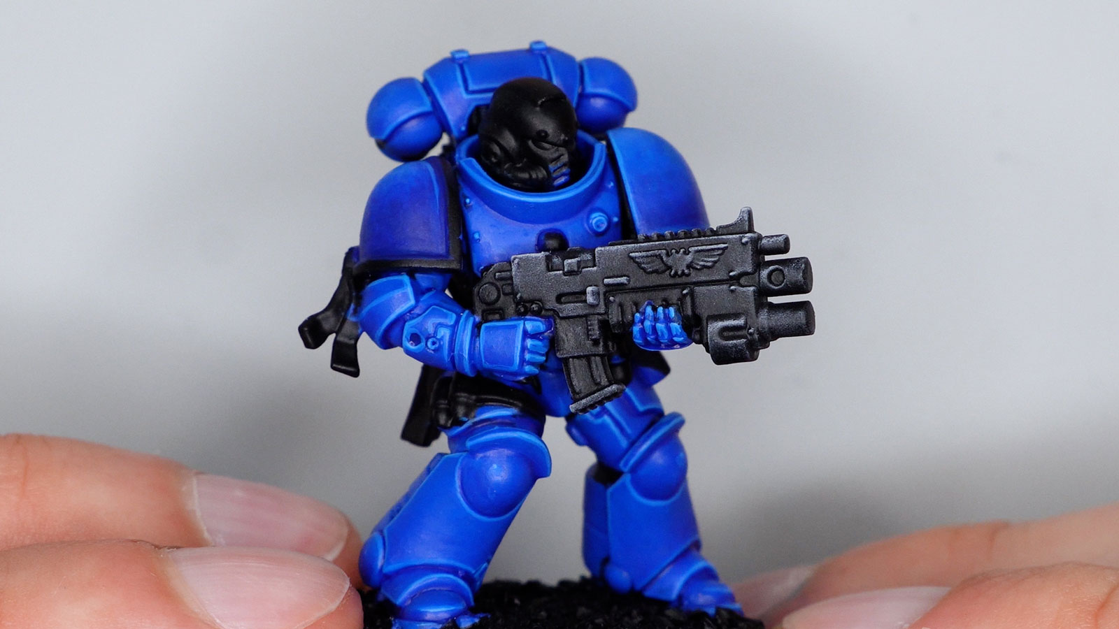
This Space Marine was basecoated with Blue Gorkshroom 3 in two thin coats. First up, I’ll do multiple thin glazes to add volume to the armour. For that, I step down one tone to number 2. Glazing with Tone Pro is a bit tricky, as the pigmentation is so strong. You really do need to thin them heavily to make them transparent, and at that point they become too watery for glazing in my opinion.

Here’s the result, it’s quite subtle as the jump from 3 to 2 isn’t that big. To get to this point, I recommend using an acrylic medium to make the paint more transparent so you need less water. I used P3 Mixing Medium as it has quite a bit of body, mixed about 1:1 with Blue Gorkshroom 2, and then just a little bit of water to bring it to a glazing consistency.
I’ll show you how to blend in a moment, but first I recess-shade with Blue Gorkshroom 1 thinned with a little Shading Medium. This flows very well, thanks to the strong pigmentation. Speaking of the Shading Medium, GW markets the idea that you can turn any Tone Pro paint into a wash with it. It really does work, but keep in mind that the thinned paint still retains a level of opacity as it settles into the recesses.
In the video you can see a comparison with a “real” wash like Warhammer Shade paints. These use a completely different pigment base and are more transparent by nature. Where the pigments collect they darken more strongly. Multiple coats make the model darker, while the Tone Pro wash becomes progressively more opaque. So the Shade Medium can’t replace real washes, but it’s a useful addition. The difference compared to Pro Acryl’s 1-Step Special Sauce, Lahmian Medium, or Contrast Medium as you can see here, isn’t that great, though.
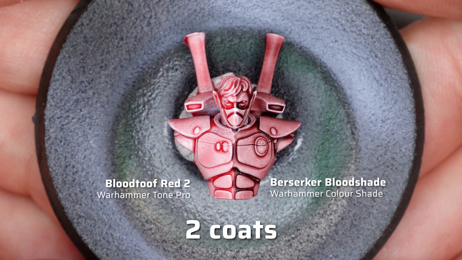
Next in the video, I apply a few thin coats of the midtone, number 3, to smooth out the transitions. Again, I needed to thin more than I would with other paints, and used some of the P3 medium. Overall, I feel there’s a real learning curve with Tone Pro’s consistency for more advanced techniques, even or especially if you have a lot of experience with other paint ranges.
Edge highlighting: where Tone Pro shines
For me, where Tone Pro shines, is edge highlighting. I apply a highlight with undiluted Blue Gorkshroom 4, really no thinning needed, and the consistency and opacity make it feel very easy. I was also able to precisely place a second, finer edge highlight with tone number 5. Flow and coverage are so perfect that one pass is enough, so that you don’t have to go over the edges multiple times.

Blending, feathering, and drybrushing with Tone Pro
Now it’s time to blend, and I saved the shoulder pads for exactly that. In the video, I apply Blue Gorkshroom 2, and while it’s still wet I add number 4 at the top and blend the two together. Even though I’m more accustomed to blending with thicker, creamier paints like P3 or Two Thin Coats, I found this went quite well after a bit of practice. Even without the Blending Medium, which contains a drying retarder that gives you more working time. Tone Pro doesn’t dry that quickly, but in thinner layers it does get tacky fairly fast.

On the other side I use feathering by applying Blue Gorkshroom 4 at the bottom and feathering it upwards with a clean, slightly damp brush. Although I’m actually better at feathering than wet blending, I found it harder to achieve smooth transitions this way. Probably because the pigmentation is so strong. Again, adding a medium like P3 Mixing Medium to make the paint more transparent helped, essentially turning the paint into a heavy glaze. But I’ll admit I’m not the world’s best blender, so do check out what creators who paint at a higher level have to say about the blending capabilities. But I’d say, if you struggle with these techniques, then the Tone Pro formula probably doesn’t make it any easier.

On the other hand, blending and highlighting with drybrushing works really well, but again there’s a slight learning curve with how much paint to pick up and wipe away. Tone Pro handles differently from thicker paints, though I do have the impression that it also tends to produce smoother transitions when drybrushing, especially when using dome-shaped drybrushes with soft bristles or make-up brushes.
Airbrushing and mixing Tone Pro
Before we go deeper into the quintet system and colour palette, a few quick impressions from airbrushing. Because Tone Pro’s consistency is already quite fluid, I found only a little additional thinning is needed. I just used plain Vallejo airbrush thinner, and combined with the extended drying time I had no issues with tip dry. They atomise very well, and the spray pattern on this zenithal base coat with Voidstone Black 5 over black is pretty good for an acrylic paint. Especially for white which often turns out grainy.
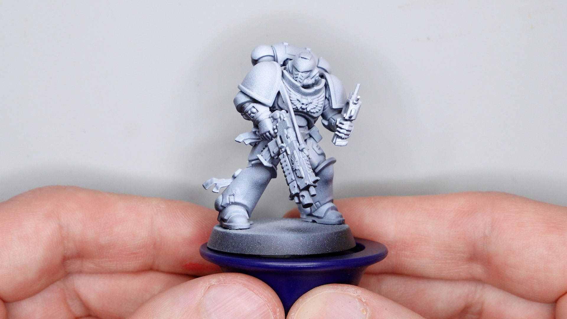
For basecoating the paints pack a real punch, so you’ll need less layers to build up colours. Zenithal gradients like in the video with Hierotek Green 5 over 1 are fine, but if you want to spray more transparent transitions, you’ll need quite a bit of thinner and adjust to the right consistency. Because of the dense pigmentation, they do overpower other colours a little faster than you might expect.
The same is true for mixing colours, especially when combined with less pigment heavy paints. So you’ll probably need mixing in less than you think. Note that apart from that, Warhammer Tone Pro mixes without any issues with any water-based acrylic hobby paint.
The quintet system vs Warpaints Fanatic
And on the subject of mixing, let’s finally talk about the quintet system with its 5 stepping tones per colour. GW aren’t the first to do this, but whether they’ve done it best is what I’ll explore now.
Reaper and Foundry were among the first manufacturers to introduce a triad system, and Warcolours has had a quintet system since 2015. The best-known version, though, is probably Warpaints Fanatic with its flexible triads: six tones per colour, sometimes seven if you count the John Blanche additions.
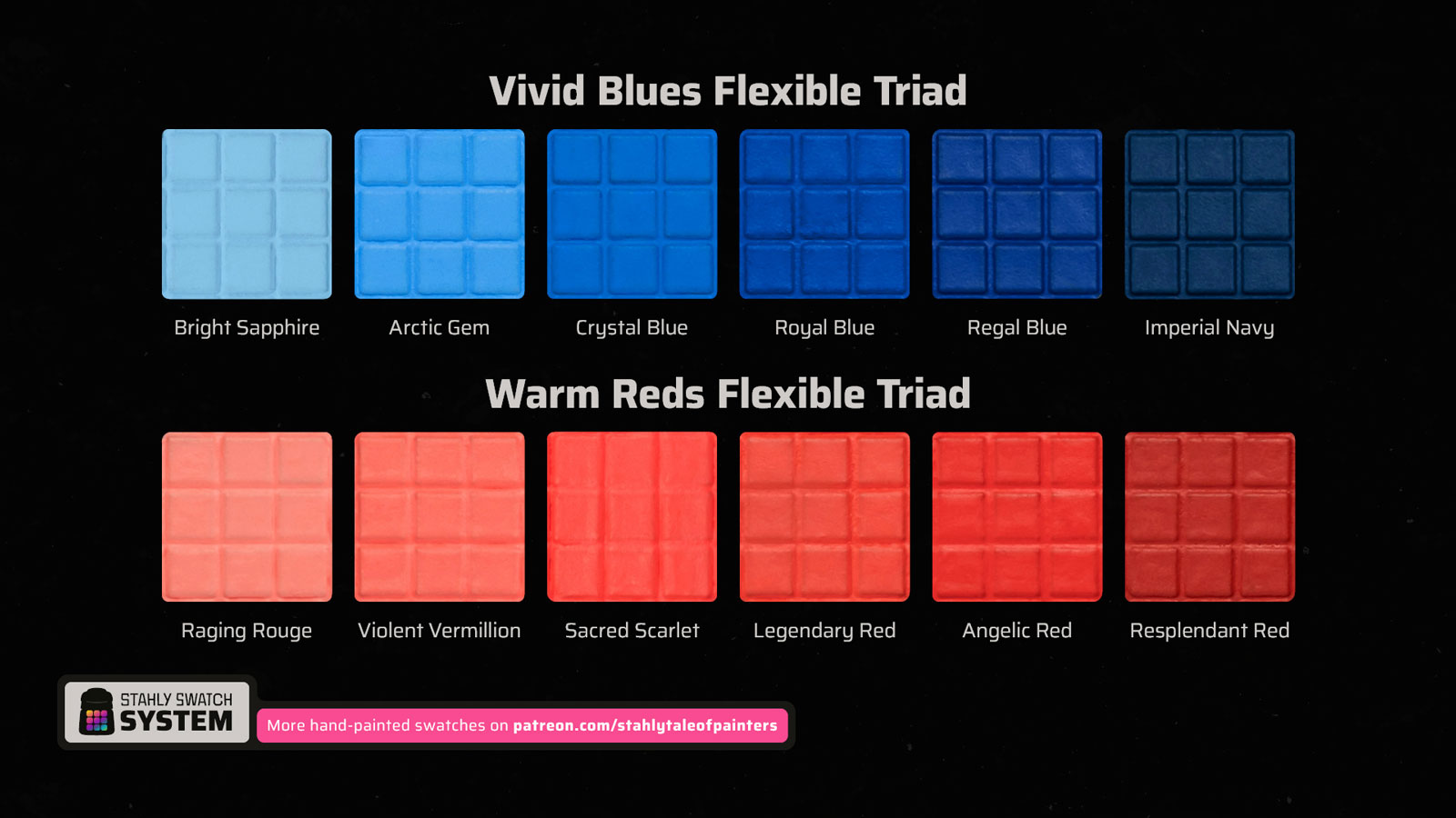
My issue with Warpaints Fanatic’s sextets, though, is the range of value. Most of them start dark at a low value and climb light, creating clear stepping tones between every colour. In my opinion, that’s how it should be. But some sextets have a much narrower range, and as a result the steps are barely distinguishable from each other. That creates redundancy and puts unnecessary strain on your hobby budget. You can judge for yourself in my hand-painted Warpaints Fanatic swatch, where I’ve professionally digitised every colour including the John Blanche and Historical ranges:
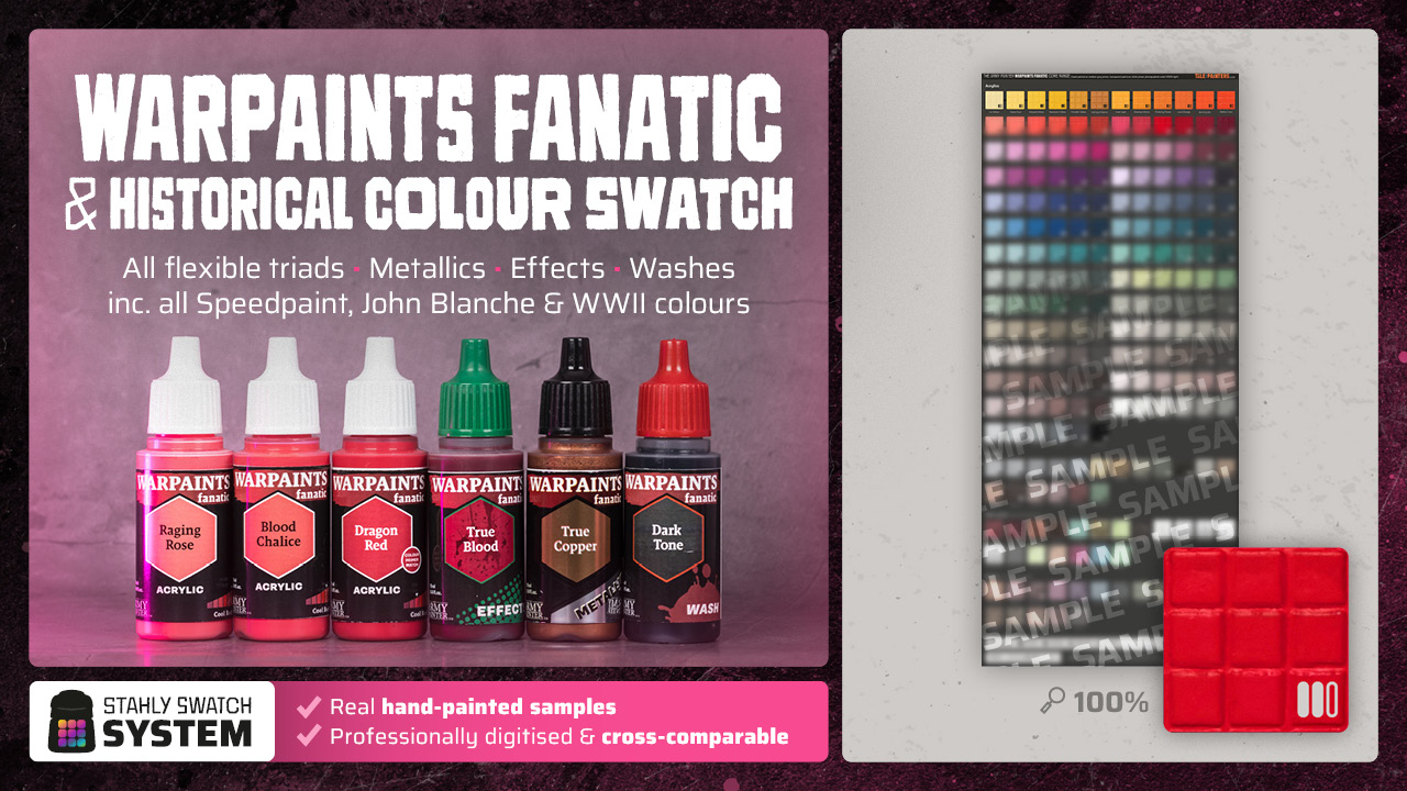
This hand-painted swatch is available in my Patreon shop for a small donation (or by becoming an Autarch tier member). I also have swatches for Citadel Colour, Vallejo Game Color, AK 3rd Gen, and Two Thin Coats – all cross-compatible with each other so you can compare colours across different brands. Check out my shop for details.
Warpaints Fanatic and Warhammer Colour are also both included in my colour matching document, which covers over 1,200 samples from the most popular hobby paint ranges.

Over 1,200 accurate hand-painted colour samples, covering the seven most popular miniature paint ranges (Citadel, Warpaints Fanatic, Vallejo Game & Model Color, AK 3rd Gen, Pro Acryl, and Two Thin Coats). Sorted by colour families, hue, value, and saturation, in an interactive PDF document with a handy navigation and helpful appendix about colour reproduction. Check out my Patreon shop for details.
I’m also creating a swatch for Tone Pro, so you can compare and convert colours against your existing Warhammer paints. I’ll update this post once it’s ready. My swatches are far more accurate than other apps or conversion tables based on RGB or hex values, because they feature real hand-painted samples. Please support the project with a small donation on Patreon, check the link below.
How well does the tone 1 to 5 system actually work?
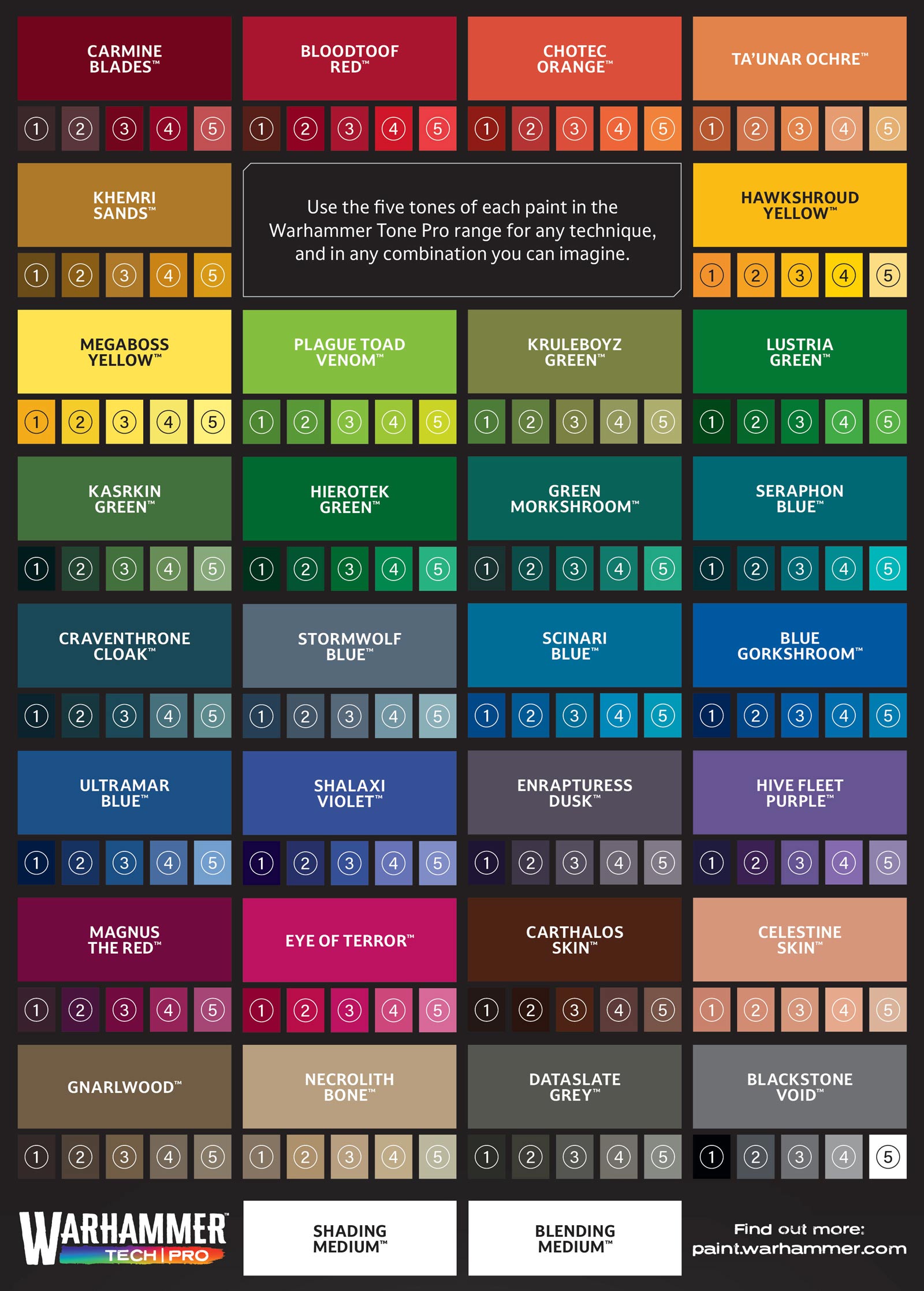
But how good is the Warhammer Tone Pro system actually? I only have the sample pack right now, but from what I’ve tested and seen over at Warhipster, the stepping tones look well chosen for most colours. As with Fanatic, though, the tonal range isn’t consistent across the board. The two yellow quintets, as well as Eye of Terror and Celestine Skin, have a narrower range of value that compresses the steps between the 5 tones. For those, consulting my swatch and picking up just two or three from it will probably be enough.
Can you just buy tone 1 and tone 5 and mix the rest?
You might also be wondering whether you could just buy tone 1 and tone 5 and mix everything in between. The answer is yes, but… no. For most quintets, tone 3 is the most vibrant colour. In some it can be tone 4 and/or 2, but usually one of the midtones. We’re not talking about single-pigment artist paint levels of saturation here, but more punch than their regular Warhammer Colour and Fanatic counterparts.
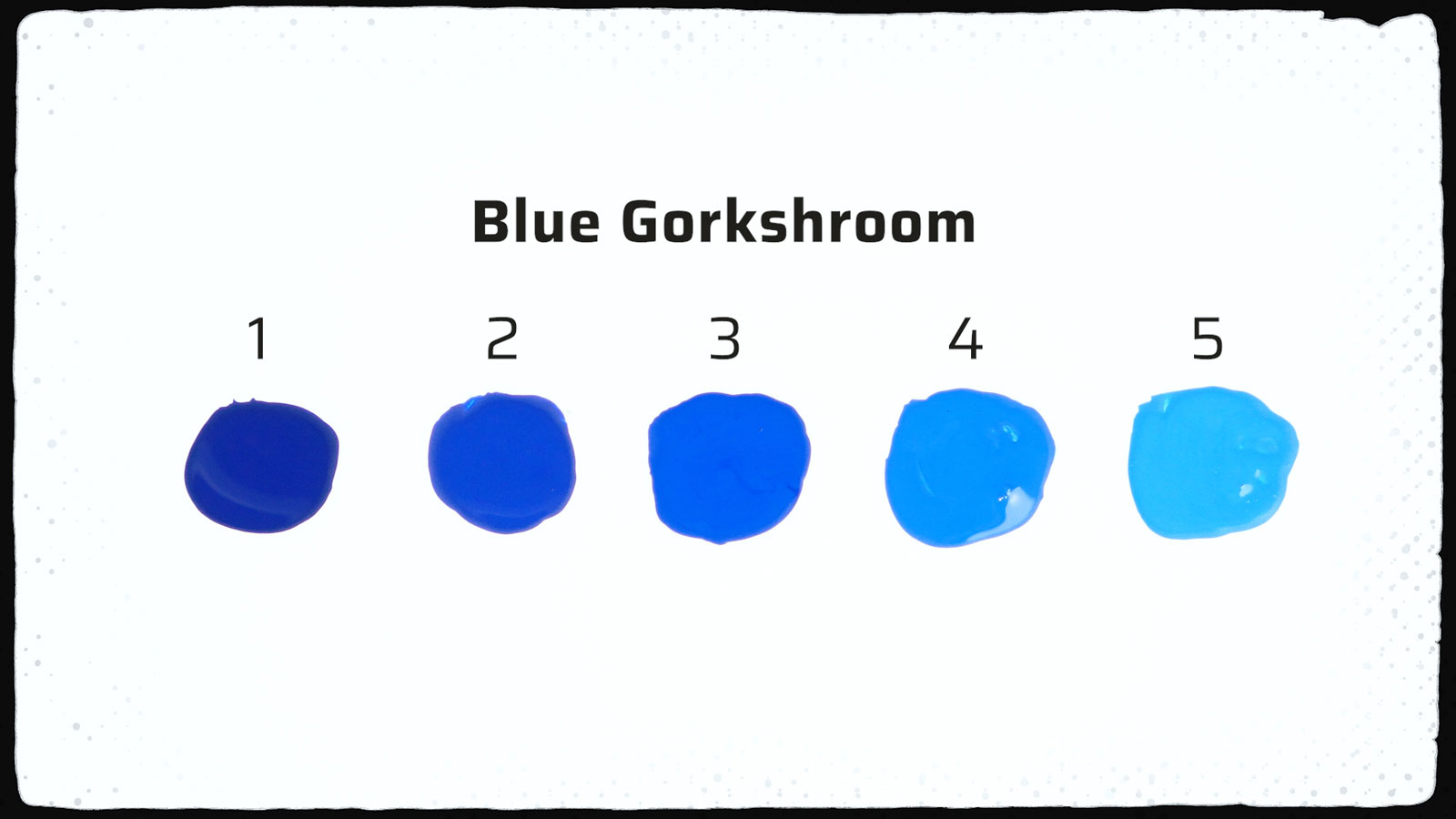
Then, moving towards tone 5 the colours tend to get slightly more pastel, and towards tone 1 a bit more muted. What this means is that mixing tone 1 and tone 5 won’t give you the same vibrancy as 3. On top of that, there can be tonal shifts within some quintets. For example, a slight cold shift towards the darker tones, or a warmer, more yellowish shift towards the lighter end. Not in all colours, but in some, so when in doubt, check my swatch.
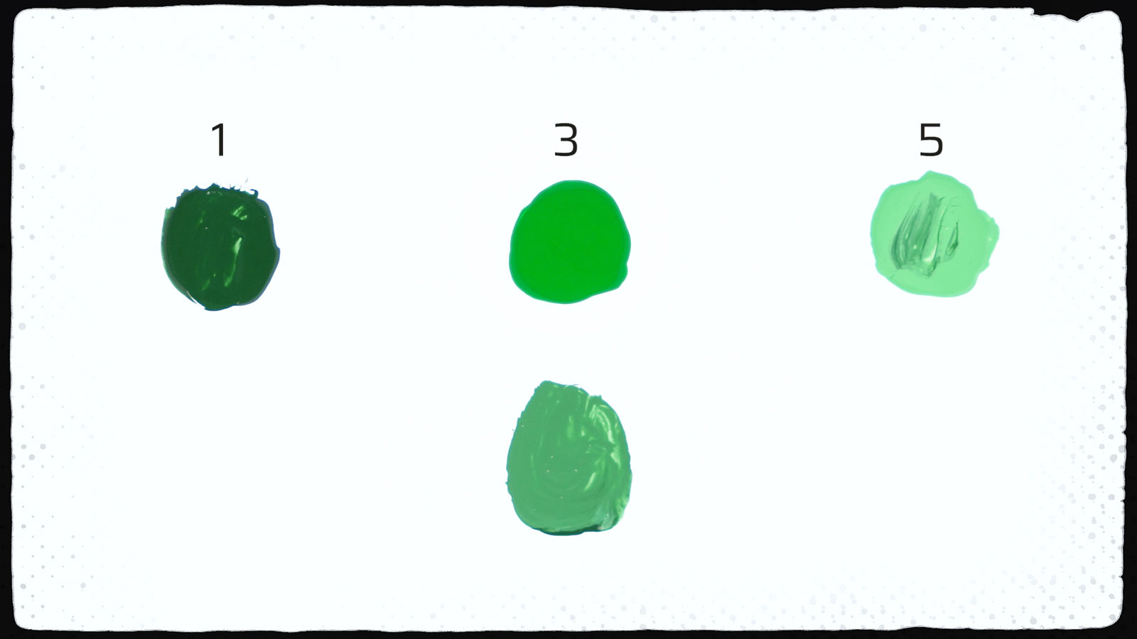
In summary, Tone Pro quintets aren’t simply the same base colour darkened or lightened. Each tone has its own individually tuned pigment mix. That’s why tones 1, 3, and 5 are usually the ones to get. Tones 2 and 4 are mainly there for convenience, aimed at army painters who want consistent, pre-mixed colours ready to go. If you’d like me to go deeper into each quintet once I have the full range, drop your questions in the comments and subscribe to my YouTube channel so you don’t miss the follow-up video.
The colour palette: what works and what’s missing
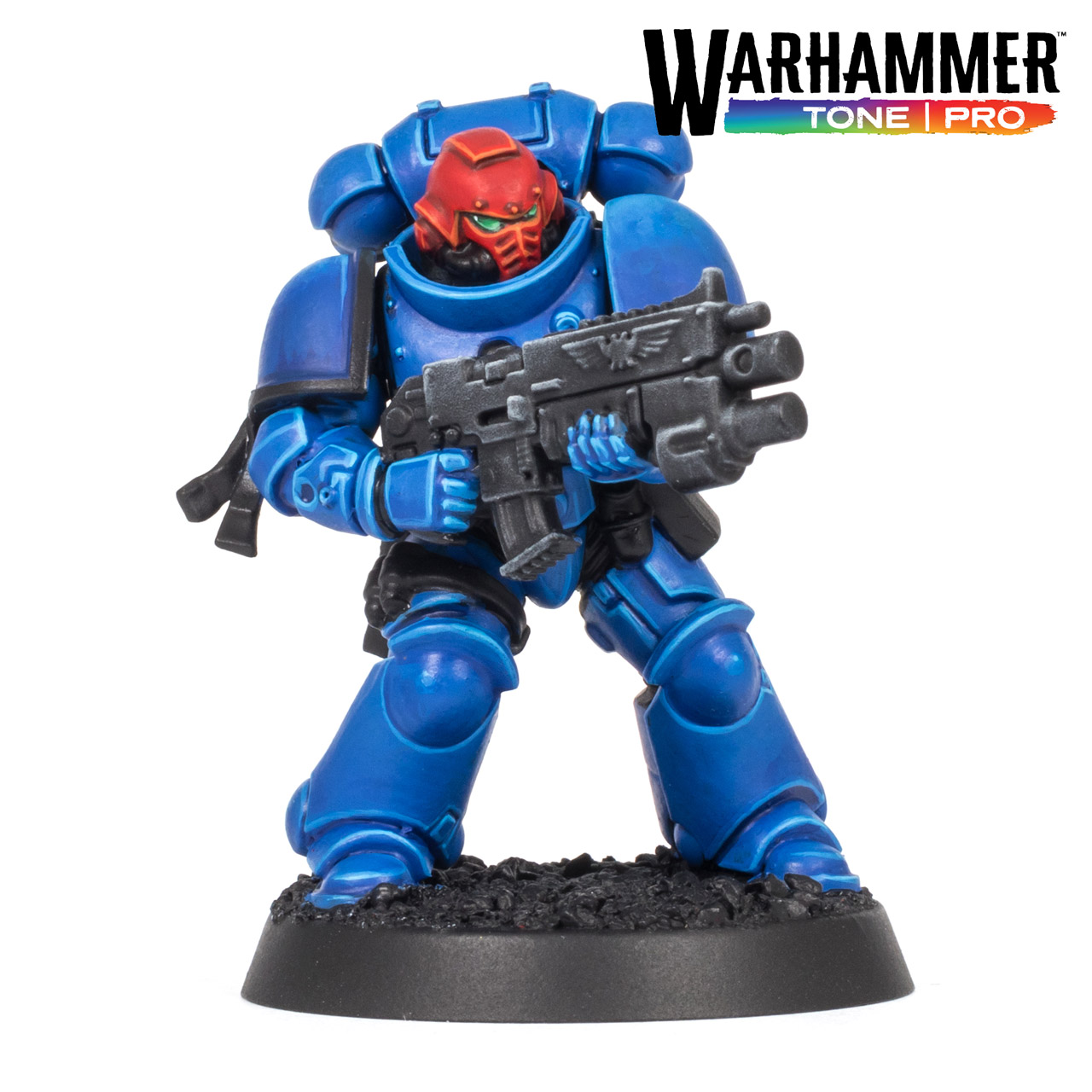
What I can already say is that for my taste the tone 1 colours could all have been a touch darker and the tone 5 colours a bit lighter, which would have pushed the steps even further apart. You can see that on the Space Marine’s blue power armour; to push the shadows and highlights even further, I would have needed to mix in some black and white respectively. Beyond that I’m fairly happy with the colour palette. Games Workshop have a good eye for selecting colours that complement their Warhammer setting. Colour palettes are ultimately a matter of taste, but my impression is that Tone Pro is better set up for warm reds, greens, and browns than Warpaints Fanatic. Though, one thing I’m really missing from both ranges is a rich golden brown. Something similar to Mournfang Brown.
Does Tone Pro set a new industry standard?
Whew, that was quite a lot. I promised you a nuanced review, so let’s draw a conclusion here. Does Warhammer Tone Pro really set a new industry standard, who is it really for, and would I recommend it given the high price?
Now, there’s been a fair bit of nitpicking in this video, but overall I really like Tone Pro. It’s a very good paint. It’s not revolutionary but it has its own identity and unique brush feel. The strengths line up perfectly with the hallmarks of the classic painting techniques you associate with Warhammer miniatures: basecoating, layering, drybrushing, and above all, edge highlighting. Which makes sense, it’s a Warhammer paint so it should work well for the typical Warhammer style. As I demonstrated earlier, Tone Pro doesn’t set new benchmarks for covering power, self-levelling, or saturation. It just catches up with other modern ranges like Ionic, Pro Acryl, Two Thin Coats, and Mini Colour, just to name a few. The real USP is that GW has packaged all of that into a velvety smooth consistency you can use straight from the pot without thinning. And of course there’s the quintet system which is perfectly matched to Warhammer factions, and will be backed by the whole ecosystem of the Warhammer Academy and YouTube and White Dwarf tutorials.
Who is Tone Pro really for?
Despite the Pro label, I think the core audience is actually army painters who want a straightforward system and quick, strong results. Display painters won’t need any of this. They prefer to mix their own tonal variations and usually want a more matte finish. The consistency combined with the high pigment density also has a learning curve for blending and glazing that is quite different from other paints, which I can see putting some people off. As it has such a strong identity, it’s a somewhat polarising product.
Where to get
You can find the latest hobby products at our 🇬🇧/🇪🇺 partner stores Wayland Games, Element Games, and Firestorm Games, at 🇩🇪 Taschengelddieb and PK-Pro, and at 🇺🇸 Noble Knight Games with a welcome discount of up to 10 – 15% over RRP. If you found this review helpful, we would love it if you supported us by using our affiliate links to make a purchase (at no additional cost to you, of course). Thanks a lot, and happy hobbying!
Feel free to leave a reaction or comment below, or post your questions here or discuss on our friendly hobby Discord channel.
8.5 Score
Pros
- Silky, consistent flow across all 150 colours, straight from the pot
- Edge highlighting, layering and drybrushing feel effortless
- High opacity and vibrant midtones
Cons
- Most expensive miniature paint per ml on the market... and pots
- Strong pigmentation makes glazing and blending tricky without a medium
- Tonal range narrower in some quintets, so a few steps seem redundant
Final Verdict
Scoring is genuinely difficult. Tone Pro a clear upgrade to the regular Warhammer Colour, and on pure paint quality I'd give Tone Pro an 8.5. Maybe even a 9 if you play to its strengths, but also with two big caveats: you really need to be up for the system, and you need to decide whether you can live with the pots and stomach the price. If either is a problem, knock off a point or a point and a half. The price in particular is no joke – per ml, Tone Pro is the most expensive miniature paint on the market, and it's not even close. So start with just cherry-picking a few colours and decide whether Tone Pro really does something for you that your other paints don't. The white is really excellent, as are the Bloodtooth Reds, and try the midtones first, as they are the most vibrant.

[…] su análisis detallado en Tale of Painters, Stahly destaca la regularidad de la textura entre colores. Varios pintores indican que pueden […]
[…] his detailed Tale of Painters review, Stahly highlights the consistency of the texture across the range. Several painters report using […]
Considering the amount of options we have for hobby paints these days I do not see these paints as being worth the amount that they are asking. So they either need to drop the price substantially or increase the amount of paint we get because otherwise I’ll be giving these paints a pass.
The “catching up” argument seems internally inconsistent to me: if Tone Pro has roughly the pigment density and coverage of other top paints while already being at a brush-ready consistency, that is itself the interesting technical difference. Saying “you can just thin Pro Acryl/Fanatic/etc. to the same consistency” ignores that thinning also reduces pigment concentration and usually coverage in the applied film. The fair comparison is therefore not straight-from-bottle coverage, but coverage at equivalent working consistency. If competing paints still match Tone Pro after being thinned to the same flow, then fair enough, it’s catch-up; if they don’t, then Tone Pro has actually moved the trade-off between viscosity, pigment density and opacity.
Great review! I agree with a lot of the points and after trying the paints at my local store I was quite confused why other reviewers treated these as so revolutionary.