
Today I’m going to review Green Stuff World’s brand new Dipping Inks, yet another Citadel Contrast “clone”. What makes them special is their size: The paints come in large 60ml bottles, which is more than three times the capacity of a pot of Citadel Contrast, and that for an RRP of 5.75 €. More paint for less money, sounds too good to be true? Let’s take a closer look if these new Dipping Inks are worth it or not.
First things first: I realize there is some kind of controversy around the company Green Stuff World. They have a reputation for copying and trademarking the ideas of others, here is a link to a thread on Dakkadakka, so please make up your own mind. I would like to point out that I bought the products for this video myself and have no involvement with Green Stuff World. But, like with all my reviews, I will form a fair and neutral opinion.
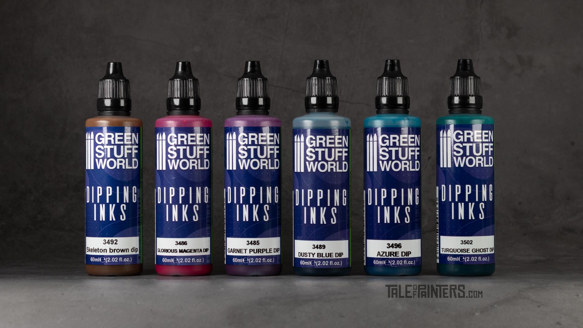
Green Stuff World’s Dipping Inks are available since July 2022 and can be found on greenstuffworld.com, and at selected retailers that carry Green Stuff World products like Taschengelddieb in Germany. The price is 5.75€ per 60 ml bottle, but I only paid 4.31 € (plus shipping) because of a 25% promotion on their website. There are 24 colours in total, a good mix of vibrant and more muted colours such as cream, brown and skin tones. The selection is roughly comparable to the size of the original Contrast colour range or The Army Painter’s Speedpaint range.

The first thing I noticed when browsing the website is that Green Stuff World uses digitally coloured 3D renderings to represent the colours. My experience is that there are often miles of difference between a digital rendering and the colour in real life. Whoever bought colours online from a paint swatch will know. There are four videos on Green Stuff World’s YouTube channel where all 24 colours are brushed on a model, and here the results look very different from the 3D renderings. And sometimes also very different between wet and dry, as Green Stuff World apparently used different lighting setups when filming. Be aware before buying!
Green Stuff World Dipping inks review – consistency & properties
For this review, I sampled six colours and I was very curious to see what they would look like – more like the renderings, or like in the video. To experiment with the inks, I sprayed some Sector Mechanicus bases with the new White Scar primer. The Sector Mechanicus bases have a good mix of textured and flat areas, so we can get a good impression of how these paints perform on a variety of details and surfaces:
My first impression is that the consistency of the Dipping Inks is very similar to Contrast paints. Please note that not all Contrast paints are the same – you might have noticed that some are rather weakly pigmented and behave more like a wash or Shade paint, like Aethermatic Blue or the new Pylar Glacier; others are very dark and do a lot of tinting like Leviadon Blue and Cygor Brown; and then just recently, they added colours like Magmadroth Flame and Baal Red, which produce a smooth but flat result without much shading and highlighting. Green Stuff World’s Dipping Inks lie well in the middle, perhaps tend a little towards the weaker side, but they tint the surfaces well and I see deep shadows and subtle highlights where the medium pulled the paint from the edges. So far so good.
Colour comparisons
I made a comparison sheet of all 24 original Dipping Inks, hand painted on a sheet of white primed plasticard and photographed under neutral 5500K light to reproduce the colors as accurately as possible.
Update 2023: I also added the 12 additional colours.

I also have an all-in-one comparison chart that covers the other “one coat” brands as well:

This hand-painted swatch is available in my Patreon shop for a small donation (or by becoming an Autarch tier member). I also have swatches for Citadel, Vallejo Game and Model Color, Warpaints Fanatic, AK 3rd Gen and more – all cross-compatible with each other so you can compare colours across different brands. Check out my shop for details.
Let’s take a closer look at some of my favourite colours.
Skeleton Brown Dip is a warm mocca brown, it’s similar to Snakebite Leather, but less yellowish, which I really like. Compared to Wyldwood Contrast and Dark Wood Speedpaint, it is slightly lighter and warmer. I see a nice contrast between light and dark on the textured areas of the base, and the ink has also spread well on the flat areas without too much pooling. This will be a colour I will definitely use often as I really like this particular shade of brown.

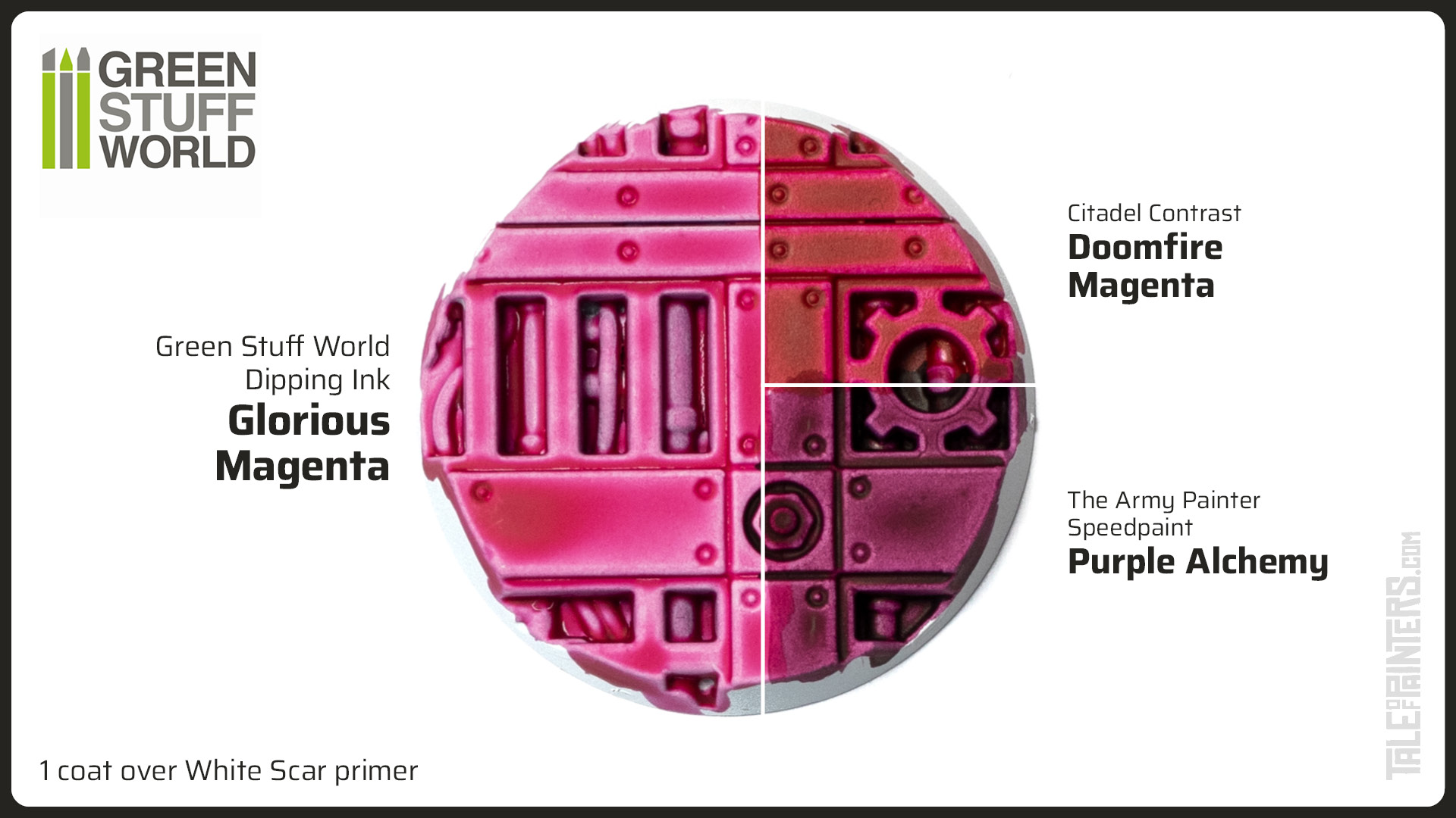
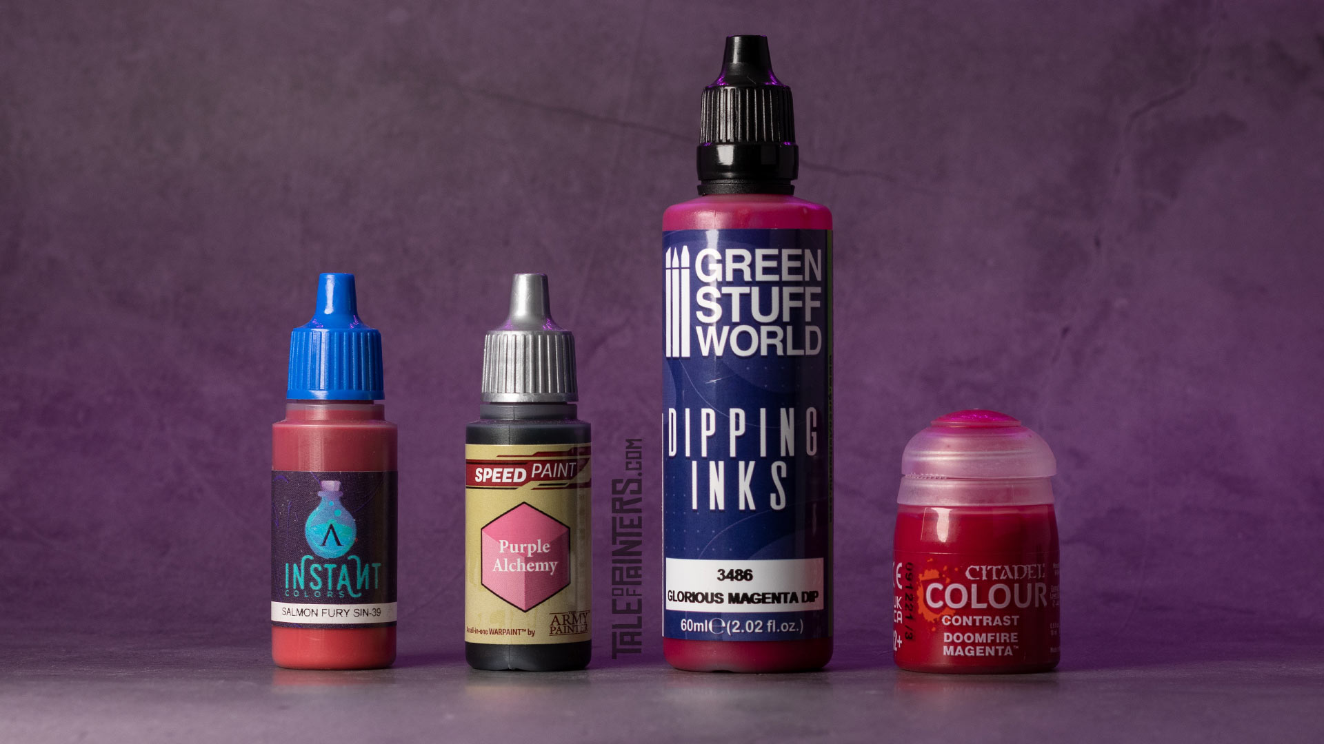
Glorious Magenta Dip is a really bright candy pink, almost neon in its vividness. Compared to Doomfire Magenta it’s much lighter, and it’s also not as flat with more pronounced shadows and highlights, though thinning Doomfire Magenta with Contrast Medium would probably produce a similar result. Purple Alchemy from The Army Painter is a much darker and muted purple as you can see. Glorious Magenta will be a really useful addition to my collection and would be perfect for that pink shading for Hive Fleet Leviathan skin, especially when thinned further with Contrast or Lahmian Medium. By the way, I made a video comparing various acrylic mediums to find out which is best, check it out by following this link.
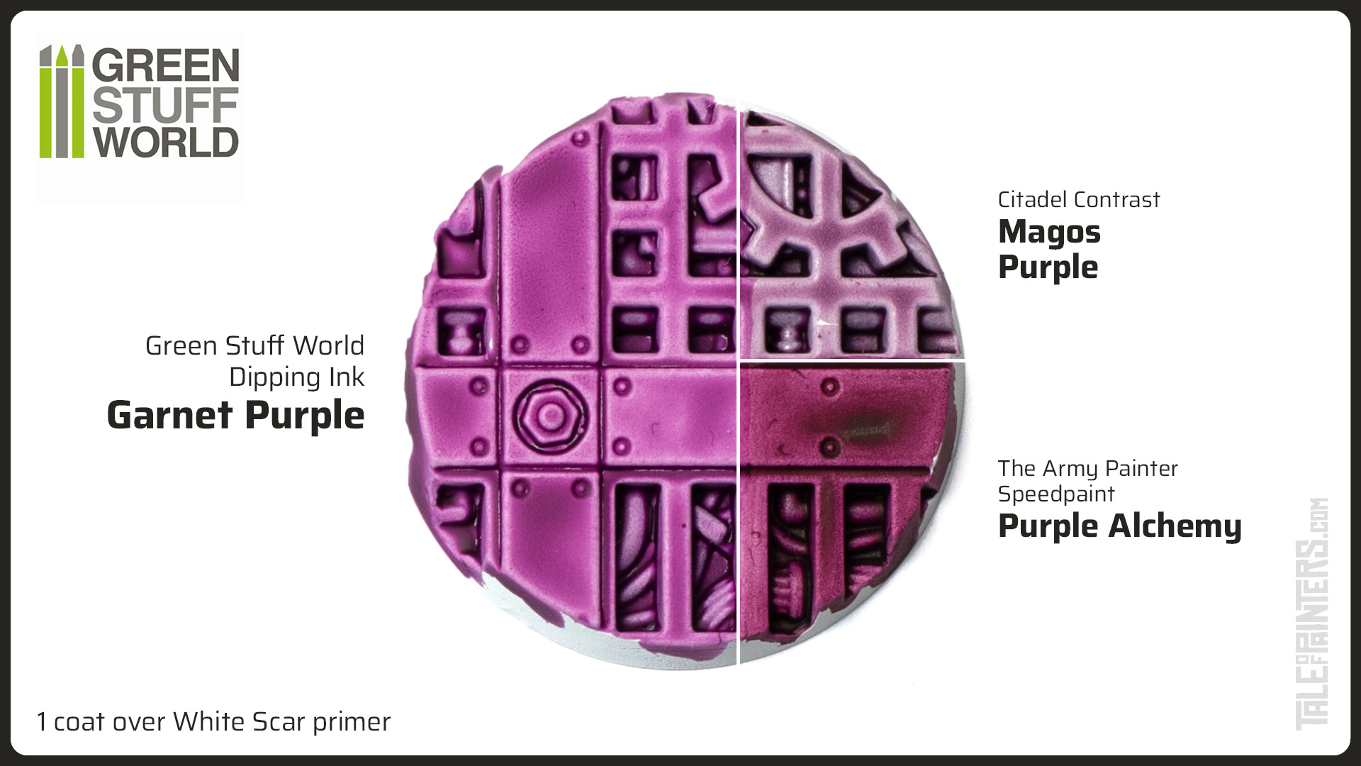
Garnet Purple Dip is next on my list, and as you can see, it’s quite similar to Magos Purple from Games Workshop, but it has slightly more depth and is more pinkish. Compared to Purple Alchemy from The Army Painter, it’s a bit more lilac. Another nice colour, but probably not as essential if you own the aforementioned Contrast or Speedpaints.
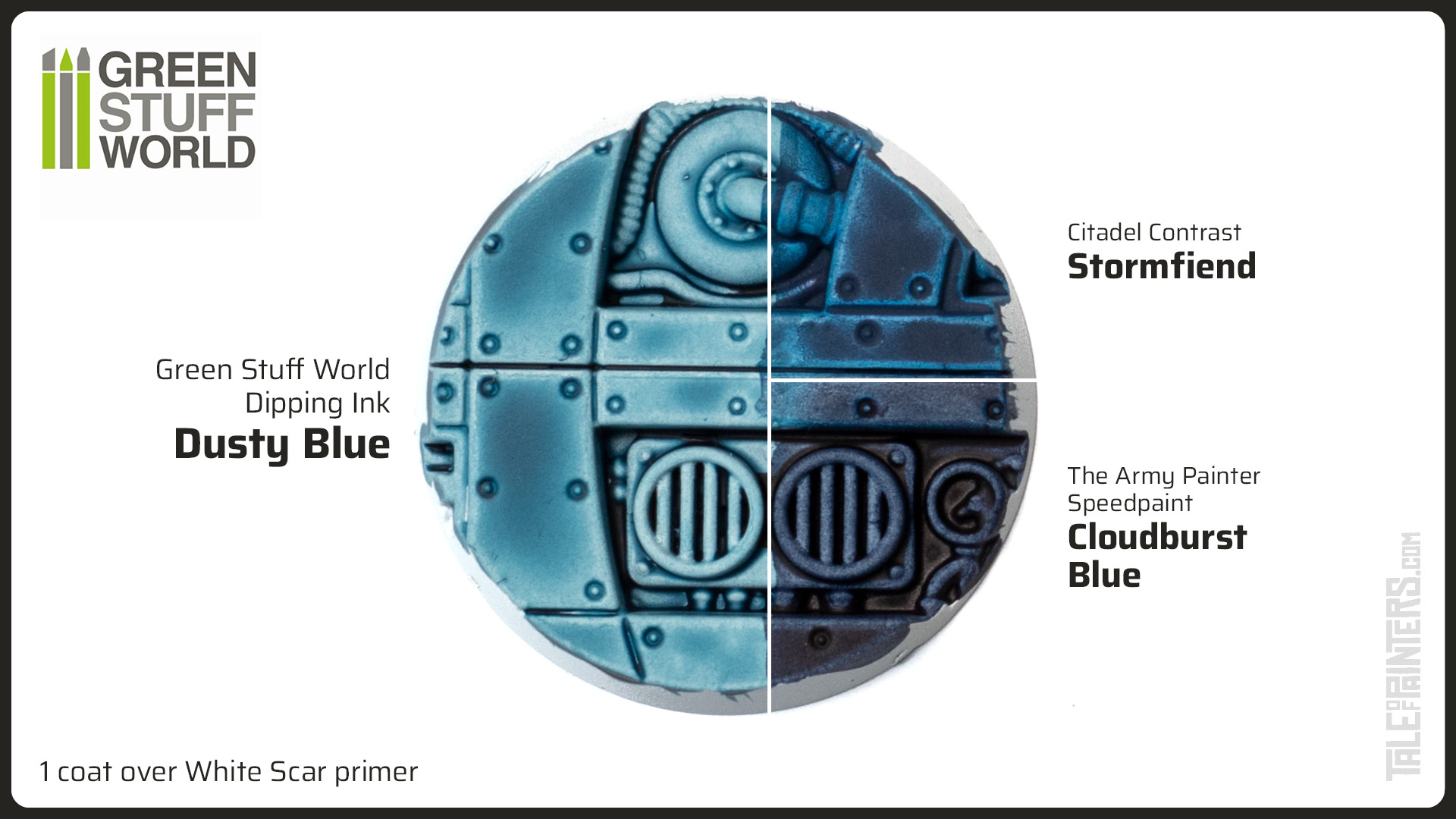
Dusty Blue Dip is a denim blue with a hint of petrol. The closest Contrast paint would be the new Stormfiend, but Dusty Blue is much lighter. The Army Painter doesn’t really have a denim blue Speedpaint, their Cloudburst Blue is much darker and more of a neutral blue. Again, I really like the result on the base here, good amount of shading with soft transitions.
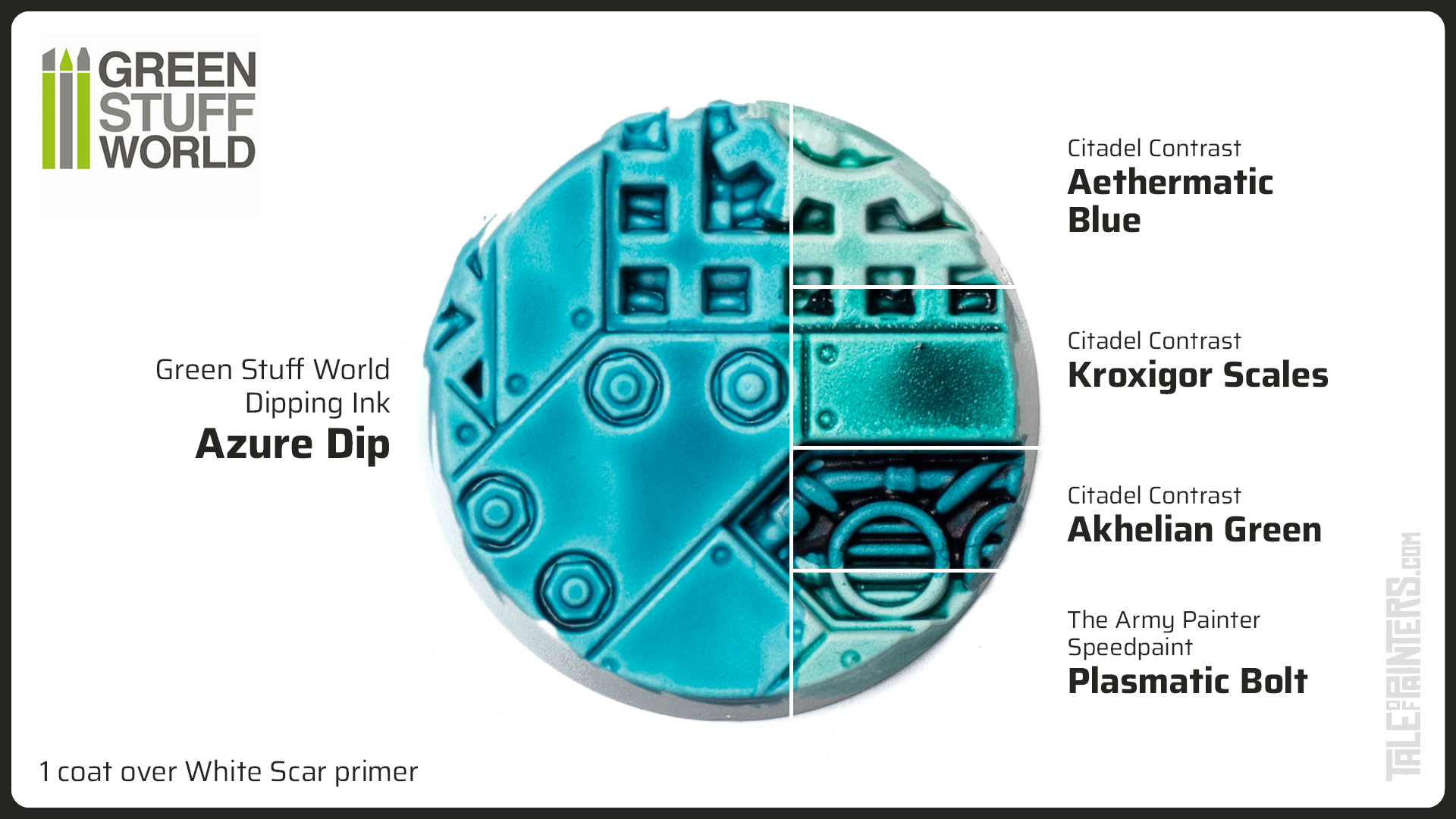
Azure Dip is a turquoise with a hint of cyan, most similar to Aethermatic Blue but more cyan in comparison, and not as dark as Kroxigor Scales or Akhelian Green. Compared to Plasma Bolt from The Army painter it’s also more cyan. I feel this colour really closes a gap in the Contrast range for a more azure turquoise, which will come in really handy.
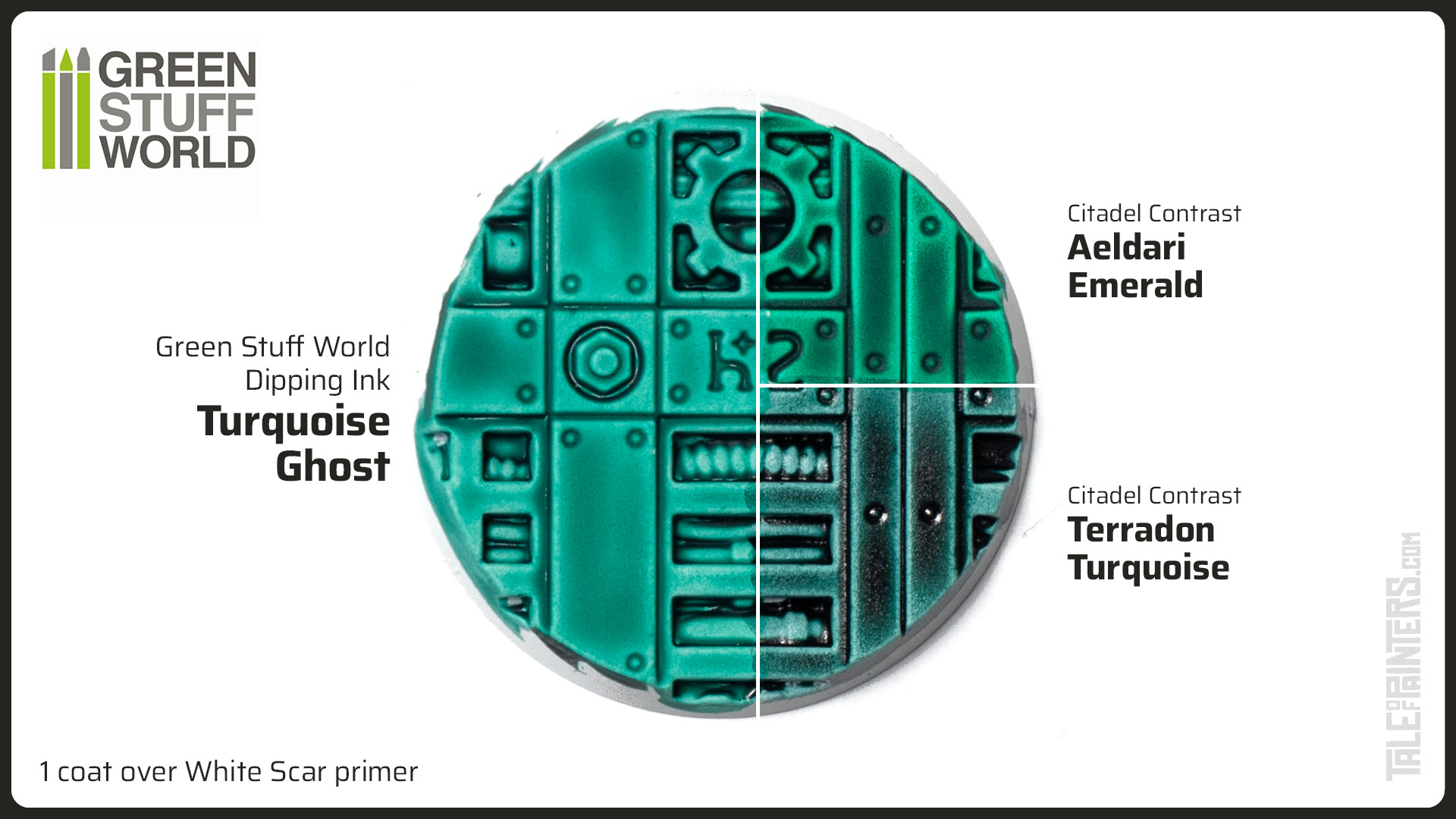
Finally, I got Turquoise Ghost Dip, which is actually more of a teal green. It’s quite similar to Aeldari Emerald from Games Workshop but slightly cooler and a nuance more neutral. The Army Painter doesn’t really have a blue-green Speedpaint, so I also added a comparison of Terradon Turquoise, which is much darker than Turquoise Ghost Dip.
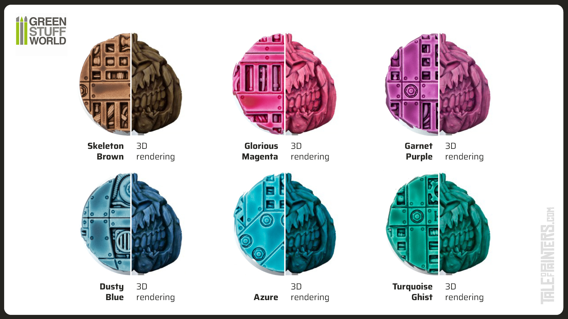
Now that we’ve tried the colours in real life, question is, how do they compare to the 3D rendered promo pictures? The answer is: So-so. Some colours match quite nicely, but Skeleton Brown looks more like Elfwood Brown here, and Azure and Glorious Magenta are brighter in real life.
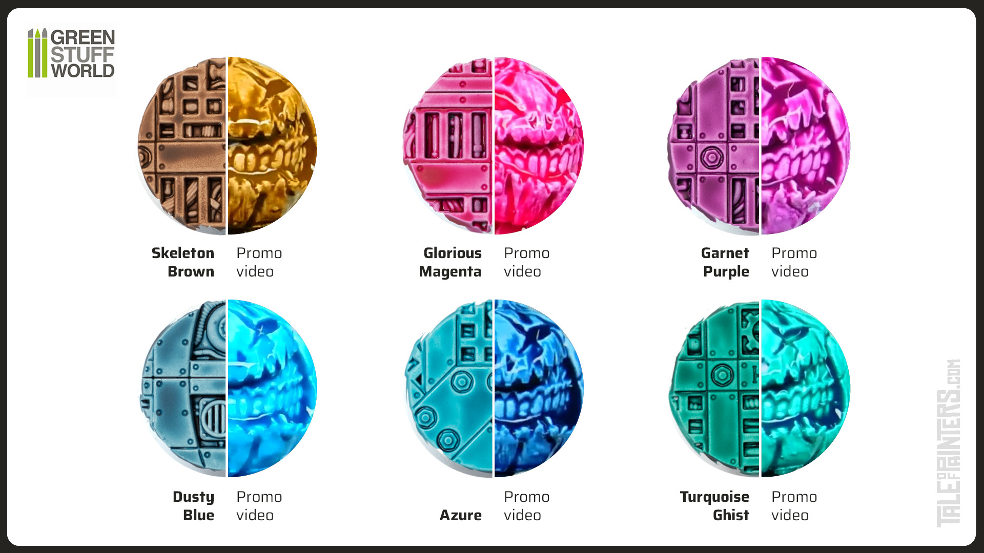
And compared to Green Stuff World’s promo videos? Well, a lot of colours in the video look really off, as you can see in this comparison. Seems like Green Stuff World didn’t use professional lighting. So I think getting the right colour is a gamble. I recommend you compare both the graphics and the videos and… hope for the best.
Washing and Glazing with Dipping Inks
Here are a few more experiments to get a better feel for this paint, check out my video:
Contrast can be diluted with Contrast or Lahmian Medium and also used as a wash or glaze. Here I dilute Garnet Purple Dip with Contrast Medium and use it as a wash, which works just as great. For glazing, I added even more Contrast Medium and applied several thin layers on top of each other, which was no problem, just like with Contrast.
Speedpaint from The Army Painter unfortunately has the problem that it can reactivate when you paint over it. The Speedpaint will bleed into the acrylic paint unless you apply a coat of varnish. Because of the reactivation, they are also not suitable for glazing, as each layer will dissolve the previous one. More about that in my Speedpaint review in the top right corner. Fortunately, Dipping Inks don’t reactivate when you paint over them, just as Contrast.
And what’s not so nice about Dipping Inks? Some colours are a bit weak in pigmentation, especially Red Cloak and Burgundy Dip, which are quite pale and lack the punch of the reds and burgundy colours from the Contrast range. Also, Black Shadow Dip is actually more of a brownish grey. Not a bad colour at all, just not what I would expect from a black ink.
Another minor caveat is that many colours form microscopic bright spots in the recesses. In places where a lot of ink collects, the paint seems to crack slightly as it dries, allowing the base colour to show through. It’s hardly noticeable, and it doesn’t happen with all colours, but it is a small disadvantage compared to Contrast.
More “one coat” paints
Citadel Contrast has become very popular and inspired many similar products. On Tale of Painters, we reviewed all “one coat” paint products currently on the market. Find our review of the Citadel Contrast range here, the The Army Painter Speedpaint review here, Instant Colors from Scale75 here, and Antithesis paints from Warcolour here. Each range has their pros and cons, so find out which range suits you best.
7.5 Score
Pros
- Closest "copy" of the Citadel Contrast formula yet
- 60ml bottles for less than a single pot of Contrast
- Also work for washing and glazing
- Don't reactivate when painted over
Cons
- "Only" 24 colours compared to Contrast's 61
- Colours on the promo pictures can be misleading
- Some Dipping Inks are a bit weak in pigmentation and/or form microscopic bright spots
Final Verdict
All in all, the Dipping Inks surprised me positively. Compared to Instant Colours from Scale75 and Speedpaint from The Army Painter, the Dipping Inks come closer to the Citadel Contrast formula and might be the most perfect copy yet. And the price is really great, the 60 ml bottles contain more than three times as much paint as the 18 ml Contrast pots, and are even cheaper at 5 Euro 75 per bottle. If you don't have a problem with Green Stuff World's business practices and are looking for a cheap and good alternative to Contrast, or just want to expand your colour palette, you should give the Dipping Inks a try.
is there an updated review for the expanded range? and comparing them to the new Vallejo paints?
Not yet, but hopefully soon, it’s definitely planned. You can compare the colours from various one-coat paint ranges here: https://taleofpainters.com/2022/12/top-tip-visual-comparison-of-all-61-contrast-23-speedpaints-24-gsw-dipping-inks/
Would really like to see this follow up. Also, perhaps a demonstration of how well they stack up against comparable contrast paints coat for coat, like was done for the Scale 75 instant colors.
Yes, it’s in the works 🙂 Broadswoard Gaming also made a nice comparison video of various one coat paints, which might help: https://www.youtube.com/watch?v=j8VwiBV-oJY
YOu forgot intense ink also from GSW made before contrast
Yeah well the concept of inks isn’t new, it’s the medium that gives Contrast-type paints a higher viscosity.
Thank you for such a great review. A question has arose when reading -and watching the video-. Do they also mix like the contrast in order to make transition between (while still wet) colors?), I could also glaze after, but just to know.
Yeah, that works as well.