
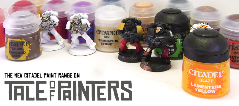
We at Tale of Painters worked hard to present you the ultimate review and guide to the new Citadel paint range. We obtained a vast array of colours to examine carefully all of the six new types of paint – bases, layers, shades, glazes, dry compounds and textures. We painted up a lot of test models to not only check the qualities of the new paint range, but also to compare it to the old Citadel Colours and to test their compatibility. We’ll also cast our eyes on the offerings of other popular miniature paint brands and see how the new range competes. Let’s see how revolutionary the new range really is.
Introduction
The Citadel Colours paint range has been around for a long time. Back in the days, before the age of the 12 ml “bolter shell” screw-tops, Citadel Colours were made by the supplier HMG Limited in Manchester, UK. HMG still does miniature paints today, they produce Foundry Paints, Formula P3 for Privateer Press, supposedly parts of the Army Painter Warpaints range and they still offer most of the old Citadel Colours under the fantasy section of their Coat’d’Arms brand. When GW introduced the “bolter shell” screw-tops, they relocated the production of their paints to a supplier in France. They kept most of the old paint names, but the all the tones changed more or less. Since then, Citadel Colours were produced in France. The foundation paints and washes were made in China in the beginning, but after a while they were relocated to France as well.

For the new Citadel paint range Games Workshop changed their supplier again. I suppose they went back to HMG Limited, as it reads “Made in the UK” on the labels. Which I think is pretty good, because I really like the other paint ranges HMG does, I think they are one of the best choices for manufacturing acrylic paints. On the other hand, a new supplier means new paint formulas and again change in every tone, as it is impossible to exactly recreate colours with different pigments and recipes.
This is why Games Workshop went the hard way and introduced new paint names for everything. This way they avert the outcry of frustrated people who unsuspectingly bought new paint pots only to find that they are totally different from their old ones despite sharing the same name. New names make it clear that you have to expect a completely new product. Last but not least, new paint names mean Games Workshop can strengthen their intellectual property by trademarking everything, thus making it harder for other manufacturers (Vallejo) to model their range after GW’s one (as they did with their Game Colour range).
The new paint range – basic observations
The paint range consists of 145 paints, which are split into seven categories: bases, shades and layers (which replace the foundation paints, washes and regular Citadel Colours respectively) and the all-new dry compounds, textures, glazes and technicals (which cover those non-paints like acrylic medium, varnish, liquid green stuff and primer). As the old range had only 72 paints, a whole lot of new tones were added. Games Workshop said they designed the new palette with their miniature range in mind, which is why there are now such oddities like purplish greys (Warpfiend Grey and Slaanesh Grey, which are meant to be used for painting Daemonettes like in the studio army).
More variety is always a plus, especially for people like me who paint on an army level and hate to mix up paints. With 145 paints, it seams the new range leaves nothing to be desired, doesn’t it? I think there are too many muted greens for once, but the biggest flaw in the design of the new range is that the lightest tones can only be found amongst the dry compounds. The colours of the layer range are often not bright enough to be used for a final, extreme highlight, especially when you paint in a style similar to the ‘Eavy Metal team. For example, if you want a true pink (like Changeling Pink), a light purple (like Lucius Lilac) or a light blue green (Hellion Green) you still need to mix. If they had scrapped dry compounds altogether and made their tones as regular layer paints, there would be much more flexibility. You could have used them for controlled highlighting and blending, but also for drybrushing, since it’s possible to drybrush with every type of paint after all.
Another gripe of mine are the new paint names. Not because they’re new, but because I really feel they made it quite hard to see through which paints are meant to interact with each other (again). Especially with all the marketing blurb about how revolutionary and easy to apply the new system is. Of course you can check out the painting guides on the website and they are giving away painting cards for almost every army in the stores (check out Sigur’s post here), but the tried system of the Reaper Master Series paints is still much easier to understand. I’d have loved to see a consistent naming scheme or even a guide on the label of each pot to make clear: “If I pick up this green, this is the base and wash I need and this is the layer paint I need for highlighting.”
They did this rudimentary with the blue greens, which all have Dark Eldar themed names (Incubi Darkness – base, Kabalite Green and Sybarite Green – layer, Hellion Green – dry compound), but otherwise there are a lot of inconsistencies. E.g. when you want to paint a flat blue, you’ve got Macragge Blue, Altdorf Guard Blue and Calgar Blue from dark to light – two Ultramarine and one Empire themed name. The inconsistent naming is very confusing, especially when you look at all those greens – there are Death World Forest, Castellan Green, Straken Green, Elysian Green and Camo Green, all muted greens that look very similar on those official colour swatches and all share Guard themed names. They could had given one line of greens Wood Elf themed names and the other one Guard themed names for example. Or they could have gone even further with paint names like “Cadian Armour Base”, “Cadian Armour Midtone” and “Cadian Armour Highlight” which would have made it really easy to understand which paints belong together, especially for the novice and younger painters.
Another thing that has changed are the paint pots. While they look the same as the last generation of paint pots at first, they’re not. They slightly altered the shape of the top part to form a better seal and thankfully brought back a mechanism that keeps the lid open. See the image above for an comparison between old and new pots. Interestingly some of the new paints still come in old pots, I heard they couldn’t produce enough new ones to meet the demand of the launch of the new range. And unlike shown on the website, shades and glazes still come with black tops. In fact, the revised paint pots are pretty good, the best flip tops I’ve seen so far. They seal very well, you can see the actual paint through the top, they stay open, the hinges are long-lasting and there is not much clogging up in the tops. Some would have probably hoped for dropper bottles, but for flip tops, they are very well designed. Just when you open them for the first time, take care not to completely spill your paint, because there is a seal you need to rip open for which you need quite a lot of force.
Now we’ll take an in-depth look at each of the seven new types of paint (in fact six as we don’t count the technical range). After that we’ll also check if the colour comparisons of the official conversion chart make for an good or at least acceptable match and have our final verdict.
Bases
As you probably know by now, bases are meant to replace the foundation paints. Foundation paints were a massive hit back when they were released. This is probably why they increased the range from 18 foundations to 34 bases, a very welcome addition indeed. Most interesting, they added a white and metallics. Foundations were a thick, fast drying paint with lots of opaque pigments and thus came mostly in duller and darker tones than the Citadel Colours. Even though you had to constantly add water to prevent visible paint streaks, I really liked them since they covered well in two or three thinned coats and when undiluted they drybrushed very well.
The new base paints changed a lot. They’ve got a slightly thinner, more fluid consistency than foundation paints, but are still a bit thicker than the layer paints. When applied, they tend to leave less brush streaks, and they don’t dry as quickly. They also have a more satin finish. In general, the tones have become slightly more vibrant – look at Mephiston Red, which is only a little bit darker than Blood Red, or Averland Sunset, which is less of a mustard yellow than Ianyden Darksun.
But what about the coverage? I took two black primed Marines to test how many layers you need for a perfect opaque finish. I compared Ceramite White to the best white I currently own, which is Formula P3 Morrow White from Privateer Press, Averland Sunset to Ianyden Darksun and Mephiston Red to Mechrite Red.

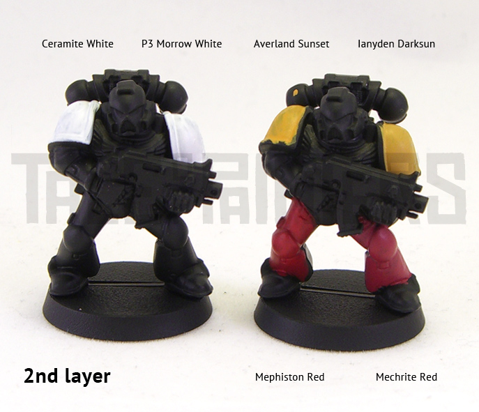
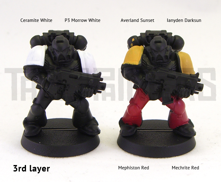

Here are the results. GW claim solid coats in a single coat. However, you need more than a single coat (unless you literally drown the model in thick paint). The tested old foundation paints covered well after two slightly thinned coats and perfect after three. The new base paints covered well after three coats, but there were still some hints of black primer coming through so they needed one more coat. But you have to be fair and admit that the tested base paints are brighter than their foundation counterparts. Mephiston Red is a really nice colour, it sits between old Red Gore and Blood Red and is much more vibrant than the duller Mechrite Red.

Regarding the white, there is little difference between Ceramite White and P3 Morrow White. It took about 5 coats for Ceramite White and 6 for Morrow White, I know, the difference is hard to see on the picture. Upon closer inspection you realize that Ceramite White is not a pure white but more of a porcelain white. So for a perfect bright white you’ll probably need to apply a coat of White Scar on top. Still much better than poor old Skull White, which could take 8 to 10 thin coats for a perfect coverage.
I also tried out some other base paints, for example Balthasar Gold, which is a brownish, brassish gold that takes about two or three coats to cover. As Vallejo Game Colour Brassy Brass, which is similar in tone, takes only one or two coats to cover, I expected more from a metallic base paint. I also tried Incubi Darkness, which covered in two coats over black because it’s already pretty dark, and Screamer Pink, which took about five coats.
Verdict: This is a hard one. Base paints have become easier to use, but are not that much different from regular paint anymore. I guess some people will prefer the thicker but better covering foundation paints while others enjoy the more vibrant tones and easier application of the base paints.
Layers
Layers are your regular acrylic paint and thus the successors of the Citadel Colours. I always felt the regular Citadel paints were the weak spot of the old paint range. They dried very fast and often thinned down unevenly, both issues that made layering and blending quite hard. There were some great colours, especially the silvers, but all in all both Vallejo, Reaper and Privateer Press had paints with better coverage and a easier to use consistency.
With the new layer paints Games Workshop caught up with their competitors. The consistency is similar to the old Citadel Colours, so quite thin, you need to add almost no water. There are no such paint separation problems as you’ve got with Vallejo or Reaper Master Series, and just a little bit of shaking is sufficient. The paint water down, blend and mix nicely, and as they don’t dry as fast anymore, so you’ve got more time to apply your highlights. When dry, the finish is as matt as the old Citadel paints. The coverage of the paints I tried was average. Not bad, but not breath-taking either and certainly not worse. Just what you would expect when you’re familiar with the old range.


Here is what came out when I played around with the new layer paints. One the first picture I blended Wild Rider Red into Mephiston Red. On the second one I applied a basecoat of old Tallarn Flesh, layered with Kislev Flesh and highlighted with old Elf Flesh. On the third one I basecoated with Screamer Pink and highlighted with old Warlock Purple and Emporer’s Children.
Verdict: The best bit about the new layer paints is the choice. They’ve closed a lot of gaps in the palette. There are more purples, more greens, they brought back blue greens and turquoise, there are a lot of different greys – blueish, brownish and purplish ones – but also warm, neutral and cool ones, there are more different browns and off-whites. A lot of cool new tones to play around with. They also improved the behaviour of the paints, which now flow easier from the brush. All in all I’d still prefer Vallejo Game Colour and Formula P3in terms of coverage, but the new layer paints are nothing to be ashamed of and it might be up to your personal preference which range you enjoy most.
Shades
Just as foundation paints, the old washes were very popular. Everybody loved them because they made it easy to get decent results in very little time, even for the not so gifted painters. I imagine a lot of people got quite nervous when they heard that their beloved washes got replaced. The shades definitely have to take on a difficult heritage, but in those video testimonials over on GW.com they full-bodied said that they made them even better. Let’s see if this is true.
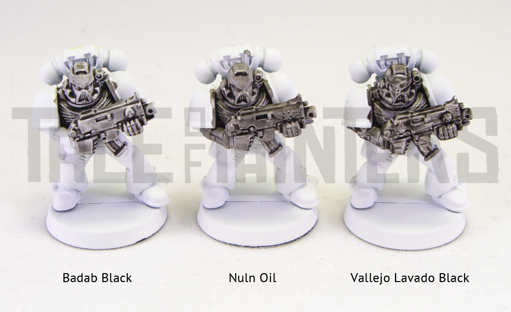
Above you can see three test models, all primed white and washed with different black washes. On the left you have the old Badab Black, in the middle there is the new Nuln Oil and on the right I applied Vallejo Lavado black wash. On thing you’ll notice when you apply the new shades is that there is much more surface tension that pushes the wash easier into the recesses of the model. As long as the shade is still wet, the shading looks awesome. But once the wash is dry, a lot of the effect is gone. As you can see above, in comparison to good old Badab Black, Nuln Oil stains the flat areas much more, resulting in less contrast to the shaded areas. So Babab Black has the better effect after all. The worst result is achieved with the Vallejo wash, which dries very patchy.

I also tried out Casandora Yellow and Coelia Greenshade. I think the results are better than with Nuln Oil, still there is a lot of surface staining. Coelia Greenshade is a nice, dark green wash, much darker than Thraka Green. Casandora Yellow has a lot of orange in it, but you can create a nice strong yellow by washing it over a white primer.
Verdict: Wasn’t impressed with Nuln Oil but the other ones were alright. Are the shades better than the old washes? No, but you can work with them. Once my stock is gone, I’m going to replace my old Citadel washes with Army Painter Warpaint Inks, their Strong Tone Ink is 1:1 Devlan Mud as I found out in this review, nd if their Light Tone Ink and Dark Tone Ink prove to be good matches for Gryphonne Sepia and Badab Black respectively I can’t see myself using the new shades very often.
Glazes
Glazes are new and compliment the shades. There are four tones, one for each of the three basic colours and green. They are similar to washes, but lighter and thinner and they don’t settle as much in the recesses as washes do. They are meant to be used for tinting areas or to restore colours that have been overly highlighted. You can see a glaze with Lamenters Yellow on the picture below so you can compare the effect with Casandora Yellow above.
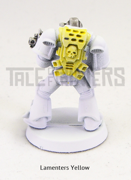
Here is an example what you can do with glazes. Over a white primer I applied Casandora Yellow, then I added white highlights, glazed with Lamenters Yellow to tint the white highlights and to strengthen the yellow, and finally highlighted with white again. Very quick way to paint a decent yellow! Another idea is to use Bloodletter (the red glaze) and Guilliman Blue (the blue glaze) on flesh to create more natural variations in the skin.

Verdict: Glazes are meant for the more experienced painter. You can create some interesting effects that wouldn’t be possible with regular paint, but be aware that the tint is quite strong so you probably need to thin them down for more subtle effects.
Dry Compounds
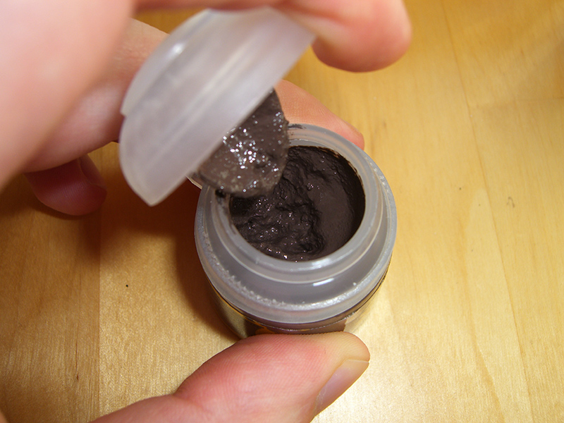
These are completely new and very unique type of paint no other manufacturer has. GW formulated a paint that is meant to benefit the drybrushing technique, quite creative you have to give them that. What you get is a paint that has a lot of pigment but less acrylic medium, the result is similar to dried paint. I had a little test run with Terminatus Stone (which is unlike the purplish swatch on the website a warm light grey) and yeah, it works pretty well. The dry paint sticks very well to the brushed surface and you waste less paint, as you need to wipe away almost nothing from your brush. Just dip the tip of your brush a little bit into the compound, don’t load up too much paint. The result are nice drybrushed highlights which look as good as with any other paint and not as chalky as you might get the impression from those super close-ups in White Dwarf.


One question I read a lot is can you actually mix Dry Compounds with water or acrylic medium to create a regular acrylic paint? Lets try it out. For the test I used plain water and Vallejo Game Colour Thinner, which is a transparent acrylic flow improver, essentially the same as the new Lahmian Medium. I found out that because the paint is very thick and grainy, you need to add a lot of water or medium to dissolve the pigments, which results in a very thin and badly covering paint, plus those grainy particles might result in an uneven finish. So not a good idea.
Verdict: Dry compounds do what they say. But are they really needed? As mentioned above, I’ve rather had more bright layer paints for more flexibility. The tones of the dry compounds are all very light, so I recommend drybrushing them over a dark basecoat first and add a wash or shade second, which not only tints those bright highlights but also helps to conceal the typical cloudy effect drybrushing creates.
Textures
This is paint mixed with fine grit that comes in six natural tones. You can use it for basing or weathering and dirt effects. Similar to dry compounds this is a very thick paste for which you need a strong brush to apply and push around. I recommend synthetic brushes as they can take a lot of beating.

To create a similar basing effect as with sand, you need to apply two thick coats. As you can see, if you only apply one coat, the texture of the base will come through. You might get away with a single coat only if you add a lot of static grass or other flock. Basing with texture paint can be a time saver, it takes a little while until it’s fully dry and hardened, but with PVA glue and sand you have a very long drying time as well and you usually need to apply a second coat of glue all over to seal the sand or it will come off once you’re drybrushing. However with only 12 ml inside a pot, on an army level you’ll easily run through the pots. On the picture below is what the base looks like after a drybrush with Terminatus Stone and a wash of Nuln Oil plus there is a base that has been traditionally textured with sand for comparison:

Verdict: Basing with texture paint is a matter of taste, look at the pictures above and judge for yourself which basing technique you prefer. Either way, I’d recommend to save Citadel texture paint for mud effects on tanks or the like only. If you really want to use textured paint for bases or even scenery, take a look into Vallejo’s range of Textures, which are available in a couple of earthy tones and come in 200 ml pots for just around 11 Euro. Also checkthis postto learn more about Vallejo Textures.
Technicals
There are four different technicals, a gloss coat, an acrylic medium, a black brush-on primer and liquid green stuff. I haven’t tried them yet as they aren’t technically paint, but I guess you’ll get what you expect from them. Garfy reviewed liquid green stuff some time ago, check out this post if you’re curious.
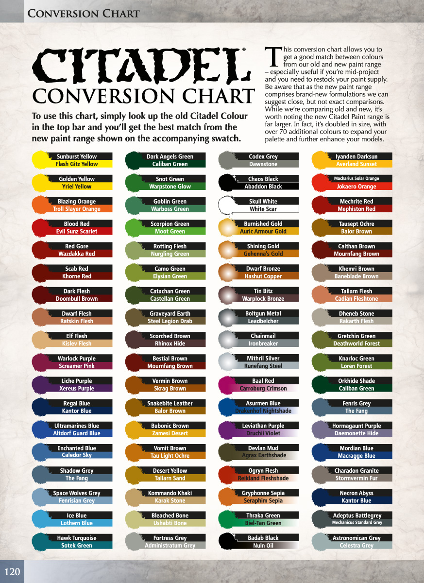
Color Compatibility
So Games Workshop released a compatibility chart for the old and new range, but if you have a closer look, you’ll notice that a couple of new paints are assigned to two different old paints. For example Caliban Green, which is a substitute for both Orkhide Shade and Dark Angels Green, or The Fang, which is subsitute for both Shadow Grey and Fenris Grey. This already gives a clue what you can expect in terms of compatibility. A lot of people wonder if they will find good matches once they run out of their old paint. I got a lot of questions in this regard, however I can only make a grab sample as I couldn’t get my hand on all the new paints. Here is a swatch with four old and new Citadel paints:
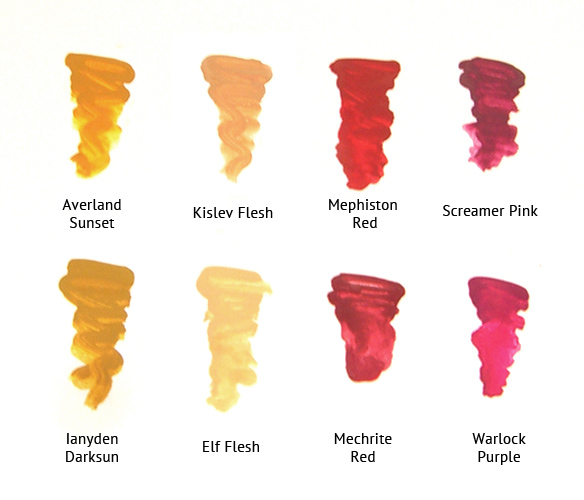
Do they match? No they don’t. Screamer Pink is much darker than Warlock Purple and less vibrant, Mephiston Red is brighter and more vibrant than Mechrite Red, Kislev Flesh is duller and slightly darker than Elf Flesh while Averland Sunset and Ianyden Darksun are probably the closest match, with Averland Sunset only a little bit more vivid than Ianyden Darksun.
I also had a good look instore how the new paints look in real life. Of course paint looks different in a translucent paint pot than dried on a model, but it gave me a good feeling for the new range. The base paints changed quite a lot from the foundation ones, most of them are slightly brighter or more vivid, so you’ll have a hard time finding a good match here. With layers and metallics you’ve got a better chance, those blues and greys look very similar, still a lot has changed. For example there is no direct match for Goblin Green as Warboss Green is darker and Skarsnik Green lighter, also there is no match for Dwarf and Elf Flesh. Cadian Fleshtone and Kislev Flesh are duller, more the like of Tallarn Flesh, while Bestigor and Ungor Flesh have more yellow. Some of the washes/shades have also changed, since Carroburg Crimson is darker and more crimson than Baal Red.
All in all, don’t expect too much in terms of paint compatibility. If you depend on some of the old paints for a specific paint scheme, I advise you to stock up now before the old tones are forever gone.
Availability
The new paints are out today and you should find them in any shop that carries GW products. There are also some good offers online. Wayland Games have them with their usual 20% discount, and they’ll also offer special bulk packs with additional discounts you don’t find anywhere else.
Final VerdictIs the new Citadel paint range “some paint-based magic”? Is it the one paint range to rule them all, do you need to throw away all your other paint and rejoice? No, it isn’t. It’s just good paint. They did a lot of things right by adding more variety and increasing the quality of their regular paints with their layers. Textures, glazes and dry compounds are a bit gimmicky, but they’ll do what they promise and I’m sure there will be people who’ll use them. With bases and shades I’m not so sure, I’m inclined to say I liked their old incarnations better.
How does the new Citadel paint range fare against other manufacturers? I think the answer is mixing and matching. One brand has the better reds, another the best silvers, yet another the best washes. Just open your mind, try out other ranges and see what works best for you. Yet, GW hobby products always benefit from the convenience bonus as you’ll probably find them in every hobby store, and when in a pinch or if you can’t find other paint brands locally, you can grab the new paints with confidence.
37 Comments
Leave a Reply
Tale of Painters is the unofficial Warhammer hobby magazine run by hobbyists like you. Support our work by using the affiliate links from our 🇺🇸 / 🇨🇦 partner stores for your next orders so we can continue to bring you fantastic FREE content every day:


Or support us directly:


One of the best articles I have read on a Warhammer blog ever actually. Really nice break down and thanks alot for writing it
thanks its filled with very good informaton who wanted to start panting Warhammer
I think I am going to use a similar blog template to yours. I find it very attractive to the reader.
Dyes And Pigments Importers In Delhi
I agree on most counts.
I find these paints fun to use, and yes, Mephiston red is a godsend to any Blood Ravens SM painter.
The new technicaly and drybrushes, as well as the textures are all extremely useful if you are not an expert painter. The new Typhus Corrosion and Ryza rust are every ork player's best friend for dirtying up all your kustom rides.
They really make a rookie's job much, much easier.
As for the Vallejo paints, I found that their little bottles of paint are hard to ration. They are good paints, but unless you plan to paint a a huge area in one colour, there will be a lot of wasted paint.
So the GW paints are so much more efficient to use for tiny details. You just don't waste all the paint, so for eyes, decorations, highlights its just better packaging.
On the other hand, I found that Vallejo's airbrushing paints actually serve as really cool shade, thin layer or glaze like effect.
Wow…
I can't believe it, but this is the only really helpful guide to the new citadel colours that I have found on the internet. Everyone else is just like "Eww, these colours are new."
I feel like now, I actually know how to make use of them. Many thanks.
Its like you read my mind! You appear to understand so much approximately this, like you wrote the book in it or something. I believe that you simply could do with some percent to power the message house a bit, however instead of that, this is fantastic blog. A great read. I’ll definitely be back.
Asian Paints Nepal
Thanks for the review, it looks like they've really upped their game!
Thank you for the review. One note – Imperial Primer doesn't seem to be a primer at all. In fact when I tried using it to prime a chipped spot it acted as a solvent on the surrounding paint. NOT GOOD!
And most men end up being your How To Get A Girlfriend Fast.
If she doesn't look fat, she will definitely miss you in due course. Make it surprise And it may be that she was in bed. What will happen here is that you will have your how to get a girlfriend fast back. An important thing to be remembered in the effort of impressing a girl is" just friends" with you, so that he can confidently be smiling to one person after another.
Look at my blog post – how to get girlfriend **
Once again, a great and informative post.
Thank you.
Tony
Thank you for taking the time for this review, it was really helpful!
I just wanted to thank you for writing up this review. It was enjoyable to read. I found your opinions to be insightful and helpful. Best wishes!
Thanks a million for writing an amazing review m8, i'm currently coming back to the hobby after nearly 10 years away from it and really didn't have a clue as to how to use this "expanded" paints range that Citadel has unleashed on the world!
Amazing review, well done!
Any idea which French paint company made the old paints? I'm hoping they still sell everything as a generic line.
That was a great review. I really appreciate the time and detail you put into this.
Fantastic review! Thanks very much for putting all the effort in. So far, I have only picked up a metallic (ironbreaker) and a dry compound (necron), but I am very happy with both. You were dead on about convenience, out here in Nova Scotia, we don't have anything in the stores but GW!
Hi,
I wonder if the sunset was Averland suitable to serve as a paint for the imperial fist?
and Casandora Yellow?
(I am French and I wrote with a traduteur so sorry if you do not understand)
cordially
One of the best articles I have read on a Warhammer blog ever actually. Really nice break down and thanks alot for writing it.
This is a wonderful review – thanks Stahly! I am stunned by the results of the Casandora yellow. Can't wait to try this wash over white on some "puff-sleeves" from my empire soldiers. Maybe this wash will be enough for regiments, add highlights on characters then.
Stephan
Great review! =O)
Happy to have found this review. Thanks for the write-up!
Thanks for the great writeup. It's really great to see an in-depth review of the technical aspects of the paint without all the GW hype.
One thing that I'd add to your naming comments is that the Citadel paints have never been friendly to non-GW players, and now it's even worse. You comment that the greens are grouped as Dark Eldar names, or it would have been nice to have different IG element names. To someone who generally likes Citadel paints but doesn't play GW games, this is a near-useless naming convention. At least the old names usually included "Green" or "Blue" or "Ochre". Many of the new ones do, but we've also got things like "Rhinox Hide" and "Stormvermin Fur" that tell you nothing about the actual color. By far my favorite is "XV-88". I'm sure that means something to hardcore GW players, but it's beyond useless to me.
I think this is going to be a great move for GW to appeal to the faithful, and probably help new painters/gamers, but at least for me I'm thinking that if the colors are changing anyway it's a good time to check out the Reaper Masters.
nice article.
for the future, something cannot be very unique, it either is unique or it is not.
Excellent review! Thanks for all the detailed info.
The thing is NAVARRO, the washes still do what they used to. The only thing is that the gradient isn't as contrasting. This can still be used to your advantage. Because you can either slop it all over the model, or feed it into recesses…
Remember that just because it is a wash doesn't mean you can forget about applying technical skill! Like I already said, the fact they've changed is important to know… for no other reason than you can make the necessary adaptations to your painting technique in order to get the results you want.
The only thing I didn't what to happen is that the old washes would change for the worst since they were sooooo nice… looking at the black wash its a major disapointment…
I'll echo the previous sentiments… very helpful and nonpartial review. Many thanks.
This is a really useful and well-presented review! I haven't gotten to try out the new paints yet, but this has helped me decide which ones to pick up.
Excellent Revew!
Really useful – cheers!
Excellent review, very comprehensive and informative.
I think the info with the shades is useful. Not because you think the old ones are better… but because if you KNOW that they tint the base colour more then you can use that information. Your coloured tests show that you can use the shades to give you pretty light and bright colours!
The glazes as well sound as though they could be useful for controlling colour. They sound a little like inks? is that right?
Also, I'm a little surprised that we have not seen a return of Matt Varnish.
Thanks for the very thorough review Stahly. You mention in your closing paragraph that some ranges do certain colors/effects better than others. If you were going to build the ultimate starter paint set what brand would correspond to which color group/effect?
Thanks Again!
Thanks for typing this. I own a lot of paint and started in the white cap GW paint days so I always want to try Coat D'Arms but don't know anyone who stocks it locally. I've bought paint only before, particularly Foundry Triads which I also like. But it can be hit and miss buying paint online.
I've got quite a lot of reds, greens, purples, and browns. I'm interested in flesh tones, Foundry makes quite a lot of these. From what you've written I think I'll like the new base paints over the old foundations, particularly Mephiston Red over Mechrite Red, but also Averland Sunset over Ianyden Darksun. I generally use the current light grey foundation paint if I want to paint white on to black primer. So extra thick white paint holds little value to me.
I'll have to try some of the Army Painter paints, I've used Vallejo and they are popular with historical guys along with Foundry as they make colors that match historical military uniforms. I'm happy for the return of glazes, I still use my old Citadel Glazes with red or is blue caps. I'm experimenting more with grey and I guess white primer, but I mainly paint Chaos and Orks so black primer is fine.
Cheers,
Thanks for a very imformative review!
This is a fantastic and detailed review. If you do get a chance to try the Lahmian glaze medium I would be very interested in the results.
Having tried a sample of each range I can't really disagree with your assessments they pretty much aling woth my experience.
I found the new bases really great, compared to old citadel colour which is far too thin for my liking. They do have a very nice finish but yes its a bit of a myth to cover on one coat even Mechrite Red needed 2-3 coats to remove blemishes. I do love the Mephiston Red colour though that's a new fave.
I think Drybrushes are a neat idea. Starting out I would have loved these products and who knows, we old hands might find some interesting uses for them. I know any paint can be drybrushed but for me I NEVER got the hang of drybrushing and its always irked me!
I shared this blog and reblogged it too. Let me know if you don't want it linked.
Thanks for the review.
Thanks Stahly, great review. I feel Like I know what to expect a little more now. I'm not all that fussed about colour compatibility but I can understand issues for people in the middle of painting an army. If anything this new range will encourage me to explore alternatives so I expect Vallejo and P3 will benefit to some extent and I'm sure the new citadel range will get a healthily look in too. I'm totally against being a fan bois so I'm going to keep my options open!
theunrealisticartist