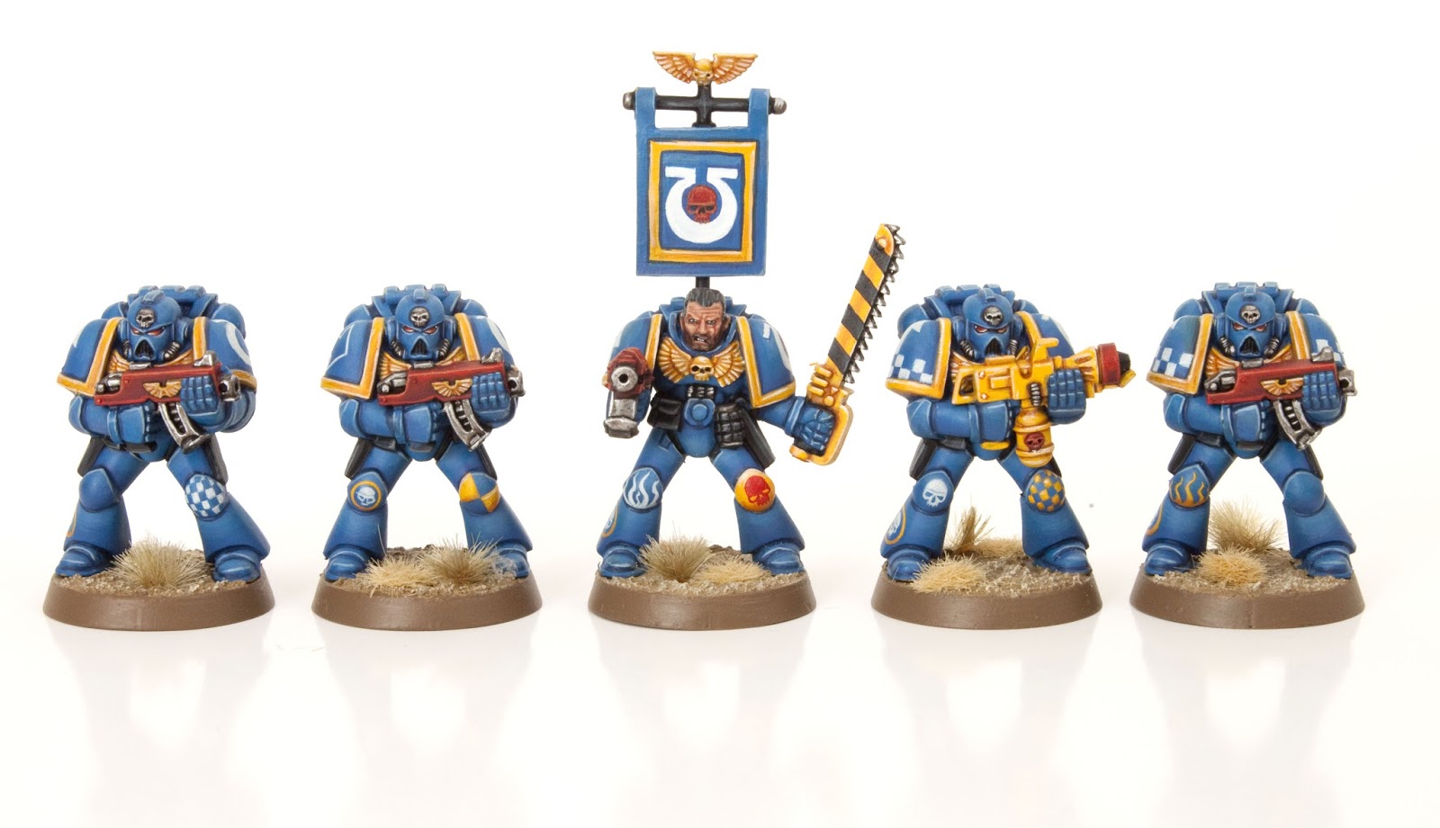

The first five statue marines are finished! OK, that’s a bit unfair, I actually have a soft spot for these guys. I think they look awesome with their heads low down in their chests and their huge shoulder pads. I’m not too worried about the same poses, the varying freehand designs are helping to give each their own character. More pictures after the jump including an old vs new picture…


Each model features a classic army badge icon in the form of a skull surrounded by a yellow ring. I also painted some variant tactical symbols. I will add more variant symbols on the next five marines. The hardest part of these models was painting bright yellow accurately. On the next five I’m going to spray the models blue then paint the yellow quickly and roughly and then tidy up by re-applying blue. That should speed things up.


The backs are quite uninspiring, does anyone spend time painting the backs of models? If you’re a gamer then you’re going to spend most of your time staring at their backs as they march forwards.


The sergeant features some red skulls to denote his rank as sergeant. The sergeant’s back banner is made from greenstuff. I rolled out some greenstuff on a wet, smooth tile and when it was 90% cured I cut out the shape of the banner and super glued it to the banner pole. I was considering chopping the banner pole off but I had to keep it retro.


Look how far Citadel has come in twenty years. Modern miniatures are covered in detail and have great movement. I love this shot.


I really like this post. It popped up in my feed a while ago and then recently; lately, I've been feeling super nostalgic and this hits close to home. You really did a good job capturing the feeling of that particular edition of 40k!
Ah, colour me ignorant, lol.
The shading on the bolter is awesome. TBH I'm not a fan of the company colour on shoulder pad thing. The green/red/cyan etc. just clash horribly with the blue IMO. Give me 1st and 2nd coy. any day. 🙂
I recently did a test scheme on a modern marine. It's for my 4th company, but you get the idea. Here's the link.
http://taleofpainters.blogspot.co.uk/2013/06/chat-switching-paint-ranges.html
I'd love to see this technique (paints, blending, and friends) applied to a modern marine, too, for contrast.
Oh, thanks a lot for this retro time jump! It's gorgeous to see the models old and new side by side. Despite the fact that casting technology has made huge progress since the time of 2nd edition, both groups of models exhibit Jes Goodwin's harmonic understanding of body proportions. All the models equally kind of "rest" in themselves with perfect balance.
Gosh, this brings back memories… And the paint job on all of them is amazing!
I love the way you have kept the painting style completely retro for the models. It works really nice. Cool stuff 🙂
I have an entire 4th company painted with gold chest eagles and black bolters. This is the start of my 2nd company and I wanted it to be different. Starting a new company was the perfect excuse to switch paint ranges so these Ultramarines will be painted with GW paints (I used to use Vallejo).
These feature way more blending and freehand than my 1st and 4th company do. I've no idea if I'll make an entire company, but I think I'll start by aiming for 1500pt army painted in these colours and see where it leads from there.
Yesterday I assembled, undercoated and base coated the next five models to complete the tactical squad. I can't tell you how excited I am to paint retro flames on the missile launcher!
Wow these are stunning. Mad freehand skills! Will you paint some of them with a more modern blue/gold/black bolters paint scheme?
Well done!!!
They look fantastic, I've got some old metal scouts lying around, I'm inspired to paint them as old school Ultramarines now.
The green stuff banner and freehand details are particularly excellent 🙂
Blast to the past!
Thanks for sharing!