To provide the best experiences, we and our partners use technologies like cookies to store and/or access device information. Consenting to these technologies will allow us and our partners to process personal data such as browsing behavior or unique IDs on this site and show (non-) personalized ads. Not consenting or withdrawing consent, may adversely affect certain features and functions.
Click below to consent to the above or make granular choices. Your choices will be applied to this site only. You can change your settings at any time, including withdrawing your consent, by using the toggles on the Cookie Policy, or by clicking on the manage consent button at the bottom of the screen.
The technical storage or access is strictly necessary for the legitimate purpose of enabling the use of a specific service explicitly requested by the subscriber or user, or for the sole purpose of carrying out the transmission of a communication over an electronic communications network.
The technical storage or access is necessary for the legitimate purpose of storing preferences that are not requested by the subscriber or user.
The technical storage or access that is used exclusively for statistical purposes. The technical storage or access that is used exclusively for anonymous statistical purposes. Without a subpoena, voluntary compliance on the part of your Internet Service Provider, or additional records from a third party, information stored or retrieved for this purpose alone cannot usually be used to identify you.
The technical storage or access is required to create user profiles to track the user on a website or across several websites for similar marketing purposes, for example on social media networks like Facebook, Instagram, X/Twitter, and others.

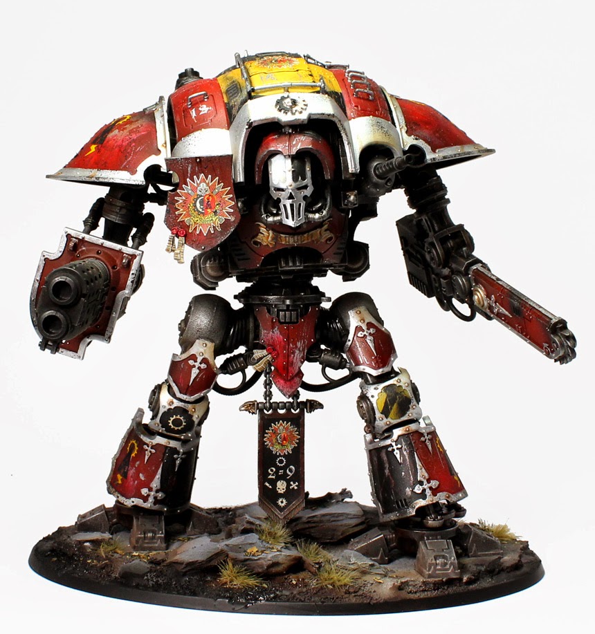


Agree great model. I believe your style here as well as your darker weathered style is excellent. These models are not supposed to look like they are straight out of the factory. They have been through hell and should look like it.
Inspirational as always mate.
Doug.
Hey Cheers guys 🙂 The model was a lot fun to paint and try out some new techniques 🙂
Despite the other comments I think you did a superb job!
Keep up the good work:)
I agree – there is a difference between a bad paint job (which is certainly not the case here) and personal taste on weathering/battle damage/etc.
Surgical Spirit? What's that in Yankee English?
I think in the US its mineral spirits or basically any type of pur alcohol.
Surgical spirit is Iso proly alcohol, (IPA) or "rubbing alcohol" in yanky.
Minerals spirits is different is the US name for White Spirits.
Nice tutorial! I agree this knight doesn't look as good as your previous paint jobs, but you are dealing with the two hardest colours to deal with – red & yellow on one model. It's also clear that you are stepping away from your usual style too with this one so there is always going to be an adjustment period as you get used to that. Still a far strong job than i have seen on many knight titans. I think more angles would likely show off the paint job better too. Keep up the great work 🙂
Yep, I think it's a step in the right direction of adding more color to TEN's models. The stencilling part of the video was rally helpful. I haven't delved in to this yet but I really feel like I could now.
TEN, have you tried using sand paper on mold-lines? It really makes it easier. Also, any gap lines can be filled with a little superglue, then filed down with sand paper once dried. Developing this skill will really improve your work and make it look more professional.
Another point I'd make is to consider adding more color modulation (highlighting and shading) to the metals.
hey thirdeye.
i hate to say this. but this model really does not look that good. it could be the pictures, but i really dont like the roughed up damage. it looks more like misplaced paint. also on the left shoulder it looks like a mash up of paint.
i'm sorry to say this but it does not really represent your previous outstanding painting jobs.
i could be mistaken but tha is the feeling i geth looking at the photo's
cheers
tim