Why is no one talking about Slapchop anymore? In this video, I’m painting the new Clanrats from Skaventide BUT I’m challenging myself to use colours from all five major Contrast-style paint ranges to finally determine who makes the best paint for Slapchop. Plus, I’ll be sharing some of my best tips and hacks to help you take your “one coat” paint game to the next level.
The new Skaven models are perfect for Slapchop-style painting due to their high level of detail and many organic features like fur, skin, and tattered clothing. But with so many Contrast-style paints these days, you might wonder which brand is worth your hard-earned money. I’ll tell you in this video:
Slapchop basecoating hacks
Before I get to testing, I’d like to share a few tips for the perfect Slapchop basecoat. After assembling my Skaventide Clanrats, I primed them black and then basecoated them with a dark warm grey similar to Skavenblight Dinge. Slapchop doesn’t always have to go from pure black to white. Try using warmer tones like warm grey or dark brown transitioning to a light ivory; this will result in a warmer and less sterile finish that might complement your models better.
And instead of all drybrushing, I like to bring out the details by airbrushing a zenithal highlight from above, in this case, with a very light grey. Only for the final step I pick out the sharpest details with a gentle drybrush of pure white. This gives a much smoother gradient because the more you drybrush, the more texture you’ll create. And if you’re thinking, “Oh, I don’t have an airbrush, it’s too expensive,” then check out Amazon. Nowadays, there are very affordable kits with gun and compressor in one device for about 50 bucks. While I wouldn’t recommend these for detail work, they are perfect for priming and zenithal basecoating. A model I can recommend is the Casubaris Airbrush kit with compressor, at the moment it’s around $80 but it’s on sale every now and then.
The big Slapchop showdown
But enough talking, let’s get to painting some Clanrats. As per the challenge, I’ll be using paints from all five “one coat” paint brands, and Speedpaint from The Army Painter is first.
The Army Painter Speedpaint 2.0
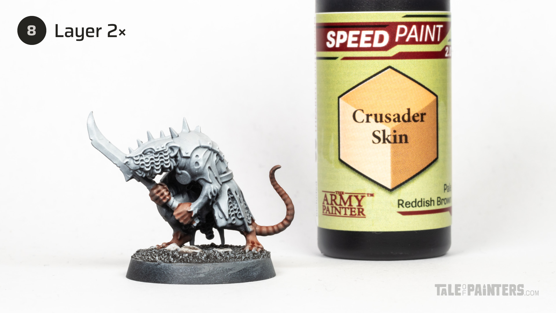

I wanted to start with painting the bare skin. After comparing all available skin tones using my “one coat” paint sheet, which you can find on my Patreon, I picked a few and experimented with them on my test models. Ultimately, I decided on SP Crusader Skin from The Army Painter’s Speedpaint 2.0 range.


This hand-painted swatch is available in my Patreon shop for a small donation (or by becoming an Autarch tier member). I also have swatches for Citadel, Vallejo Game and Model Color, Warpaints Fanatic, AK 3rd Gen and more – all cross-compatible with each other so you can compare colours across different brands. Check out my shop for details.
I noticed that many Speedpaint colours are relatively thin, meaning they have low viscosity. This prevents them from pooling easily on smoother surfaces, which is great, but I sometimes find them a bit difficult to control because they might flow where you don’t want them to. This also meant that for SP Crusader Skin, I had to apply two layers to achieve the desired intensity, also due to its thinness.
For the fur, I chose SP Gravelord Grey. The result after one layer was a perfect medium grey, but since I wanted a really dark grey tone, I had to apply multiple layers here as well. However, even on the smooth arm muscles, the Speedpaint didn’t leave any noticeable streaks or pools even after multiple coats.
Overall, Speedpaint pairs well with Slapchop. Although I had to apply multiple layers for the skin and fur, which arguably contradicts the “one coat paint” principle, be assured there are plenty of colours in the Speedpaint range that can achieve rich results with just one layer. The only real drawback for me is the reactivation issue. While it has been almost eliminated with the improved 2.0 formula, it’s still faintly present. In practice, this isn’t a problem when painting over with similar colours, but when I painted the fleshy joints of my Hormagaunts with Speedpaint and then tried to touch up, the peach and pink Speedpaint reactivated and bled through the white.

Green Stuff World Dipping Inks
Let’s move to the clothing, here I decided to use a dark petrol. There aren’t that many petrol colours among the various one coat brands, and after consulting my colour swatch and several experiments, I decided on Green Shark Skin Dip from Green Stuff World.
I have extensively tested their Dipping Inks (review here) and gave them quite a high rating. In retrospect, I might have been a bit swayed by the low price, as Dipping Inks are available in extra large 60ml bottles for a great price. Don’t get me wrong, they are by no means bad, but after more experience I find them somewhat inconsistent. Some colours, like the reds, are weakly pigmented, while other colours are quite opaque. And I feel the palette, with its 36 colours, has some interesting and unique colours, but is not well balanced, missing some key colours. I made a free paint swatch for the Dipping Inks range so you can see what I mean:


Green Shark Skin Dip is one of the colours that is not entirely transparent and contains a high proportion of opaque pigment. Generally, “one coat” paints, much like inks, use dyes to achieve their intense tinting properties. To create specific, more pastel-like shades, some manufacturers mix in opaque pigment, usually white or light grey. But for Slapchop and zenithal basecoats, you want to use colours that are as transparent as possible, allowing the carefully built up undershading to come through. Opaque “one coat” paints will flow into the recesses and cover the shading, which is the exact opposite of what you want. As you can see in the video, the result after one layer of Green Shark Skin Dip is quite patchy. However, I’ll show you how you can make opaque colours work with the Slapchop technique.
What you need to do is applying multiple layers until you have a fairly even coat. As you can see in the video, there’s little left of my zenithal undercoat, so we need to restore the shading. For this, we want to apply a wash—in this case, Drakenhof Nightshade—and make sure it doesn’t pool on the flat areas by removing any excess with a clean brush. Citadel Shades are ideal because they are quite thin and settle well into recesses (read more about them here). When using other washes I would recommend thinning them with a drop of medium, such as Contrast Medium.


And here is the result. With the wash, the clothing now blends well into the overall appearance. Yes, it involves a few extra steps, but I think this is the best way to make opaque one coat paints compatible with Slapchop. And you can even turn it to your advantage. Using opaque paints on smooth areas can create a more even finish, like with the clothing of this Clanrat. This also works very well for smooth armour plates.
Citadel Contrast – the OG “one coat” paint
To add more variation to the clothing, I wanted to introduce a lighter tone. After consulting my comparison sheet, I chose Briar Queen Chill from the Contrast range. This is also a pastel shade with a high amount of opaque pigment. So I used the same process as with the Green Stuff World Dip and applied several layers of Briar Queen Chill and then restored the shading using a wash. Since there are no petrol-coloured washes available, I made my own by diluting VXP Starship Steel from Vallejo’s Xpress Color range with Contrast Medium. I also tried Citadel Gryph-charger Grey, which has an identical shade, but found that VXP Starship Steel dried a bit more evenly.


You can find some particularly rich colours in the Contrast range, so for the warpstone pendants I used pure Karandras Green. I simply applied a generous layer, and thanks to the zenithal Slapchop undercoat, you create volume with light and shadow automatically. This is Slapchop how it’s meant to be.
I still enjoy using the OG Contrast paints, even though they are comparatively expensive. And the flip-top pots with their large openings are not ideal because the paint dries out and thickens faster. Also, some Contrast paints can dry a bit glossy, and the range has certain colours with a high proportion of opaque pigment, which you can tell when white pigment settles at the bottom of the pots over time. Unfortunately, like most other manufacturers Games Workshop doesn’t really indicate which colours are opaque and which aren’t, so to help you identify the more opaque one coat paints I added markings on my comparison chart, which covers all the colours from all the brands in this video and is available on my Patreon.
Despite these issues the Contrast range stands out for me thanks to its intense and saturated hues, and the 61 paints cover a good range of colours.
Vallejo Xpress Colors
Next, let’s take a look at the Vallejo Xpress Color range. As I’ve mentioned I used VXP Starship Steel diluted as a wash to shade the light blue fabric, but I wanted to paint some more details with Vallejo’s one coat paint. For the leather belts and pouches, I thought of a warm brown with a hint of red. After consulting my chart for options and trying out various shades, I settled on VXP Mahogany from the Xpress Color range.
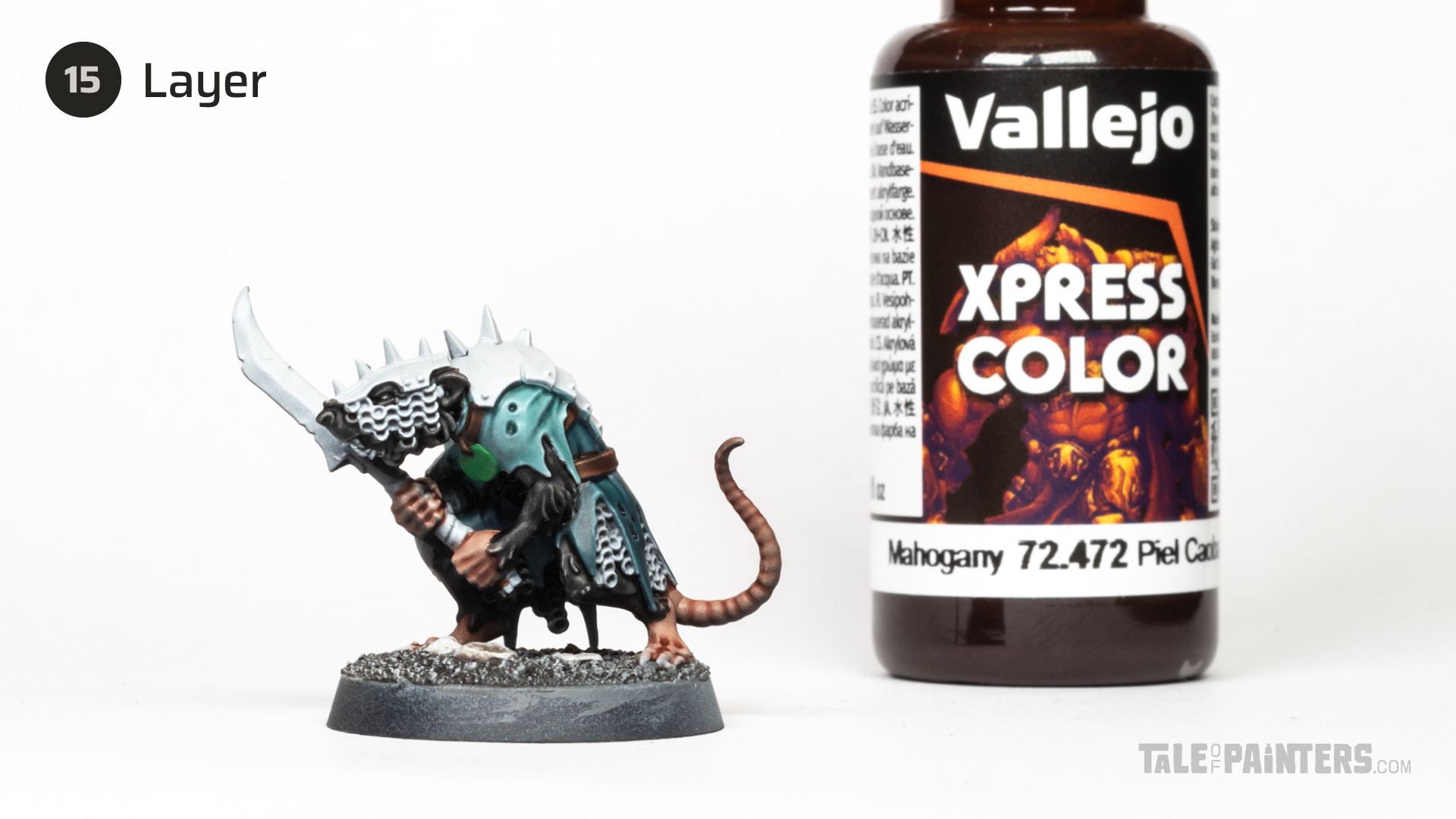

What makes Xpress Color special is that it is divided into regular colours and more heavily pigmented Intense Colours. The Intense Colours are strongly pigmented and quite opaque, while the regular Xpress Colors are often a bit less pigmented than other brands. So for many of their colours you might need to apply two layers to achieve a similar depth as one layer of Contrast or Speedpaint. However, the fact that Xpress Colors tend to be a bit more transparent is not a bad thing for Slapchop, as it allows the zenithal undershading to show through better. One layer of VXP Mahogany was completely sufficient for the leather bits.
Additionally, Xpress Colors settle very evenly, which is an advantage for smoother areas like clothing, and most colours dry very matte, which I personally prefer. However, there are also small nitpicks: Xpress Colors need to be thoroughly shaken, or they won’t work properly. And I feel that while they distribute very evenly, they don’t pull away from the edges quite as much as Contrast or Speedpaint, resulting in less pronounced edge highlights. Though, this is not a significant issue for Slapchop, as you already established highlights through drybrushing.
Scale 75 Instant Colors
Last but not least, we come to a one coat paint range that hardly anyone talks about anymore: the Intense Colors from Scale 75. No wonder, because most of the 48 colours are either very pastel, weakly pigmented, quite opaque, or all three combined. As a result, they feel very different from the other brands and aren’t really suited for quick results, as you often have to apply multiple layers.
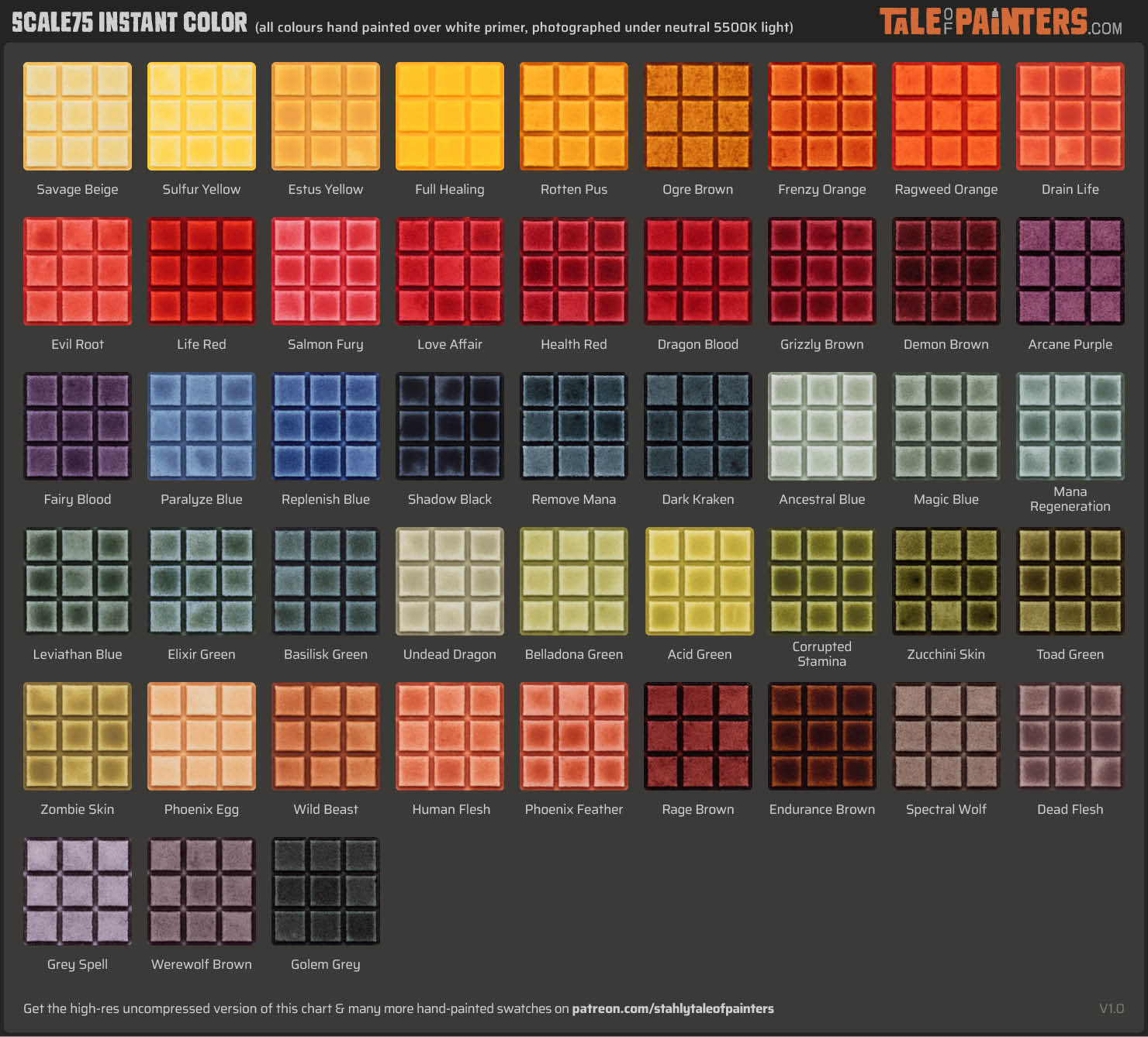

The pastel, muted tones make Instant Colors unique, though. You can check my free Instant Color swatch to see what I mean. For the wooden pieces, I wanted a light, greying tone to contrast with the dark fur. S75 Dead Flesh was ideal for this. However, I only applied it to the lighter areas and left the dark areas dark. Like most Instant Colors, S75 Dead Flesh has a high proportion of opaque pigment, and the light brown would negate the shading if I would let it flow into the black areas. So don’t write off the Instant Colour range straight away, especially if you plan to use the paints for glazing or manual shading. However, for the reasons mentioned I wouldn’t exactly recommend them for traditional Slapchop painting.


Metallic “one coat” paints
So, now I have tested all five one coat paint brands available at the time of this post. Before I reveal my conclusion, I would like to briefly touch on metallics. So far, Speedpaint is the only brand that offers one coat style metallic paints. This is because one coat paints are based on transparent dyes, whereas metallic paints need to contain aluminium or mica particles, and combining both shouldn’t work in theory.
The Army Painter gave it a try anyways, and I experimented with their silver and copper Speedpaints. As you can see in the video, Broadsword Silver worked quite well, but it was too blueish for my Skaven scheme. Polished Silver’s tone was more of what I had in mind but the shading effect wasn’t strong enough. The copper tones also didn’t quite meet my expectations, so I ended up painting the metal details with traditional metallic paints and shading them with a wash. However I know quite a few people like the metallic Speedpaints, so please share your advice in the comments below.
The conclusion
And this is how my Clanrat looks after completing my challenge:


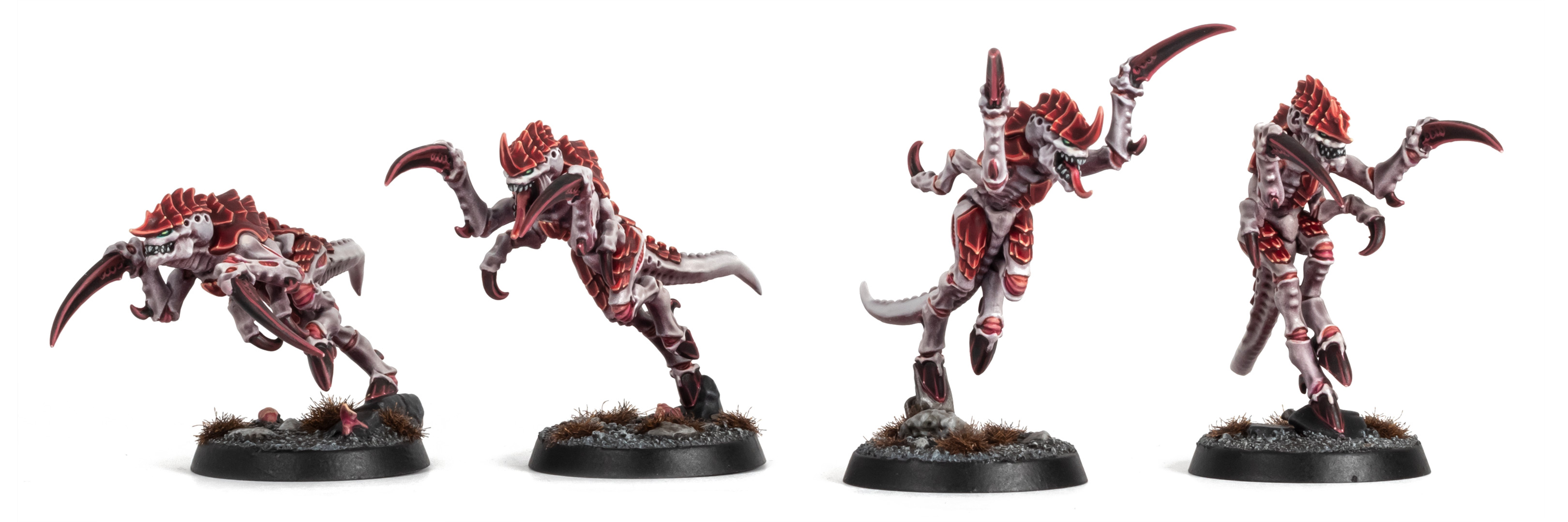
To get the models battle-ready for the table, I think this is quite decent already; you just might want to pick out the eyes and teeth. But before I tell you which “one coat” paint range performed the best for me, I couldn’t resist spending some more time on the models by adding extra highlights and weathering:


If you want to follow exactly how I painted these Clanrats, just check this free step-by-step tutorial:
So to come back to the question from the beginning, which brand is the best for Slapchop? I would exclude Instant Color and Dipping Inks for the reasons mentioned earlier. They have their uses, but they can’t match the user-friendliness of the other brands and are better left for more advanced and experimental painters.
This leaves us with Contrast, Speedpaint, and Xpress Color. Contrast has vibrant and rich colours, though not all of the paints behave the same, and there is a learning curve of finding out which colours are fully transparent and which aren’t. The Army Painter’s Speedpaint has the widest selection of colours and fantastic paint and starter sets. Consistency and behaviour is more uniform, though there are also a few colours containing a high proportion of opaque pigment, such as the pastel shades. The still-present, albeit minimal, reactivation can also be an issue in certain situations as I pointed out earlier.
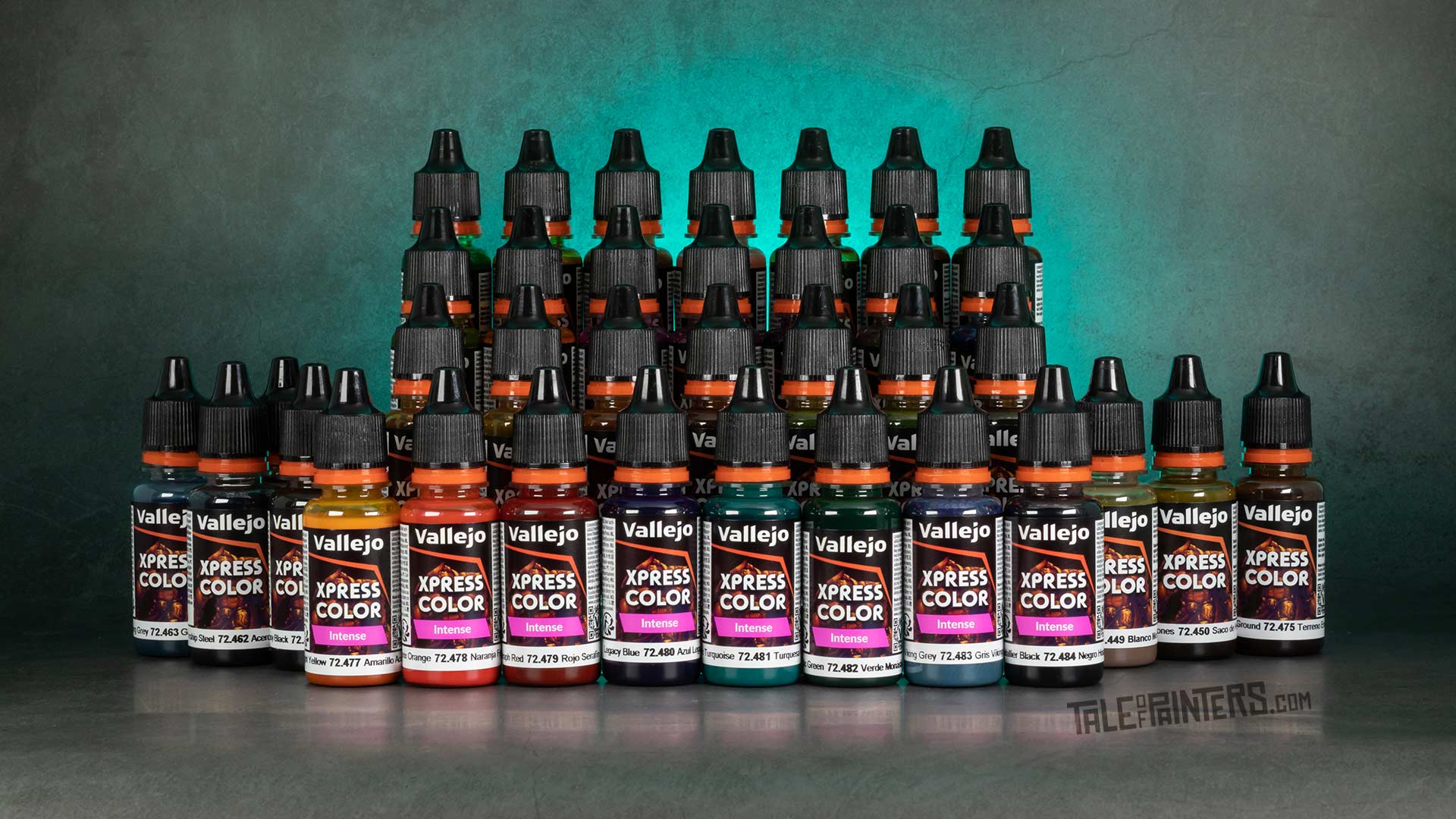

Therefore, for me, Vallejo’s Xpress Colors have the slight edge. The “perceived” weakness that most colours are not as strongly pigmented turns into an advantage in Slapchop painting, as more of the undershading can shine through. Additionally, the colours are affordable and dry with a pleasingly matte finish.
But all three of these paint ranges are well-suited for Slapchop and a lot of it comes down to personal preference. And remember this video covers the needs of Slapchop style painting only, so to find out which Contrast-style paint brand I think is the best overall you have to check out this post, where I rank all the “one coat” paint brands in a tier list.
You can find the latest hobby products at our 🇬🇧/🇪🇺 partner stores Wayland Games, Element Games, and Firestorm Games, at 🇩🇪 Taschengelddieb and PK-Pro, and at 🇺🇸 Noble Knight Games with a welcome discount of up to 10 – 15% over RRP. Using our links helps to support Tale of Painters at no additional cost to you, so thank you very much for using them!
I hope you found this review helpful, feel free to leave a reaction or comment below, or post your questions here or discuss on our Discord channel.


