
In this epic two-part review we’ll take a look at the complete Warpaints paints range from The Army Painter. Yes, you read it right, for this review we will test every single colour, 124 paints in total.
In part 1 we start with the 96 regular acrylic paints, while in part 2, we look at the rest – metallic paints, Quickshade inks and effect paints. Prepare for a looong post 😉
Please note: This review was updated and expanded in 2023.
The Warpaints range
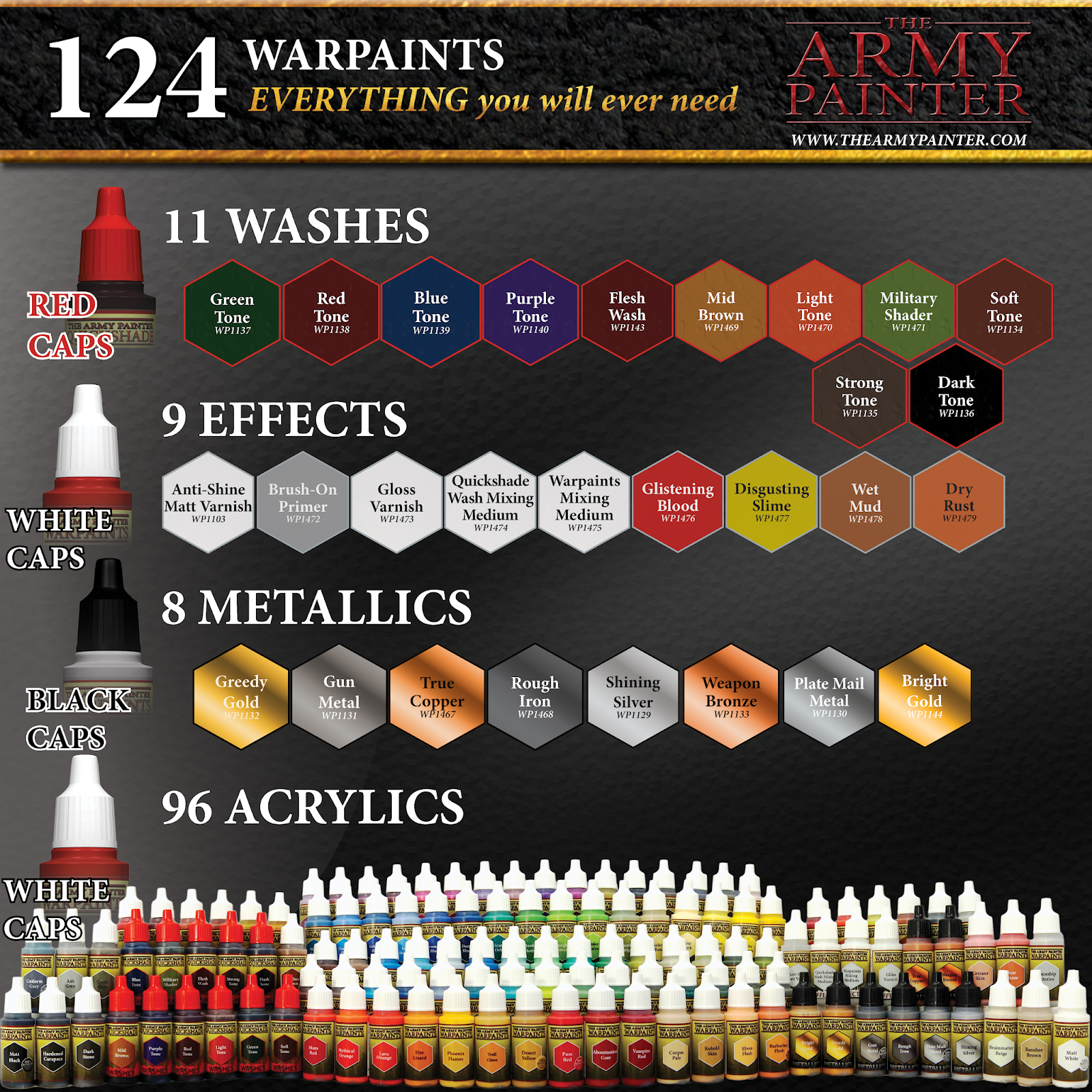
The Army Painter’s Warpaints range started in 2012 with a compact set of 36 paints to complement The Army Painter’s Color Primers. Since then, the Warpaints range received several extensions and is now a fully-fledged paint range consisting of 124 paints. There are 96 regular acrylic paints, 9 effect/technical paints, 8 metallic paints, and 11 washes.
Update: In 2021 and 2022, the range was expanded with two more paint sets, the Skin Tones and Metallic Colours paint set, which both added more colours, as well as a matching airbrush-ready Warpaints Air range.
Warpaints come in dropper bottles like Vallejo paints, comprising 18 ml of paint each. RRP is 2.50 €/£2.00 (0.138 €/£0.111 per ml), inks and metallics are 2.75 €/£2.25 (0.153 €/£0.125 per ml). For comparison, Citadel paints are 3.60 €/£2.75 per paint after their recent price hike and only comprise 12 ml (so 0.30 €/£0.229 per ml), or 6.30 €/£4.75 for 24 ml with their shade paints (0.263 €/£0.198 per ml). That means Warpaints cost less than half of Citadel paints per ml! Not counting some of Citadel’s recent metallic paints, which are even more expensive…
Please note: The figures refer to the time of publication of this review. Prices have risen slightly since then.
Other popular brands like Vallejo paints are 2.75 €/£2.45 for 18 ml (0.153 €/£0.136 per ml), while Formula P3 paints from Privateer Press are priced at 3.30 €/£3.25 for 18 ml (0,183 €/£0.18 per ml).
The Army Painter offers several paint sets with further savings built-in. There is a complete paint set with all 124 paints, a starter set with 10 paints, a mega paint set with 50 paints, a set with all 11 Quickshade inks, and more. There are also several “branded” paint set for games like Zombicide, Dungeons & Dragons and others, we’ll have a look at these sets in a future post, too.
If your local gaming store doesn’t stock The Army Painter products, you can find them online at our partner shops Wayland Games, Element Games, Firestorm Games, and Taschengelddieb. Placing your order by following these links will support Tale of Painters at no extra cost for you at all. Much appreciated.
Warpaints Acrylic Paints review
In this first part of our two-part Warpaints review, we take a look at the 96 regular acrylic paints that form the core of the Warpaints range.
Warpaints’ acrylics are a decent quality paint that is nice to work with. They’re nothing fancy, but flow smoothly from the brush, and dilute, blend and mix quite well. I would describe their consistency as relatively thick, similar to a Citadel Base or Vallejo Model Color paint, with a more gel-like medium compared to Citadel that dries rather quickly. Once dry, the finish is satin.
When it comes to coverage, Warpaints are between Citadel Layer and Base paints. Like in any paint range, there are paints that cover extremely well, and also a few that are more difficult to work with. I’ll give you a complete walkthrough below.
The only issue I have with Warpaints is that every now and then you get a colour that is not properly blended. The heavier coloured pigments will have collected at the bottom of the bottle and the lighter acrylic medium floats on top, so only transparent liquid comes out. The solution is to shake the paints properly and give them a good stir with a cocktail stick. The Army Painter recognized this issue as well, and since late 2022, The Army Painter includes a metal agitator ball in every bottle, which definitely helps mitigating the issue.
Nevertheless, this can be a pain and is also one of the reasons why Warpaints have a somewhat bad reputation. Fortunately, only a few colours were affected in my Mega Set, most of them had a perfectly fine consistency. It seems to be a batch-to-batch thing, with come colours being more prone than others. Personally, I quickly discarded the colours that were affected as the constant shaking and stirring got on my nerves.
100% Colour Primer match
Warpaints are advertised as a 100% match to the Colour Primers of the same name. The Army Painter’s Colour Primers are primer and coloured spray in one, and The Army Painter currently offers 23 different colours plus 2 spray varnishes. Check out our review here.
I couldn’t test them all, so here comes a random sampling. On the left side of the helmet, you can see the Colour Primer, and on the right the Warpaint version (sorry for the thick paint, I sprayed and painted over the same helmets several times 😉
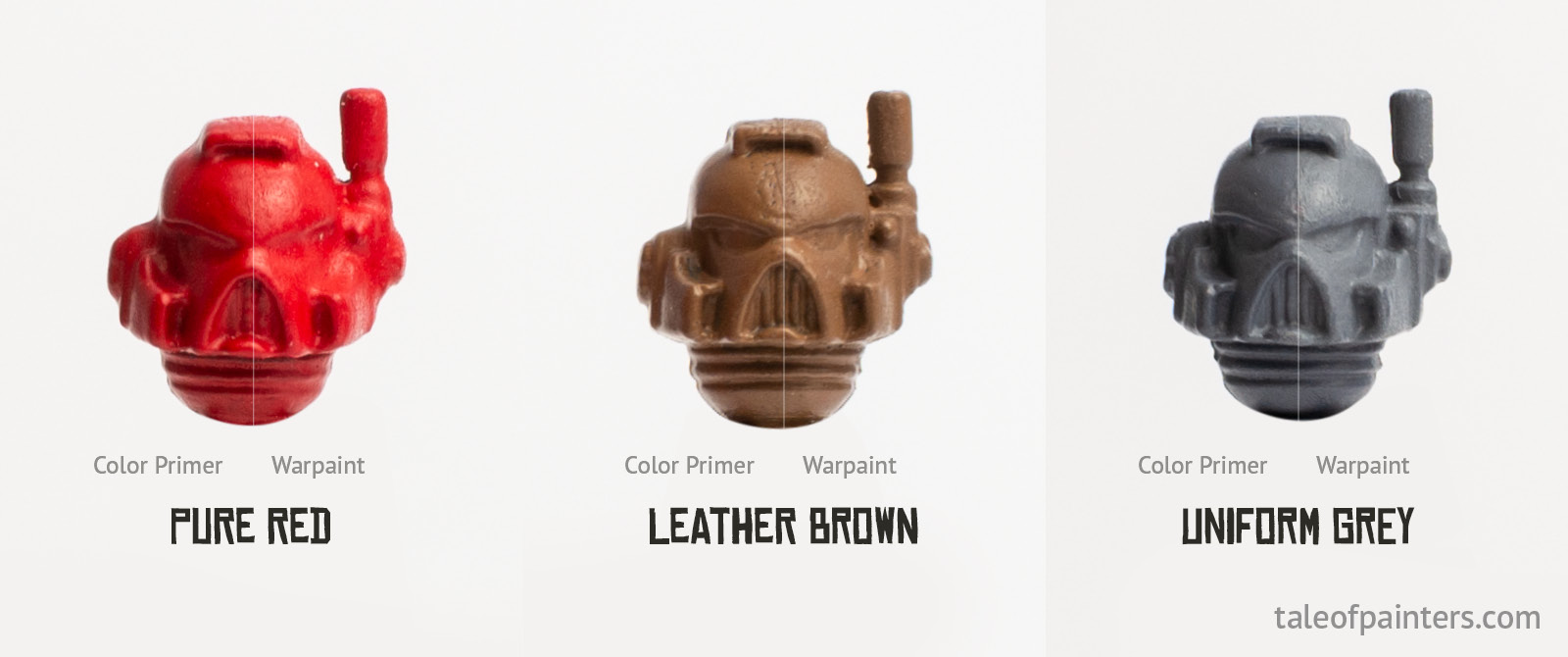
Pure Red and Leather Brown are pretty much spot on, it’s very hard to tell the difference between Color Primer and paint. Uniform Grey is also pretty close, the Warpaints version only a nuance lighter.
As you can see, Warpaints are an excellent match for their respective primers. Maybe not 100% (but then I’d mark this off as marketing speech), but like 99%. Well done, The Army Painter.
I actually think they match much better than Citadel paints to their respective spray paints. I have a can of Mechanicus Standard Grey, and the difference to the paint version is much more noticeable than with The Army Painter’s products – the grey has a slight yellowish-greenish hue that isn’t present in the paint.
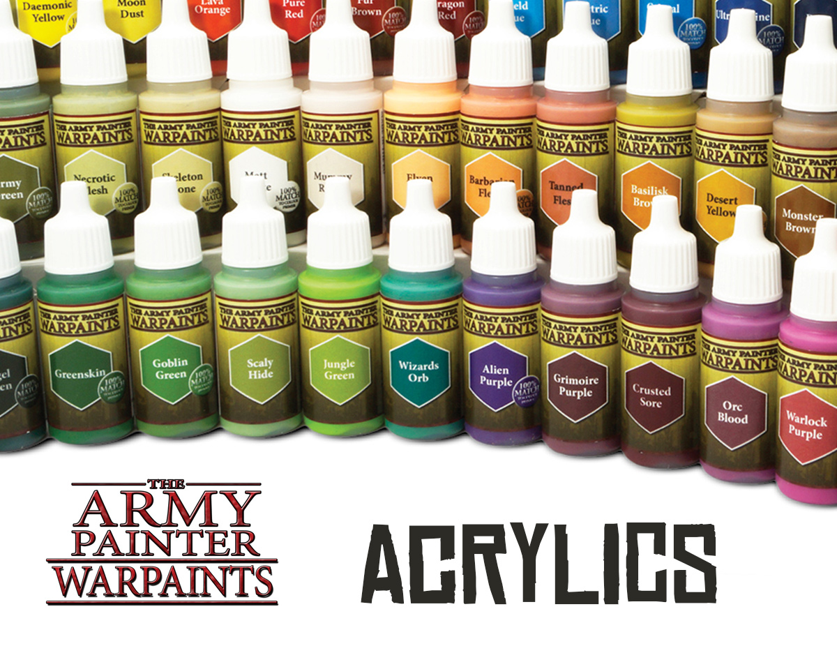
The 96 acrylic colours
Warpaints’ core range offers an extensive selection of 96 acrylic paints, including a lot of interesting and unusual colours you won’t find in the Citadel or Vallejo paint range.
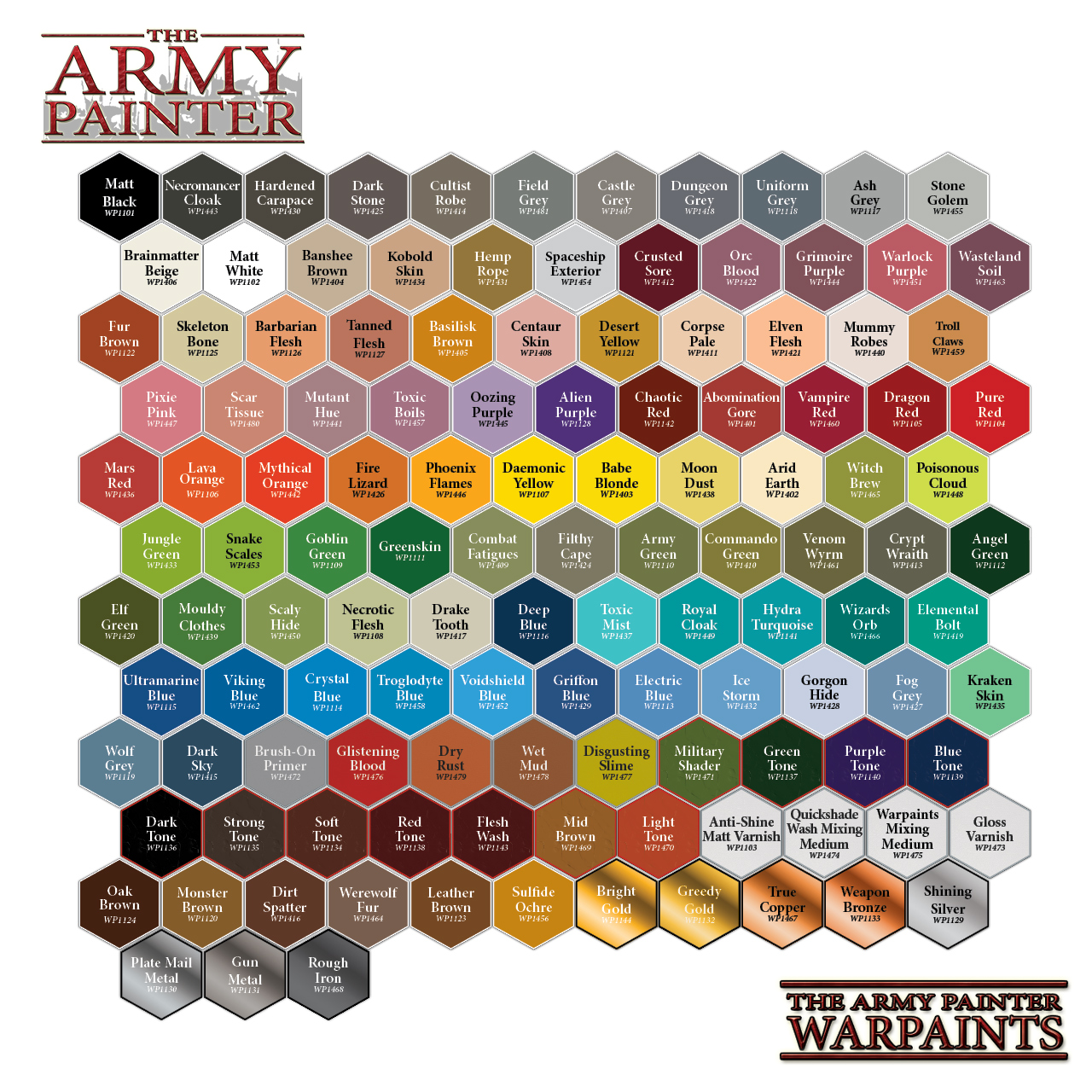
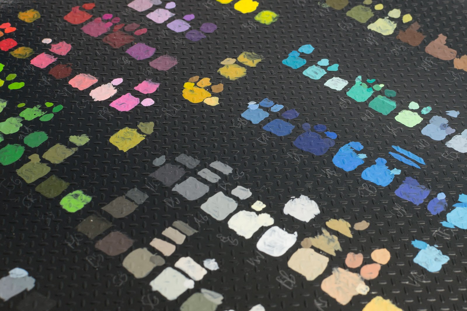
The chart above gives you a basic idea of which colours are similar and/or are meant to go together. However, I found it’s not a perfect representation. For example, Warlock Purple, Scar Tissue and Centaur Skin form a really harmonic combination for basecoating, shading and highlighting – even though they are sprinkled all over the “map”. Some colours also look a bit different in real life.
For this review, I give you a complete walkthrough with a visual description of every single paint. To do this, I applied every paint over a black primer to test the opacity and compared all Warpaints to each other and to similar Citadel paints as well. For your convenience, I will also suggest suitable paints for highlighting. If I don’t list a paint to highlight with, there is no direct matching lighter paint, and I suggest mixing in some off-white (for example Brainmatter Beige for warm colours or Gorgon Hide for cool colours) to lighten up the paint instead.
Here comes some colour theory: A colour is described by hue, value and intensity. A hue can be warm, neutral or cool. Warm or cool means the colour leans either towards the warm spectrum of the colour wheel (yellow, orange, red), or the cool spectrum (green, blue, violet). Value means the relative light- or darkness of colour – lighter means closer to white, darker closer to black, medium in-between. Intensity is about the saturation of colour – vibrant or vivid means the paints are pure and bright, while pale or muted means the paints are dull and often have a dark or greyish tint.
Range walkthrough
Having said that, here we go:
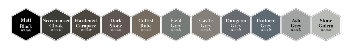
Matt Black: A very nice semi-matte black, that, unlike GW Abaddon Black, covers almost perfectly with a single coat. My recommended highlight colour: Any dark colour you want 😉
Necromancer Cloak: This is a dark, neutral to warm grey. It’s similar to GW Eshin Grey but leans a nuance more towards the warm side. My recommended highlight colour: Castle Grey or Dungeon Grey.
Hardened Carapace: A dark anthracite/warm grey. It reminds me of old foundation paint Charadon Granite from GW. My recommended highlight colour: Castle Grey.
Dark Stone: A medium to dark taupe, it’s a reddish-brownish grey.
Cultist Robe: Looks actually nothing like the paint swatch. It’s actually a dark olive green, not a grey.
Field Grey: A medium grey with a nuance of drab green. Could be useful for certain historic uniforms or for painting scenery. My recommended highlight colour: Castle Grey.
Castle Grey: A medium, warm grey. It’s very similar to Stormvermin Fur, only a nuance lighter. My recommended highlight colour: Filthy Cape.
Dungeon Grey: A medium, neutral grey. It’s an almost exact match for GW Dawnstone. My recommended highlight colour: Ash Grey.
Uniform Grey: A medium, neutral grey similar to GW Dawnstone, but slightly cooler. Pretty good coverage. There is also a matching Color Primer for this. My recommended highlight colour: Ash Grey.
Ash Grey: A light neutral grey, perfect for highlighting Dungeon Grey, Uniform Grey or GW Dawnstone. Almost an exact match for GW Administratum Grey. My recommended highlight colour: Spaceship Exterior.
Stone Golem: A very light warm grey, lighter than on the colour swatch. Compared to GW Pallid Wych Flesh it’s slightly less reddish. Would be useful to mix with Castle Grey, Field Grey, Dark Stone or GW Stormvermin Fur for highlighting. The consistency of my bottle was a bit thin. My recommended highlight colour: Spaceship Exterior.
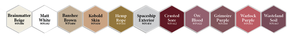
Brainmatter Beige: A very nice off-white that is useful to brighten up colours when mixed. It’s like a mix of GW Screaming Skull and white. You can also use it to highlight Skeleton Bone or GW Screaming Skull. My recommended highlight colour: Matt White.
Matt White: A nice and smooth white. Opacity is similar to Ceramite White, but it doesn’t dry as chalky. I’d definately prefer this over GW White Scar.
Banshee Brown: A pale, light warm brown that is similar to GW Rakarth Flesh, but less greyish. Useful for mixing into browns for highlighting. My recommended highlight colour: Brainmatter Beige.
Kobold Skin: A medium skin tone for caucasian skin, a bit like a mix of GW Cadian Fleshtone and Kislev Flesh. My recommended highlight colour: Corpse Pale.
Hemp Rope: A medium to light ochre paint with a hint of green. A bit like mixing GW Balor Brown with Ogryn Camo. A peculiar colour. Maybe it’s something for historic wargamers (or for painting Sylvaneth).
Spaceship Exterior: A very light, almost white neutral grey. It’s even brighter than GW Ulthuan Grey. It’d be nice as an extreme highlight for Ash Grey or GW Ulthuan Grey. My recommended highlight colour: Matt White.
Crusted Sore: A deep crimson red, similar to Khorne Red but slightly darker. The consistency of my bottle was a bit thin. My recommended highlight colour: Vampire Red.
Orc Blood: A medium warm purple with a hint of red. It’s more vibrant and violet than on the colour swatch. My recommended highlight colour: Toxic Boils.
Grimoire Purple: A dark, muted, quite greyish plum purple. My recommended highlight colour: Mutant Hue.
Warlock Purple: Not to be confused with old GW paint Warlock Purple, this warm pink is actually a pretty close match for GW Pink Horror. Coverage is pretty good for a pink. My recommended highlight colour: Scar Tissue.
Wasteland Soil: Compared to Orc Blood, it’s a less violet and more reddish muted sanguine purple. My recommended highlight colour: Mutant Hue.
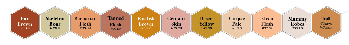
Fur Brown: A warm medium brown with a slight nuance of red. Compared to GW Skrag Brown it’s less orange and slightly more muted. Also available as a Color Primer. My recommended highlight colour: Tanned Flesh.
Skeleton Bone: A yellowish bone colour, a pretty exact match for GW Ushabti Bone. Decent opacity and there is also a matching Color Primer for this one. My recommended highlight colour: Drake Tooth.
Barbarian Flesh: A vibrant, reddish caucasian skin tone. Excellent for highlighting Warpaints Tanned Flesh. Very similar to old GW Dwarf Flesh, if you remember that paint, or GW Bestigor Flesh. There is also a matching Color Primer. My recommended highlight colour: Corpse Pale or Elven Flesh-
Tanned Flesh: A tanned reddish skin tone that is excellent for shading Warpaints Barbarian Flesh. It’s a very close match for GW Ratskin Flesh. My recommended highlight colour: Barbarian Flesh or Kobold Skin.
Basilisk Brown: A yellowish ochre paint with decent coverage. It’s an excellent match for old foundation paint Tausept Ochre, and similar to GW Zamesi Desert and Balor Brown. My recommended highlight colour: Troll Claws.
Centaur Skin: A light fleshy pink that works very well for highlighting Warpaints Scar Tissue. In real life, it’s more vibrant than on the paint swatch. Compared to GW Fulgrim Pink it’s warmer and more reddish, almost salmon-like.
Desert Yellow: A sandy ochre paint, very close to GW Zamesi Desert. Consistency of my bottle was rather thin. There is a matching Color Primer for this one. My recommended highlight colour: Basilisk Brown.
Corpse Pale: A light caucasian skin tone with a nuance of yellow. It’s an almost exact match of GW Flayed One Flesh. My recommended highlight colour: Brainmatter Beige or Mummy Robes.
Elven Flesh: A light vibrant flesh tone with a nuance of orange or yellow. Similar to GW Ungor Flesh. My recommended highlight colour: Corpse Pale.
Mummy Robes: A very light, almost white warm grey. It’s an exact match of GW Pallid Wych Flesh. It’s as light as Warpaints Brainmatter Beige, but while Brainmatter Beige leans slightly towards the yellowish side, Mummy Robes leans slightly towards the reddish side. My recommended highlight colour: Matt White.
Troll Claws: A versatile light ochre that would be useful for highlighting Warpaints Basilisk Brown or GW Tau Light Ochre. My recommended highlight colour: Corpse Pale.
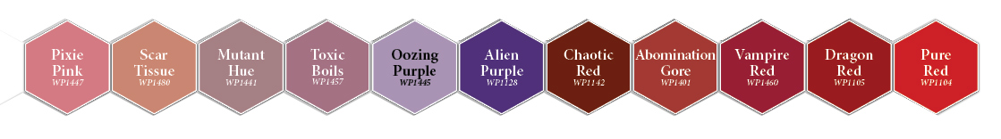
Pixie Pink: A medium pink, very similar to GW Emperor’s Children. While Emperor’s Children leans slightly to the warm side, Pixie Pink leans slightly to the cool side.
Scar Tissue: A warm, fuchsia pink. A bit more vibrant than on the colours swatch. My recommended highlight colour: Centaur Skin.
Mutant Hue: Quite similar to Toxic Boils, but a bit more muted and reddish, more like a grape violet.
Toxic Boils: A very light, warm mauve violet. Much lighter than on the colour swatch. It’s similar to GW Dechala Lilac, but while Dechala Lilac leans towards the blueish side, this one leans slightly towards the reddish side.
Oozing Purple: A light, slightly pale violet. Compared to GW Genestealer purple, it’s a bit lighter, so it would make for a great highlight. My recommended highlight colour: Toxic Boils.
Alien Purple: A medium violet. Very similar to GW Genestealer purple, but slighty darker. Opacity is above average. Also available as a Color Primer. My recommended highlight colour: Oozing Purple or Orc Blood.
Chaotic Red: A dark red, similar to GW Khorne Red, but slightly more warm and brownish. There is a matching Color Primer for this paint. Consistency of my bottle was a bit thin. My recommended highlight colour: Abomination Gore or Dragon Red.
Abomination Gore: A muted, slightly brownish medium red. My recommended highlight colour: Mars Red.
Vampire Red: A medium red with a hint of crimson. Would work for highlighting Warpaints Crusted Sore or GW Khorne Red. My recommended highlight colour: Pure Red.
Dragon Red: A medium vibrant red. A suitable highlight color for Chaotic Red. Quite similar to GW Mephiston Red. It’s also available as a Color Primer. My recommended highlight colour: Pure Red.
Pure Red: A bright vibrant red, a pretty much exact match for GW Evil Sunz Scarlet. Good coverage for such a bright red. There is a matching Color Primer for this. My recommended highlight colour: Mars Red.
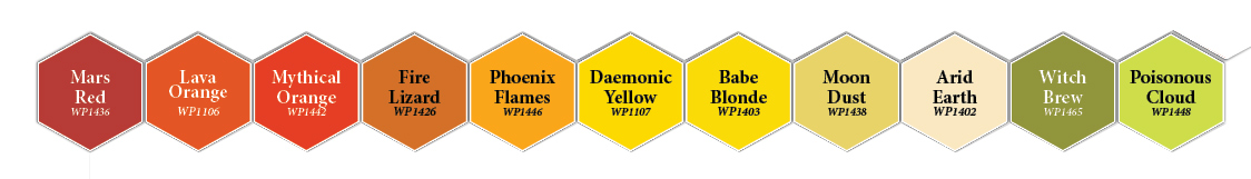
Mars Red: This is a bright red with a hint of coral. Great for highlighting Pure Red or GW Evil Sunz Scarlet without the danger to make your highlights appear too orange. It’s very similar to GW Wildrider Red. My recommended highlight colour: Lava Orange or Scar Tissue.
Lava Orange: A deep vibrant orange, similar to GW Troll Slayer Orange. My recommended highlight colour: Mythical Orange.
Mythical Orange: Looks nothing like on the paint swatch, at least the bottle I had. It’s actually lighter than Lava Orange, similar to GW Fire Dragon Bright, but a bit more muted and leaning towards a yellowish orange. Coverage is rather weak.
Fire Lizard: Doesn’t look exactly as on the paint swatch in real life. It’s not a light brownish orange, but more of a mustard yellow. It’s very similar to GW Averland Sunset.
Phoenix Flames: A warm medium yellow. It’s very similar to GW Yriel Yellow, maybe a nuance less orange. My recommended highlight colour: Daemonic Yellow.
Daemonic Yellow: A medium yellow with a quite good opacity for yellow. It’s very similar to GW Flash Gitz Yellow, maybe a nuance less vibrant. Works great for highlighting Phoenix Flames. There is also a Color Primer for this. My recommended highlight colour: Moon Dust.
Babe Blonde: This is a cool light yellow. Cool in the sense that it has a slight amount of blue in it. Consistency and opacity was pretty bad on my bottle. Have to say I don’t like the name of this paint though. I think it’s unnecessarily sexist. My recommended highlight colour: Matt White.
Moon Dust: This is a light yellow that’s excellent for highlighting Daemonic Yellow or GW Flash Gitz Yellow. It’s not as bright as GW Dorn Yellow though, so it’s useful for filling the “gap” between Flash Gitz and Dorn Yellow. Coverage is pretty good for such a bright yellow. My recommended highlight colour: Arid Earth.
Arid Earth: This is a very light, almost white pale yellow. It’s great for that final extreme edge highlight. It’s lighter than GW Dorn Yellow, and a bit paler. My recommended highlight colour: Matt White.
Witch Brew: A yellowish, vibrant lime green with pretty good opacity. Compared to GW Moot Green, it’s much more yellowish. My recommended highlight colour: Poisonous Cloud.
Poisonous Cloud: A bright and vibrant lime green. Works great for highlighting GW Moot Green, or for Jungle Green and Witch Brew. Like a lot of bright greens, the coverage is weak.
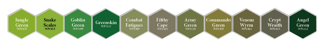
Jungle Green: A bright, almost neon green. Similar to GW Moot Green but slightly more bright and vibrant. Almost exactly the same as VGC Scorpy Green, makes a great replacement for old GW Scorpion Green, too, if you remember this paint. Coverage is below average. My recommended highlight colour: Poisonous Cloud.
Snake Scales: As you can see on the colour swatch, it’s pretty similar to Jungle Green, maybe a tiny bit warmer. But it’s hard to tell the difference between both paints. Almost an exact match for GW Moot Green. Coverage is also below average. My recommended highlight colour: Scaly Hide.
Goblin Green: A medium green, very similar to GW Warboss Green. Good coverage. There is also a Color Primer for this. My recommended highlight colour: Mouldy Clothes.
Greenskin: Another medium green, slightly darker than Goblin Green. It’s more vibrant than GW Waaagh Flesh. There is also a matching. Color Primer. My recommended highlight colour: Goblin Green.
Combat Fatigues: This is a pale green with a slight nuance of olive. Quite similar to Necrotic Flesh, but less yellowish. It’s lighter than on the colour swatch. An almost exact match for GW Nurgling Green, though the coverage is a bit better.
Filthy Cape: A light warm grey, doesn’t have the hint of green like on the colour swatch. My recommended highlight colour: Stone Golem. Also useful for highlighting GW Stormvermin Fur.
Army Green: This is a pale, greyish green. Opacity is above average. A great colour to highlight Elf Green, Crypt Wraith or Cultist Robe, or GW Lothern Green. It’s an almost exact match for GW Straken Green, maybe just a nuance more greyish. There is also a Color Primer for this one. My recommended highlight colour: Combat Fatigues.
Commando Green: A medium green with a nuance of yellow. It’s a bit more greenish and vibrant than on the color swatch. My recommended highlight colour: Army Green.
Venom Wyrm: A dark olive green with a nuance of brown. My recommended highlight colour: Elf Green.
Crypt Wraith: A dark drab green. It’s more greenish in real life than on the colour swatch. A very close match for GW Castellan Green. My recommended highlight colour: Elf Green or Army Green.
Angel Green: Similar to GW Caliban Green. Despite the name, it’s a bit more muted and less vibrant than old GW Dark Angels Green. There is a matching Color Primer for this. My recommended highlight colour: Greenskin.
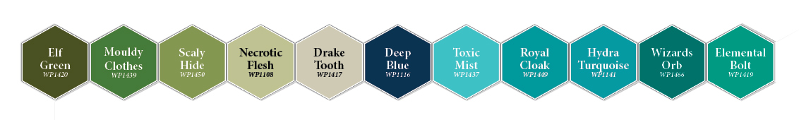
Elf Green: A dark drab green. It’s very similar to GW Death World Forest, just a nuance less olive. My recommended highlight colour: Army Green.
Mouldy Clothes: A light, not too pale and not too vibrant green. Lighter than on the colour swatch. It’s an almost exact match for GW Skarsnik Green, just a little bit warmer and more vibrant, but not by much. Coverage is pretty good, better than Skarsnik Green. My recommended highlight colour: Scaly Hide.
Scaly Hide: This is a nice, light pale green. Lither than on the colour swatch. It’s similar to GW Nurgling Green, but more neutral and less yellowish. Great coverage for such a light colour.
Necrotic Flesh: A light, yellowish khaki green. It’s very similar to GW Krieg Khaki. It’s a good colour to highlight GW Ogryn Camo. Also available as a Color Primer. My recommended highlight colour: Drake Tooth.
Drake Tooth: A light yellowish bone colour. It’s an almost exact match for GW Screaming Skull. It’s great for highlight Warpaints Skeleton Bone or GW Ushabti Bone. Decent opacity. My recommended highlight colour: Brainmatter Beige.
Deep Blue: A dark, slightly greyish denim blue. A bit lighter than on the colour swatch, it’s very close to GW Alaitoc Blue, just a nuance darker. Decent opacity. My recommended highlight colour: Griffon Blue.
Toxic Mist: A very light, almost white turquoise. It’s much lighter than on the paint swatch in real life. Great for highlighting Royal Cloak or GW Baharroth Blue, for acchieving an intense plasma glow. My recommended highlight colour: Matt White.
Royal Cloak: A light turquoise that is very similar to GW Baharroth Blue. It’s much lighter than on the paint swatch, the paint looks actually more like Toxic Mist on the chart. While Baharroth Blue leanse a nuance more towards the cool blue side, Royal leans a nuance more towards the warm green side. My recommended highlight colour: Toxic Mist.
Hydra Turquoise: A medium, warm turquoise. Similar to GW Temple Guard Blue, like the other Warpaints turquoise paints, it leans more towards the warm green side, while Temple Guard Blue leans more towards the cool blue side. My recommended highlight colour: Royal Cloak.
Wizards Orb: A slightly mooted cool jade green. Slightly lighter than it appears on the colour swatch. It’s pretty much between GW Kabalite and Sybarite Green, so a great colour to transition between both paints. Coverage is excellent. My recommended highlight colour: Elemental Bolt.
Elemental Bolt: A vibrant cool mint/jade green. Compared to Sybarite Green, it’s more vibrant and a nuance more blueish. Opacity is great as well. My recommended highlight colour: Kraken Skin.
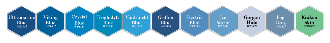
Ultramarines Blue: A medium blue with a nuance of violet. It’s similar to GW Altdorf Guard Blue, but a nuance darker. Also available as a Color Primer. My recommended highlight colour: Electric Blue.
Viking Blue: A vibrant medium blue. It’s not darker as Crystal Blue, as both are almost the same colour. An exact match for GW Teclis Blue. Coverage is slightly below average. My recommended highlight colour: Troglodyte Blue or Voidshield Blue.
Crystal Blue: Another vibrant medium blue, very similar to Viking Blue and GW Teclis Blue. Leans maybe a tiny nuance more towards the yellowish side. Covers really nicely. There is a Color Primer for this. My recommended highlight colour: Troglodyte Blue or Voidshield Blue.
Troglodyte Blue: A light vibrant blue, an almost exact match for GW Lothern Blue. Great for highlighting Viking Blue or Crystal Blue. Above average opacity. My recommended highlight colour: Troglodyte Blue.
Voidshield Blue: A light vibrant blue, a nuance lighter than Troglodyte Blue. Useful for highlighting Troglodyte Blue or GW Lothern Blue. My recommended highlight colour: Ice Storm.
Griffon Blue: A medium slightly greyish denim blue, slightly lighter than it appears on the colour swatch. An almost exact match for GW Hoeth Blue. My recommended highlight colour: Wolf Grey.
Electric Blue: A light pale blue with a nuance of purple. Above average coverage. Similar to GW Calgar Blue, but a nuance lighter. My recommended highlight colour: Gorgon Hide.
Ice Storm: A very light pale blue. Very similar to GW Blue Horror. My recommended highlight colour: Gorgon Hide.
Gorgon Hide: A very light, almost white pale blue-grey. My recommended highlight colour: Matt White.
Fog Grey: This is a light blueish grey. A bit lighter than it appears on the colour swatch. It’s very similar to Fenrisian Grey, just a nuance lighter. My recommended highlight colour: Gorgon Hide.
Kraken Skin: A light and vibrant cool green. Works great for mixing with Wizards Orb or Elemental Bolt for highlighting. It’s similar to GW Gauss Blaster Green but more vibrant, and, even though it’s a cool green, leans a little bit more towards the yellowish side in comparison. Good opacity for such a light and bright green.
Wolf Grey: A medium blueish grey… or greyish blue? It’s almost an exact match for GW Russ Grey, just a nuance more blueish. Covers very well. There is also a Color Primer for this. My recommended highlight colour: Fog Grey.
Dark Sky: A deep navy blue. It’s in-between Caledor Sky and Kantor Blue – a bit darker than Caledor Sky, more vibrant than Kantor Blue. Can be highlighted with either Deep Blue, Ultramarines Blue, Crystal Blue or Viking Blue.
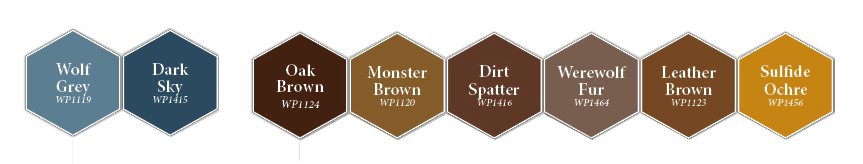
Oak Brown: A dark brown, not too vibrant, not too muted, not too reddish. It’s very close to GW Dryad Bark. My recommended highlight colour: Werewolf Fur, Leather Brown or Dirt Splatter.
Monster Brown: A light pale brown. It’s similar to GW Baneblade Brown, but a nuance warmer/more reddish. My recommended highlight colour: Banshee Brown.
Dirt Splatter: A medium brown. Compared to GW Mournfang Brown, it’s a nuance lighter and less reddish. My recommended highlight colour: Monster Brown.
Werewolf Fur: A pale medium brown. It’s similar to GW Gorthor Brown, but a nuance darker. Opacity is above average. My recommended highlight colour: Monster Brown.
Leather Brown: A medium ochre brown. It’s similar to GW Steel Legion Drab, but a bit warmer and slightly more reddish. Covers very well. My recommended highlight colour: Monster Brown.
Sulfide Ochre: A yellowish ochre, similar to GW Balor Brown, but slightly lighter and a nuance more yellowish. Opacity is below average. My recommended highlight colour: Skeleton Bone.
Warpaints old and new compared
When I compared this new batch with Warpaints I bought between 2012 and 2015, I noticed that some colours have changed slightly, as you can see below. Note that this is not an exhaustive list, but only a couple of paints I had from back then.
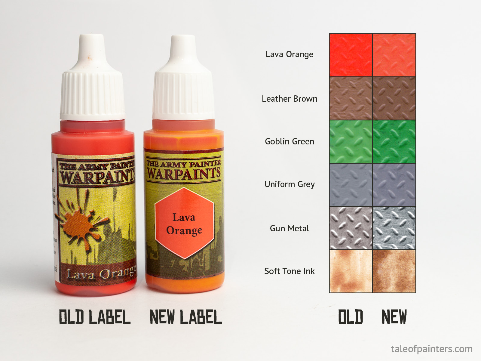
The differences are only nuances, however, two paints stood out. Old Gun Metal had very fine metallic pigments and a warm hue, while the new one is more of a neutral steel colour. Soft Tone Ink has become a noticeable darker brown wash.
I asked The Army Painter and they stated they didn’t change the formula or manufacturer(s), so most likely the raw materials or pigments changed a little bit over time, I can’t say for sure.
However, the differences only seem to occur between older paints (identifiable by the old label as seen above) and the current batch of paints. I checked several up-to-date bottles (bought from different sources), and the colours are consistent. Paints with the old label seem to have phased out about 2 years ago, so it’s really only an issue if you have really old Warpaints you need to replenish. New Leather Brown and Uniform Grey are a closer match to their respective Color Primer than their old versions, so that’s a plus.
It’s important to know that variations like this happen with other paint ranges, too. For example, I bought a bottle of Brassy Brass from Vallejo lately that was much lighter than the bottle I got years ago.
Verdict
The Army Painter’s Warpaints offer a solid range of acrylic paints. Quality and consistency are average, but that’s not meant in a negative way at all, especially since they are one of the most affordable and widely available miniature paint ranges.
Warpaints cater to a lot of different needs. For historic and military wargamers, there are a lot of tinted greys and drab and olive greens to experiment with, while there are loads of bright paints for fantasy and sci-fi collectors as well. It’s a quite large range with very few gaps, the only colours I’m personally missing personally would be a dark turquoise, a dark blue-grey and a dark blueish green. Maybe something to consider for future expansions of the range, The Army Painter?
I love that there are a lot of hues you won’t find in the Citadel paint range – or actually in any other range save for Reaper Master Series, which are difficult to acquire outside the US. For example, very light paints such as Arid Earth, Poisonous Cloud, Toxic Mist or Gorgon Hide. Or all those plum, mauve and grape purples like Wasteland Soil, Mutant Hue and Toxic Boils, that are great for painting wounds, bruises and otherworldly skin.
That’s it for part 1. Check out part 2, which covers the metallic and effect paints, as well as Quickshade washes:
21 Comments
Leave a Reply
Tale of Painters is the unofficial Warhammer hobby magazine run by hobbyists like you. Support our work by using the affiliate links from our partner stores for your next orders so we can continue to bring you fantastic FREE content every day:


![]()
![]()
Or support us directly:


When you say Crusted Sore was thin, how would it cover over black primer?
how well*
6 or 7 seven coats? Maybe your bottle will have a better consistency.
That’s a shame, I am looking to do a crimson red color scheme for my kabalites and wanted to use crusted sore as the base paint, then do vampire red highlights. Which primer would you suggest I use considering most of the miniature will be painted in crusted sore.
You could go for Khorne Red or Gal Vorbak Red. More expensive, but better coverage. Vallejo Game Color Scar Red might also be worth a try. For priming you could use Chaotic Red primer from The Army Painter if you want to start with a dark red.
I have typed in your highlight suggestions into this handy chart.
https://docs.google.com/spreadsheets/d/1xRiRxzVi7D1GLvXFMqAApDXOjjeJIRQgCNkFmcxOv88/edit?usp=sharing
I'm bookmarking this, fantastic guide.
This is review I was looking for! Thanks!
Hi,
Thanks for the thorough review.
I have tested complete opaque swatches of Cultist Robe and Crypt Wraith, both I and my professional colour sensor find them to be very close. The colour sensor shows a DeltaE 2000 of 2.
Do you also find them to be very close?
Kind regards
Kalle
I picked up a bottle of white and one of the matt black. Both of them had the consistency of toothpaste – almost like the artist paints in tubes. I figured it was a bad batch, but when I tried again it was the same thing. It was disappointing.
Even as a long time AP-user, this was very helpful.
Sweet, thank you, I will look into those brushes and looking forward to Saturday! Appreciate the hard work.
Great thank you, can't wait for part 2 as I am just starting out and trying to choose my paints now. Vould you also do a brush recommendation article, I don't want to spend too much. Thanks
Part 2 will be ready this Saturday. For brushes, The Army Painter also have a brush range with a great value for money ratio. Personally, I use The Army Painter Wargamer Drybrushes and Monster brushes for drybrushing and basecoating, davinci Series 1526y for basecoating, layering and washing, and Winsor & Newton Series 7 M for highlighting.
Brilliant guide, thanks very much, looking forward to the next review
Great guide. Thank you so much
Since I almost exclusively use Army Painter, this is of incredible use to me. It's sad that Army Painter does not have helpful resource on what color to use over what (which is vital for color dumbs like me), and it's very nice of you to do this!
Hey Sevej- We are actually working on one. It's extremely time consuming as you can imagine to compare to all of the major paint ranges, and we want to make sure we get it right when we are able to publish. There are also some loopholes we have to jump through. Obviously, it's not polite to use another brand's likeness in our own published materials. 😉
Haha, no worries. It's just that I buy online (and I can _only_ buy online–I'm in the South East Asia), so finding a color of the same hue for highlight/shade depends a LOT on the color chart. I actually found that the other brand's comparison is not as vital as the comparison between your own colors.
Excelent Review Stahly
Very thorough! Thanks for the review