

Here we got the second Attack Bike!
This one has the driver firing his bolt pistol whilst driving because in 40k you just can’t keep drivers of anything from getting their handguns out and firing them somewhere. They also got a bunch of battle honours on the attack bike, probably because the gunner keeps focussed and doesn’t start chucking grenades left and right.
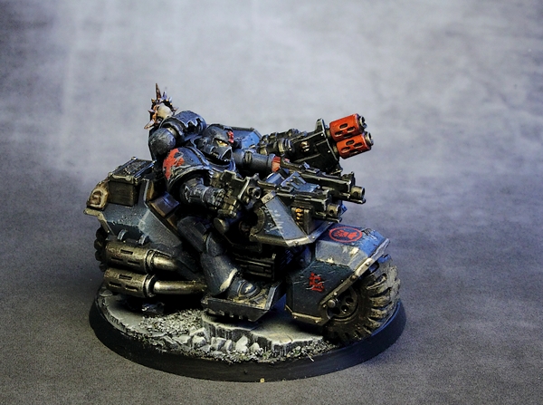
This one has the driver firing his bolt pistol whilst driving because in 40k you just can’t keep drivers of anything from getting their handguns out and firing them somewhere. They also got a bunch of battle honours on the attack bike, probably because the gunner keeps focussed and doesn’t start chucking grenades left and right.
Below we got them both in front of traditional white background:

Next: Assault Terminators!
Melta's are hot hence why the red.
That's not a choice, it's the way it's done. Melta barrels are red (dark red for variety if you like), plasma weapons barrels are yellow-to-red gradient (or red with stylized white flames) and power weapons are light blue.
Our forefathers did it that way, it was done that way in The Golden Age and it shall be done that way until the end times. 😉
On a more sane level – the rest of the army's got red meltagun barrels, the customer is highly O.K. with that and personally, I think you need contrast. I mean all the colour there is on this model is just blue and red anyway and the weapion's gotta stand out. The mushy, muddy, undefined look may be alright if you paint for competitions or selling the thing via internet picture but I do believe that a proppa, well-visible weapon does the trick better on the table and viewing it in real life.
Gotcha. Nothing wrong with keeping it old school.
Are the red barrels a stylistic/color breakup choice? They stand out quite jarringly.