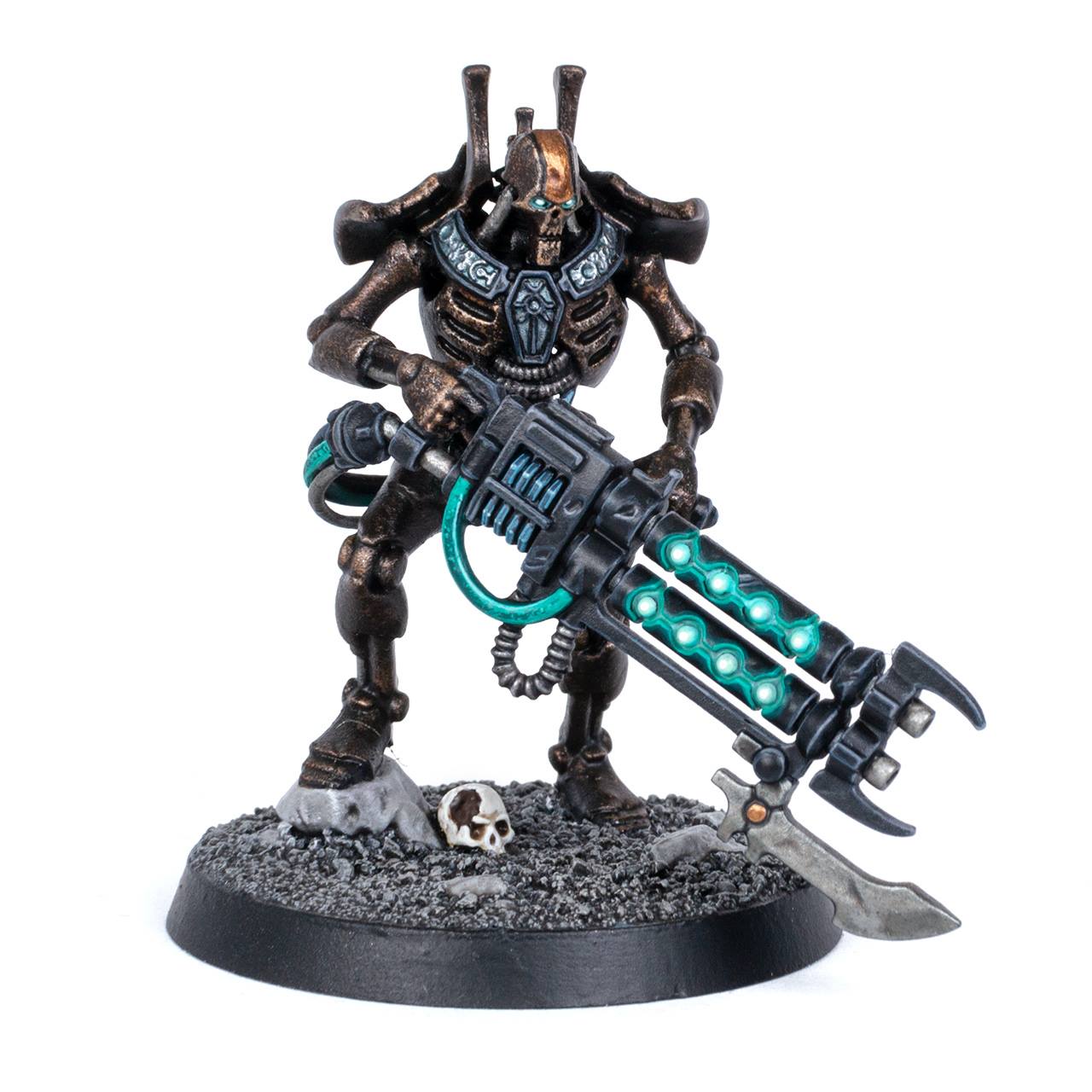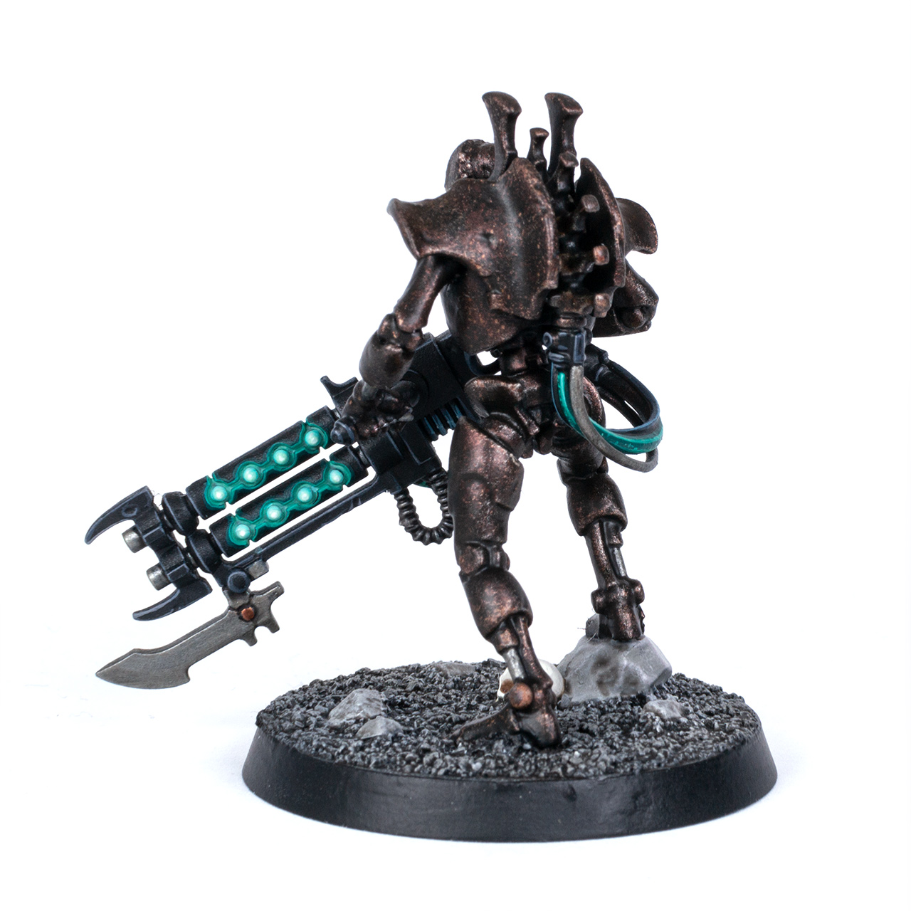

So I’ve painted a Necron from Indomitus, too, yay! I chose the Royal Warden as a test model for my own Necron dynasty that was inspired by the brass Szarekhan paint scheme – but with my own twist. I wanted a very effective paint scheme with a lot of texture, so most of the body has just been sponged, drybrushed and washed. Unlike the ‘Eavy Metal paint scheme, my brass is darker, and the gauss glow is a cooler green. I’m not entirely happy with the finished model, though. Maybe you can help me out in the comment section?


For the body, I applied Warplock Bronze with a sponge over black primer, then Runelord Brass, then I washed the whole body with Cryptek Armourshade Gloss, thinned with a little bit of Contrast Medium, then drybrushed the body with Canoptek Alloy. The process creates a lot of texture, but maybe it’s too much in contrast to the smoothly painted weapon? Maybe the shade of brass is too dark, making the model too dark overall? Maybe the ornaments around his neck need to be a different colour, e.g. a lighter brass like the stripe on his head? I’m really lost, maybe you can share your thoughts in the comments.
At least I’m happy with the weapon and glow effects. The weapon was drybrushed with Thunderhawk Blue, then highlighted with The Army Painter Uniform Grey. I painted the orbs with Corax White, then washed with Nihilakh Oxide, layered with Reaper Master Series Mint Green, Gaussblaster Green and White. The reflections on the edges were painted with Vallejo Game Color Scurvy and Jade Green (though I might want to change to a more subtle effect once I proceed to mass-production). As you can see, I removed the cloak, I felt it was a bit too asymmetrical for my taste. I also upgraded the base to 40mm because why not. I felt 32mm were a bit small for the huge gun.
So, what do you think of my paint scheme? Too dark? Too muted? Or perfectly fine? Leave a comment or reaction below.


I really love the armor. In fact it inspired me to redo my color scheme with those colors. If you dont like the contrast to the weapon i would just dry brush over the weapon with a dark silvery metal. Like the new iron hands steel. And jeah the black "necklace" is a bit dull, i would color it in the same color as the head plate
I love the armour! But I agree the gun doesn't go with it.
I think some 'hotter' colours would work if you repainted the gun though. Highlights in dark red maybe, and replace the cool green with orange or yellow?
I wonder if the shoulder blade armour could be a different colour? That might help break up the one tone in the back.
Its balance the gun is more the focus with the colours. The glow from the gun overpowers the necrons dark tone. Balance it like you said, maybe with the highlight maybe the chest details a darker tone of the glow on the gun to bring focus back up to the necron face and the head stripe is good.
I agree with emmajcrafts the chest needs a bit more of a darker glow to help bring focus back to the center of the model. That being said fantastic scheme and work!
I think the body looks great, but yeah a few sharp highlights here and therewthere help. For me, replacing the bronze on his forehead with a lighter colour or perhaps even white would lift the model and attract the eye to his face. Awesome painting as always though mate.
Hm…I'm by no means an expert…heck I'm just a very mediocre painter, so I think I should have no right to critique your work, but since you asked….I think what is a bit unsatisfying to the eye, is that the body just looks a bit dull compared to the nice crisp edge highlights of the gun. In fact I think that the whole sponging and drybrushing results in a bit of the look you get when you prime a model black and then make the zenithal with a white rattle can spray. I don't know how to put it, but this kind of mottled, dotted undercoat that you get from this method. The body just stands in stark comparison to the hard edges of the weapon. Maybe a few bright Highlights on the body?
I agree, just a bit of extreme edge highlighting (knuckles, cheek bones etc) will stop the whole looking like a silhouette. Maybe a bit more white on the eyes to make them really pop.
I agree with the others – a sharp highlight could make an awesome scheme an excellent one! Why did you leave off his cool capey thing? 🙁