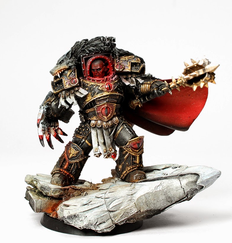

Hey all, today I bring you my finished Horus Warmaster that I showed half finished a few days ago. I decided to go with a mixture of color schemes by various artists who contributed to the book Visions of Heresy. Having finished the model I have plans that I would like to paint a few more of the FW Primarchs in the coming weeks as side projects between commission work. I enjoyed painting both Mortarion and Horus. What do you guys think? Would you like to see more of FW Horus Heresy models on Tales of Painters?
This site contains affiliate links you can use to support Tale of Painters. As Amazon Associates, eBay partners, and partners of our partner shops we earn from qualifying purchases. Thanks :)


ThirdEyeNuke
ThirdEyeNuke is no longer an active contributor to Tale of Painters. However, you can still browse his archived posts by clicking on this banner.


Thats a cracking paint job!!
I'd also agree that the face is too red, but otherwise looking awesome!
Excellent and would love to see more HH, your style seems to suit them excellently TEN! I agree with the others that the face is a bit too red, could use some skin colour in there so it looks more like OSL, not like he has a red head 😀
Nothing short of awesome!
Hey all, thanks for the kind words 🙂 I did think of doing more intense upwards highlights when painting him and it still can be done easily. If I make the change I will post some photos, but will have to see what the owner of him wants to do.
Excellent work. I agree you could do some upward highlights but that's just nit picking. Either way I think what you have done is fantastic.From all the Horus's I have seen by various people over the months, this one is by far my favorite as it captures the essence of who Horus is. Good stuff.
I would love to see more of the HH characters on Tale of Painters. Please give us more!
I don't really understand why his head is red. Does Horus have red skin?
He didn't have red skin. Its just a lot of the art work in HH portray him later with a red face due to the excessive glow from his armour. If you have a look at some of the HH books you will see. I think its a nice change to see him painted like the art work rather than the usual flesh colored face. Hope that helps 🙂
@ Anonymous, absolutely agree with that and it was my very first thought when I saw the model as to how I would paint him but as others have said, including myself, it just needs that little bit of extra highlighting or an upward glow to finish it off and make it look more like a red glow than red skin.
But hey it is all subjective of course 🙂
Yeah… i completely missed that. Guess it needs more work.
You managed to make him look really evil.Nice!
I think what you have done is fantastic and personally I would not change anything. Keep up the good work.
OSL of the face seems excessive to me, he could be perfectly Vulkan… but overall a pretty amazing paint job.
I agree here. It seems like dark skin with red OSL. Not light skin with OSL. Almost looks like blood rather than red light.
Over all I do like it though, just the one criticism. And I liked Mort as well… Would love to see more HH characters here, perhaps even some step by step stuff to see how it's was done.
And the head? :V
Lovely work there and a great nod to the excellent Visions of Heresy artwork (great book that, I've got the Ltd ed version to go with my, equally superb, FW HH books and don't regret the purchase one bit).
I would agree with From The Fang though that the face could do with some extra highlights, maybe using the white up lighting from the Emperor/Horus image along with the red glow. Just a thought 🙂
Still excellent work though and more of FW's tremendous HH series is a must surely.
Your lucky to have the limited edition. Its a gorgeous book to have.
I know 🙂
I've also got the Isstvan campaign collectors edition sat next to it, beautiful books really and very inspiring though I do fear I've started a very expensive habit now 😉
Looks great TEN. Only thing I'd add is a some brighter highlights on his face to make it stand out a bit more. Just personal preference though.
Still approximately 1,000,000% better than I'd have managed though!