
In this tutorial I’m going to show you how to colour correct your photos. This guide is to be used in conjunction with my previous tutorials: Beginner’s Guide to DSLR Photography and How to Photograph Miniatures with an iPhone Smartphone. Read on and let’s get started.
Software
To follow this tutorial you will need some image manipulation software. I’m using Pixelmator for this tutorial because it’s affordable at £22 and has an intuitive interface making it ideal for beginners. You can also get Pixelmator for the iPad, useful if you take your pictures with your iOS devices. I personally use Photoshop (it’s pay as you go for around £8.50 a month). You can buy a stripped down version of Photoshop called Elements and that retails for around £60. Another alternative is GIMP (General Image Manipulation Program) which is free for both PC and Mac. Adobe Lightroom is specifically targeted at Photographers and includes tools for colour correcting and processing large numbers of files. Lightroom retails for around £60.
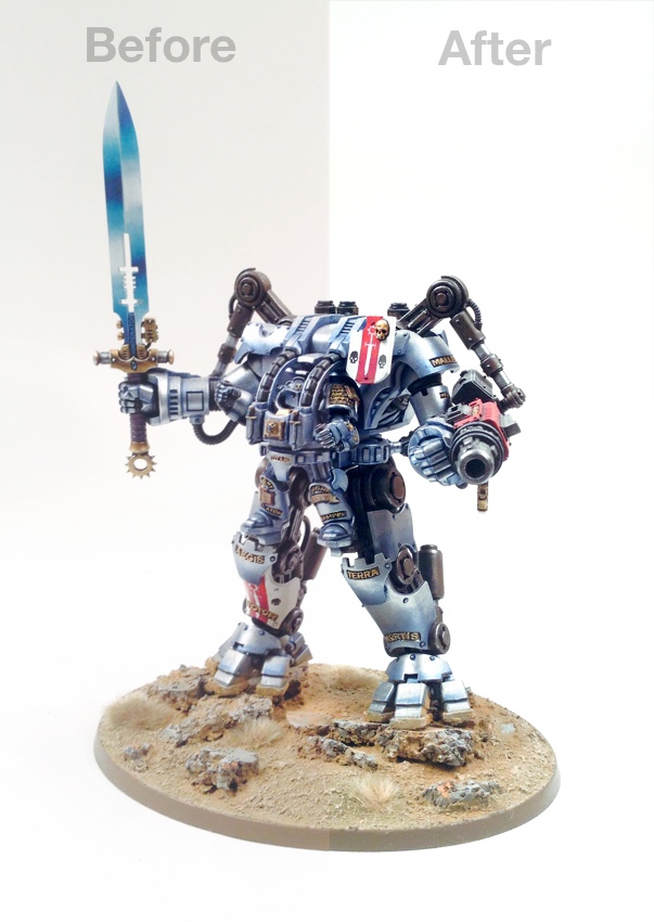
I’m going to edit the Dreadknight picture from the iPhone photography tutorial because the whites aren’t quite white, the picture is lacking contrast (looks flat) and the picture has a red tinge (it’s ever so faint, but I see it).

Cropping
Select the crop tool from the tool bar and draw a rectangle over the subject. A little white space around the subject is good. You don’t want loads of empty space around the subject because the subject will be lost in the picture. Before you hit enter or return to crop the image you can move the adjustment points to fine tune the crop. The crop rectangle will be split into nine rectangles. This is an aid for the rule of thirds. The theory is that if you place points of interest in the intersections or along the lines, then your photo becomes more balanced and will enable a viewer of the image to interact with it more naturally. Personally for model photography I like a nice central subject.
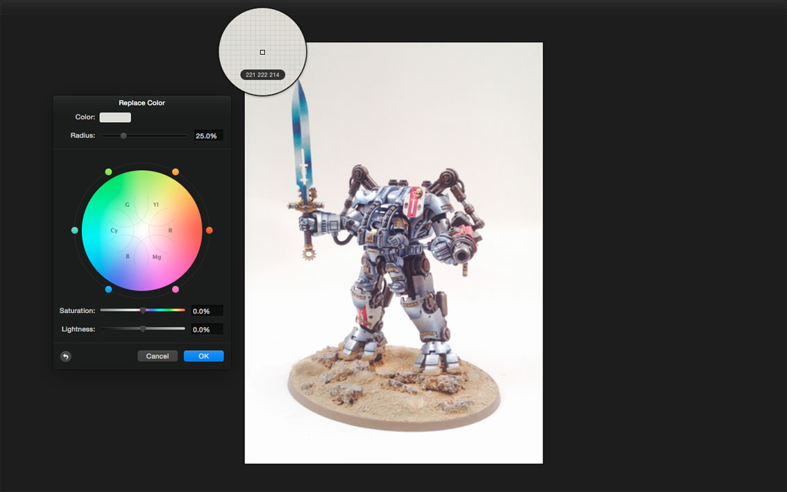
Replace Colour
We’re going to fix the background by making it pure white. In RGB (Red, Green and Blue) white is represented by R255 G255 and B255. Select Replace Colour (Pixelmator>Effect Browser>Colour Adjustment>Replace Colour) by dragging the icon over to the image and dropping it on the image. Then click a sample of background that isn’t white. It’ll tell you the RGB breakdown of the area you’re hovering over. Check the picture above to see how far off from pure white it is.

Move the radius slider to adjust the tolerance of the colour you selected. The image will turn black and white as you do it. Black represents areas that won’t be replaced. White represents the area that will be replaced. Adjust the slider so the subject becomes black and the background area you wish to correct is white. Once this is set you can replace the colour. I don’t actually want to replace the colour with a different colour so I’m just going to nudge the saturation down a touch and up the lightness to brighten the area closer to white. Remember you can use selection tool to hover over the image to check the background colour reads as close to R255 G255 and B255 as possible.

Curves
Curves is also located in the Colour Adjustment panel. Curves allows you to adjust the the tonal range of an image. The histogram shows a graph which is representative of your picture. The top right point is the white point. The bottom left point is the black point and the middle point is the midtones. Looking at my histogram it shows very little black and lots of white. The histogram is a useful tool when colour correcting. Mine shows very little black, small midtones and stacks of white. I drag the top right white point to the left just a touch and instantly see the background lighten. Only needs a small nudge because the picture wasn’t that bad to start with.
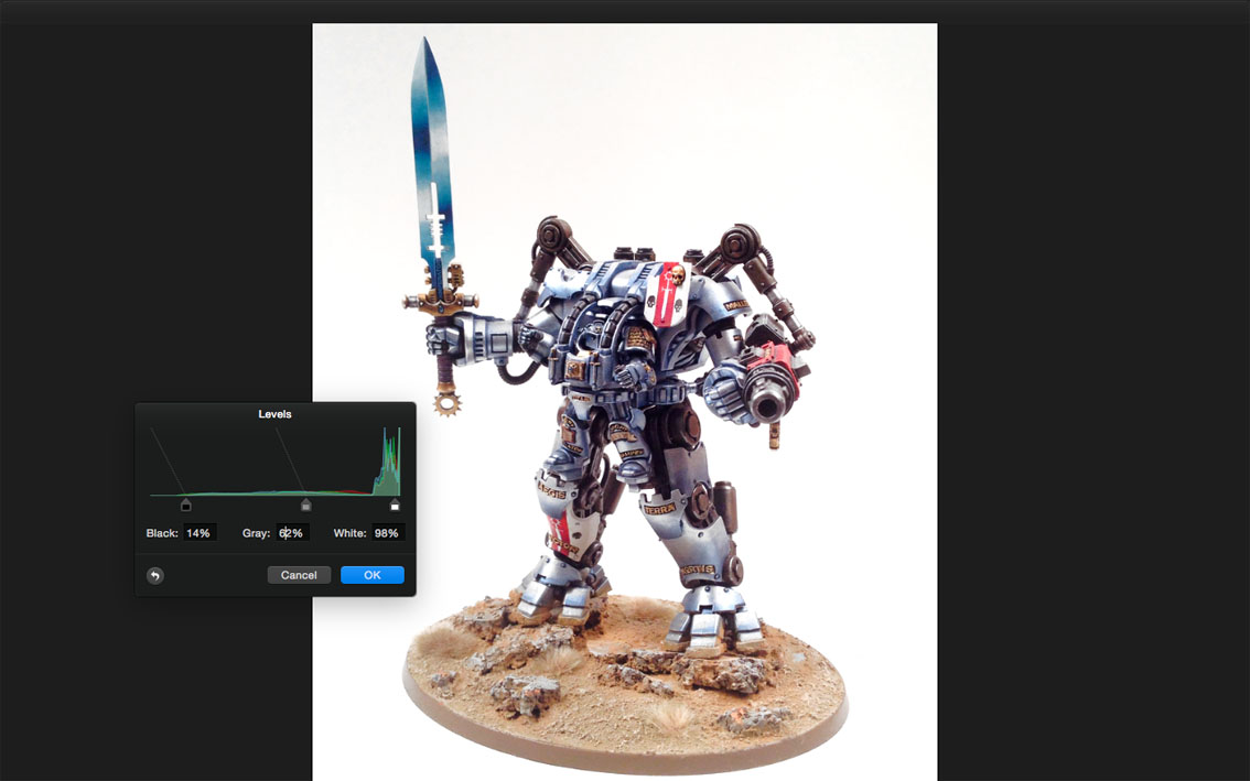
Levels
Levels can adjust brightness, contrast, and tonal range by specifying the location of complete black, complete white, and midtones in a histogram I already know the picture is lacking black so I slide the black slider on the left over quite a lot and instantly see an increase in contrast to the subject. I also tweak the gray slider to adjust the midtone. I nudge the white slider over a touch to the left just to brighten the white a little more. Not too much though beaches I need to be careful of those very bright highlights on the subject becoming too white.

Dodge
Dodge is located in the toolbar on the left. You can use like a paint brush to lighten areas. You can set it to Highlights, Midtones or Shadows. By right clicking your mouse you can adjust the diameter of the brush and the hardness of the edge. I want to lighten the very top of the image background because it’s still not quite R255, G255 and B255. I set it to highlights because I’m brightening the white. I set the Exposure to 50% so it paints softly and gradually and blends into the existing white background. I also used the dodge tool on the sword to make it brighter.

As you can see from above the dodge tool was a success and our whole background is perfectly white and we didn’t have to cut out the subject, erase the background, or paint white around it.

Earlier, I mentioned the image had a tinge of red to it. You’ll need to open colour balance to correct this. Your image might be a little yellow, or have a cold blue feel. However it looks, locate the Colour Balance sliders in the Colour Adjustment palette. I start by selecting midtones and slide cyan (blue) slider away from the red. I also tweak the Yellow/Blue slider into more blue. I see the results in the midtones of the model such as the silvery blue armour. I then repeat the same for Shadows and Highlights. Only small tiny adjustments are needed.

That’s it, one iPhone image colour corrected. We have bright whites, dark blacks and perfect reds and shining blue armour. Now we need to save our file.

Always save your file with a descriptive name. There is nothing worse than trying to find an image in a year or two that has the name IMG23030493.jpg I’ve labelled this one hi res Dreadknight.jpg. I’ve saved as a jpg and made sure the quality is set to best. Jpg or JPEG stands for Joint Photographic Experts Group. It is a universal file format that has controllable (but irreversible) levels of compression.

Hi res (or high resolution) tends to either have a very large print size or a large number of dots per inch (dpi) technically 1000mm x 1000mm at 72dpi would be roughly equal in quality to 250mmx250mm at 300dpi with similar effective outputs. Generally though, 300dpi (hi res) is the standard for print publications and 72dpi (lo res) is for web. It’s also worth remembering you can only make things a smaller resolution. 300dpi to 72dpi for instance. You can not go from 72dpi to 300dpi. You’ll just be stretching the pixels.

The iPhone saves it’s pictures at 72dpi with a size of 850mm x 1150mm. To make this lo res for web we need to keep the 72dpi but change the size. I find 300mm height a good size to fit monitors and tablets when viewed at 100%. Above, you can see that at 100% size there is no loss of quality. If you were to zoom in you would see a pixelated image.
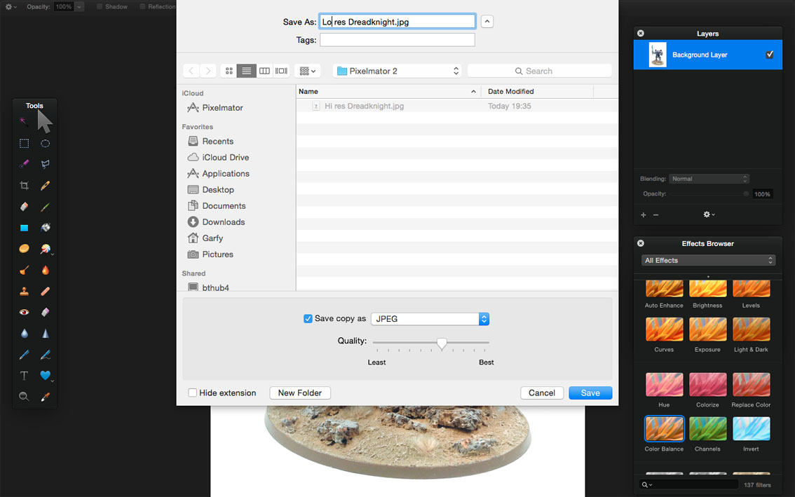
Save a copy of the image and name the file appropriately (Lo res Dreadknight.jpg). You now have a hi res version for printing pictures or zooming in on details and a lo res version for uploading to the web or emailing.

You can see the size difference is dramatic. Lo res files are going to load much faster on a blog or website and you can email lots more in one go.

This is the finished image saved for web as a low resolution jpg.
You probably have some questions… here’s my FAQ.
That’s great if you like white backgrounds but I prefer black!
This tutorial works just as well for backgrounds. Just use the opposite end of the sliders and instead of the Dodge Tool use the Burn Tool.
All this seems like hard work?
Efficiently processing images is important. Doing them one by one is time consuming. If you shoot several images under the exact same conditions, editing them all at the same time will be very efficient. If you’re using a Mac with Pixelmator you can record what you do on the first image using a piece of Mac software called Automator and then play back the recorded action to edit the remaining images. If you’re using GIMP then there are plugins you can download to add functionality to the software. Photoshop has built in recordable actions which you can batch automate. Another option in Photoshop for DSLR users shooting in RAW is opening all the images in Photoshop at once and adjusting them all simultaneously. This is what I do to give myself complete professional control over my images and then I use recorded actions to resize and save. I can rattle through hundreds of images shot under the same conditions in minutes.
I like to shoot in RAW on my DSLR, can Pixelmator open CR2 files?
Yes. I just checked. It doesn’t open them like photoshop (giving you full adjustment and multiple file editing abilities) but it does open them. It also opens pdfs.
Photoshop has a feature called Selective Colour, does Pixelmator?
No it doesn’t. Replace Colour in Pixelmator is close, but it’s not as good.
I’ve been editing in Pixelmator and I’ve saved over my original?
You should always save the original file and then save a version of the edited file. Sometimes you won’t like what you’ve done in the edited version and will want to go back to the start. Pixelmator and GIMP adjust the levels and colour balance in a non-reversible way. Photoshop uses something called Adjustment Layers to alter a layers levels, curves, etc in a non-destructive way making it simple to turn the adjustments off independently. To get round this you can always duplicate the layer in Pixelmator or GIMP so you have the original to hand but it’s no where near as good as Adjustment Layers in Photoshop.
I’ve uploaded my pictures to blogger and the white background is looking grey?
This took me ages to figure it. It was infuriating putting in all that work to create white backgrounds only for them to look grey when uploaded. I couldn’t find anything in Blogger. So I started poking around in the settings on Google+ and lo and behold, I found it. It’s called Auto Enhance. Turn it off immediately! When you create any google account (email, youtube, blogger etc you’re also automatically creating a Google+ account and the default for your photos is Auto Enhance>Normal.

Auto Enhance if left on will change the look of your carefully edited images when uploaded to Blogger or Google+. Turn it off!
Thanks for helping me, now I’m going to send my edited pictures to White Dwarf!
Stop! White Dwarf encourage people not to edit pictures. You’re better off trying to capture as much as you possibly can in camera and then if you’re photograph makes it through, let their professionals edit the picture. The best thing you can do is make sure they’re lit evenly with no shadows and send them the highest resolution you can.
Is it over yet?
Nearly, this has been a long tutorial and it doesn’t cover everything. You might want to use selection tools to isolate areas and colour correct individual pieces. Or maybe you want to add layers on top and set them to multiply and turn the opacity down to 10% to give a different colour tinge. There is so much you can do in image manipulation software, the fun is experimenting.
I look forward to seeing all your colour corrected photographs over at the PYGS (Paint Your Games Support group) Facebook page which is presented to you by Tale of Painters. You can even add me as a friend on Facebook.
Do you like our tutorials and reviews? Here is what you can do to support us: Check out the websites of our sponsors, place your next orders at Wayland Games by clicking here or on the banner on the right. Thank you very much, we appreciate any help to keep us going.
6 Comments
Leave a Reply
Tale of Painters is the unofficial Warhammer hobby magazine run by hobbyists like you. Support our work by using the affiliate links from our 🇺🇸 / 🇨🇦 partner stores for your next orders so we can continue to bring you fantastic FREE content every day:


Or support us directly:


Fantastic! Thanks for these articles, they are so helpful 🙂
Stupid Auto Enhance! That's been driving me nuts. Thanks for pointing it out!
another great entry into the series.
Wow. Another great article. It's not hard to find most of this information out there on the web, but I absolutely love your hobby-focused articles. You're really knocking them out of the park with these ones. Keep it up!
This article series is pure gold!
(2nd try with this comment as first vanished mysteriously)
For balancing my light and colors in Lightroom I use a SpyderCube (http://spyder.datacolor.com/portfolio-view/spydercube/). It's pretty easy to use (Usually three steps…) and you can be sure, that you're picture got the right colors and white is really white no matter what your display says.