
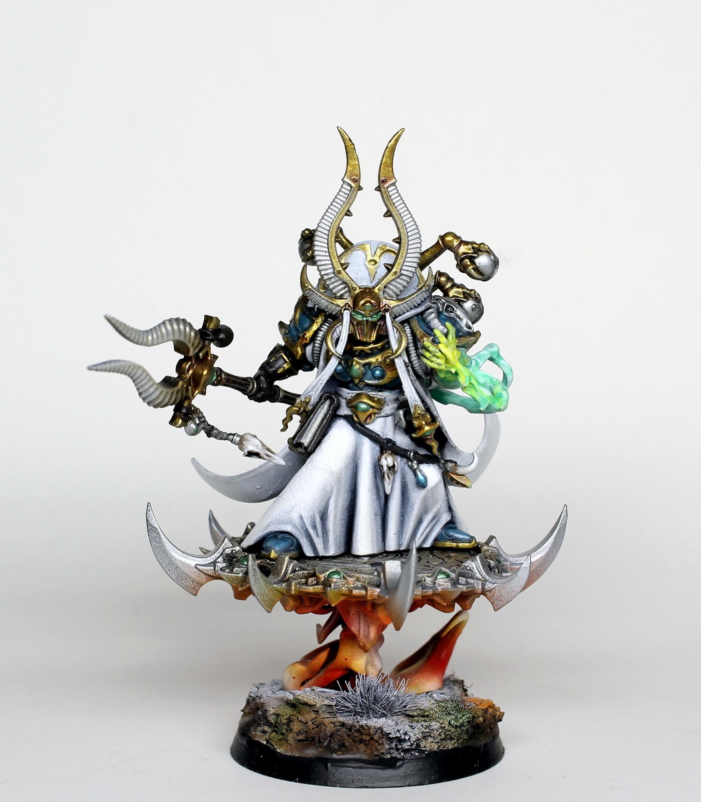
Hey all, hope your having a good Monday. Today I thought I’d show a recently finished Ahriman Arch-Sorcerer of Tzeentch.
GW over the last six months have been releasing a lot of Tzeentch models and they have all been pretty fantastic. Ahriman is one of those and so incerdibly detailed I tried to cut back on the paint job to make the model look less fussy. I went with a white scheme. Why? Sound silly but Ahriman and Saruman the White. Yeah its silly, but I quite like the look. For this model I used a lot of the Watercolours paint range that I revieved last year as the colours they produce are quite vibrant and fit this type of model well. What do you think and what do you think of all the new Tzeentch models. To be honest as much as I like them I can’t wait for GW to cover the Nurgle armies more along with Slaanesh!

17 Comments
Leave a Reply
Tale of Painters is the unofficial Warhammer hobby magazine run by hobbyists like you. Support our work by using the affiliate links from our 🇺🇸 / 🇨🇦 partner stores for your next orders so we can continue to bring you fantastic FREE content every day:


Or support us directly:


Fantastic work on him. I like the clean look of the robe as it makes the energy glow pop even more.
Love the model! Picked one up for myself earlier to get back into the hobby- any tips for painting this particular model?
He is a really nice model. My best advice would be to paint the model in different pieces. Paint the plinth and back section of the cloak seperately.
Awesome mate!!!!T
Thats truly stunning.Love it. The white is brilliant. Dan
Thats cracking, in a awesome way. Love it!
Hey guys, thanks for the cool feedback. I really enjoyed working on him and I'm considering keeping this model and maybe painting a unit of the Terminators as I quite like them.
Very cool!
Great rendering of a difficult colour scheme. Nice to see different styles from the studio too.
In my eyes he's a step away from your usual palette but I really like him, looks stellar in the paler colours you've used. I'm not much for the rainbow-scheme so often used by gee-dub, which certainly has its place and use, and this is much more up my alley.
*you're 🙂
I echo the other sentiments! The white is a bold choice and looks great, and I'm totally okay with your reasoning behind it, haha. Saruman became all tzeentch-y after his fall anyway, so I think it's totally justified.
…about Slaanesh, though… I have some bad news! But I'm still waiting for a "Return of Slaanesh" campaign, seems like the kind of thing GW would do.
And hey Anonymous, thanks for popping in under a pseudonym to crap on the guy. There are nicer ways to say, "Needs improvement."
No offence, but I don't "crap on", the model is very well painted. However, in my opinion, the green eyes fall out of the whole look and "need improvement" =)
Green eyes on his helmet, staff, etc look really poor. Perhaps if you added a very bright green stroke on each of them, the eyes would look much better.
to echo what others have said the white looks great on him really nice to see an different style paint scheme.
I do enjoy that white robe look. I like your osl under the disk too!
Wow! I absolutely love him in the white. Great work.
Superb that!