

This is it: The first issue of the new, relaunched White Dwarf. Increased staff, a new experienced editor that comes from outside, every section of the magazine rethought. After the slow but steady decline in quality amongst the last couple of years, GW realised the problem White Dwarf had, becoming less of a true hobby magazine and more of a monthly sales pamphlet, and this is their answer. We at Tale of Painters take a good and unbiased look at October’s issue of White Dwarf, and see whether GW’s good old hobby magazine is worth the (increased) cover price once again.
Design and Production Values
The first thing you notice is the new cover design. Gone is the white background with a cut-out artwork, instead the cover features a close-up of the new Forgefiend model on a dark red background. Also gone is the classic White Dwarf logo. The new one is plain letters, missing the gold embossed style of the old one. It looks more modern, something you would expect when you look out for gaming magazines on your local newsagent. The cover has a matte finish, while the logo, the type and the model are glossy, which adds a nice touch. They are also using a slightly thicker paper, and even added two fold out pages in the New Releases section. The page count increased from around 128 pages to 156. The dimensions changed a little bit, while the old issues were DIN A4, the new ones are 17 mm shorter in height, thus the new size is a more compact 210 x 280 mm. As a bonus, this issue comes with a Horus Heresy poster. For all of this, they increased the cover price by 1 Pound/Euro/Dollar, depending on where you live. This review features the German edition.

The plain and more modern look of the cover mirrors the changes of the layout of the inside pages. While in the old White Dwarf issues each article was designed in its own way, the new White Dwarf shares a common design for the whole magazine. It’s a basic grid layout, with black type and a little bit of dark red for headlines or info boxes on a white background with a very light pergament texture, and almost no other ornaments. The style of photography changed slightly, most of the model showcases are shot on a dark background now (with a red spotlight in the new releases section, which I don’t like because it distorts the paintjobs). All of these changes give the magazine a more serious and mature touch. One reason for the more minimalistic layout is probably the easier convertion to its digital version, because as from now on, White Dwarf will be available digitally for iPads, too. So I, being a graphic designer in real life, can understand why they changed the logo and the design. It’s a very clear design and by no means poorly made, but I think most people will prefer the old, more playful design. Because after all, a fantasy and sci-fi magazine is allowed to look like one.
New Releases/Cover Stories
The new releases section has changed a lot and no, it hasn’t become shorter. It still is one of the main components of the magazine and feels like a combination of the old, catalogue-style new releases section and the usual flavour of the month article. Each new model or kit is lavishly illustrated with large-sized pictures and close-ups, they’ve even added two fold out pages for the Maulerfiend and Forgefiend. Each model also comes with an explanation and sometimes a commentary for the close-ups. Sadly most of these tidbits read more like sales pitch and hold only limited information. This is even more annoying because there is no other specific Chaos Space Marines article in this issue. To find out more about the codex or the background, you have to turn to Jes’ and Phil’s designer notes in the back of the magazine, which feels a little awkward. They should roll the designers’ comments and concept art into the new releases section, putting them next to each model. This way the new releases section would become much more informative. And maybe bring back those sprue breakdowns of plastic kits when you’re at it, I loved those.

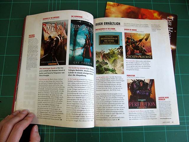
The new releases section also covers Finecast re-editions, Forgeworld models, Black Library books, digital products and even licensed games like the new “Relics” board game from Fantasy Flight Games. Thus the whole section comprises a whopping 48 pages – over 1/4 of the whole magazine. Prices can only be found in a list at the end of the section (they surely don’t want to spoil your appetite while you’re looking at all those fancy pictures)

The second cover story is a feature of the Horus Heresy releases by Forgeworld. This is a quite nice 8 pages long article that shows off some artworks and models, and offers some background and designer notes. My highlight is the interview with Simon Egan, where he talks about how he approached sculpting the primarch Angron. Indeed, Forgeworld is quite prominently represented in this issue. Whether this will be a permanent feature or just a momentary sales push of the Horus Heresy release, only time will tell.
Gaming/Tactics
The first article from the gaming side of things is the battle report. This month features Space Marines against Chaos Space Marines (non-surprisingly). The format has changed quite a lot. There are a lot of small pictures that detail certain events of the game, and at the end of the battle report there is a comprehensive tactical analysis of the game by third persons. Unfortunately, the report still suffers from unnecessary complexity, as they still combine turns and haven’t added maps. I’d say the presentation hsa become even messier, because in the past they had at least big shots of the whole battlefield with arrows, where you could see where the units where placed and how they moved. The small pictures are more fragmentaric. I’m also missing a real narrative going on, especially as the 6th edition rulebook puts so much emphasis on forging a narrative. A little bit of fluff, how it came to the conflict played out, a short battle story or something like that. The motivation of this battle report is to blatantly give the new Chaos models a test run.


The second gaming driven article is called “The Rivals”. This is a debate of two competitive tournament gamers, talking about the concept behind their Fantasy army and sharing their army lists. Then they face each other in a battle of words, and finally prove their arguments in a game. While their game itself isn’t detailed, only the outcome, I found this article to be a novel concept and quite entertaining. It shows more depth than the usual WD tactics articles without losing a sense of humour.
Hobby/Inspiration
The new White Dwarf has a couple of shorter articles that cover almost every part of the hobby. For inspiration, there is “Army of the Month”, this time presenting a huge and inspiring Skaven army, featuring lots of creative conversions. And it’s not just pictures, its owner gets to tell a little bit about the creation of this army, too. Next there is another installment of Blanchitsu, with a selection of inspirational inquisitorial warbands and even some glimpses into the sketchbook of GW art director John Blanche. There are just a couple of models shown, but the grimdark self portrait of John makes this article worth reading alone.


After that is the well-known (and a bit bland) “Hall of Heroes” series, then comes “Parade Ground”, a model showcase with a different theme each month. This time it’s troops, with nice non-‘Eavy-Metal-painted models from all game systems. Unfortunately a couple have already been shown before, Duncan Rhodes’ Brets even the issue before. “Kit Bash” is a short 4 pages article about converting. The converted Ork flyers are not especially jaw-dropping, but I see some nice potential here for the future. “Battle Ground” is a series about terrain-making, showing off the Tau outpost battle board from the 40k rulebook. It even features some scratch-built terrain, gasp (but sadly no work in progress shots).


Finally there is “Paint Splatter”, the monthly dose of painting guides. This is a bit of a let-down, as it’s not only no ‘Eavy Metal Masterclass, but also follows the format of the painting guides of the last couple of issues. This means step by step pictures with only the paint, the technique and the paintbrush used credited. Almost no commentary, they even advise you to buy the “How to buy Citadel Miniatures” book if you want to find out more about the techniques used. What makes it worse is that it seems that the tutorials where made by the WD staff itself, and not even by the studio’s army painting team. Which means some of the results don’t look great at all. Meh. At least this month of “Paint Splatter” contains a nice variety of tutorials, from painting rust to Chaos Space Marines to Warpstone.
Designers’ columns/Behind the scenes
I’m pleased to see they added more articles allowing a look behind the curtain. There is Jervis Johnson talking about limitations in army lists in a “Standard Bearer” tradition, but also a hobby column by Jeremy Vetock, who is sharing his passion for custom scenarios and matching terrain.


My personal favourite of the whole issue is “This month in…”, a behind the scenes look at the studio, the White Dwarf team, Forgeworld and the Black Library. There are four pages detailing the latest battles and models painted by the WD staff, six pages of Jes Goodwin and Phil Kelly talking about the creative thoughts behind the new Chaos Marines release (with concept art by Jes!), two pages of Forgeworld stuff, and two pages of Black Library, where Gav Thorpe talks about his latest Dark Elves novel. All in all a great article with some real depth, I just don’t know why they put it in the back of the magazine, even after the shop list and event calendar.
Other regulars
Thankfully the other regular offenders are kept quite short. There are the local event news, presentations of new GW stores and selected independant retailers, and of course the address list of shops, which became international now.
Verdict
White Dwarf has made a big step forward, it’s so completely different than last month. It finally feels like a true hobby magazine, made by passionate people and not by bean counters. Another positive note is that they completely did away with blatant ads. While the new releases section is very long on the one hand, there aren’t any double-page spreads that just say buy this and that like in the old WD issues. I also really like that they tried to cater to every aspect of the hobby – like gaming, painting, modelling and terrain making. The only thing that’s missing now would be some gaming material, like a new scenario or a rules expansion, a proper ‘Eavy Metal level painting workshop, and some narration, maybe a short story or an article that fleshes out some of the background. I’d love to see such kind of articles at least on a semi-regular basis.
Of course there is always room for improvement, as I explained in my walkthrough above. Hopefully the new WD team will listen to the feedback of the readers so that they can improve the magazine even more over the next couple of issues. It would be sad to witness such a strong start, just to see them reverting slowly to old habits. I also hope they keep the page count and production values up, after all the increased cover prize is nothing to sneeze at, but can be justified with the increased amount of serious content.
All in all, I really enjoyed this new beginning, and award this issue a 8/10.
Do you like our tutorials and reviews? Here is what you can do to support us: Check out the websites of our sponsors, place your next orders at Wayland Games by clicking here or on the banners on the right, or at Total Wargamer by clicking here or at the banners on the right. Thank you very much, we appreciate any help to keep us going!
10 Comments
Leave a Reply
Tale of Painters is the unofficial Warhammer hobby magazine run by hobbyists like you. Support our work by using the affiliate links from our 🇺🇸 / 🇨🇦 partner stores for your next orders so we can continue to bring you fantastic FREE content every day:


Or support us directly:


thx for the review, I only read parts of it but plan on reading in full as I'd like to hear the full opinion.
I just got my issue today and after skimming through it and weighing out all the pros and cons I think I'll say that I'm fairly impressed. Still have yet to read any actual content but the main pro for me is that it finally seems there are more than 1 or 2 articles with some substance like the design notes or the HH stuff (again, I actually have to read it to properly judge, but the amount seems promising).
The red background and lighting in most of the mini photos is…interesting. I think I still prefer the pro-looking ones on white background but at least they have included proper "action" shots without colour lighting.
I like the focus Black Library and FW get (and to some extent FFG). Now, the next step is to actually include at least one short story from the BL magazine.
Like the foldout in the new release section and the overall presentation, althoguh didn't mind the old one either.
for now I'm still only a painter/builder so the gaming stuff and bat-rep don't matter to me (slowly getting into gaming).
Sort of miss the old graphical style of some of the articles. The plain white seems too dry but not a big deal.
Hate the fact that the store listing is still included and takes up 10 pages ;(
Painting section sucks for the most part and I will keep complaining about the lack of the awesome masterclasses of old (thank the Emperor I have a lot of the old ones for good painting reference).
Love the poster =)
My biggest complaint is definitely the photos. All of the new CSM stuff with the red lighting looked awful. I was very disappointed with the new models until I saw them on the traditional white backgrounds. All of a sudden they don't suck!
Good review, enjoyed reading it.
I agree with the general feeling on here, the battle report was a low light, but the other sections were generally enjoyable. I would welcome more WIP shots and high class painting tutorials – I've been cutting out and hoarding those for years till this new paint range and approach started.
The main thing I can say that shows its an improvement is that I was still looking at it more than an hour after it arrived.
I definitely found it to be a step in the right direction. It seems alot "meatier" especially for the $10 USD. And it doesn't hurt that I'm a 20+ year disciple of the Dark Gods. If the improvements continue, and they do several of the things you noted ("Eavy Metal, game content, scenarios (I used to love that)… they may even get a subscription out of me for the first time in 10 years or so.
The one thing I keep telling people is its like a real magazine now with authors again. I did like the three commentators at the end of the battle report basically taking him to task for losing.
Easily the best issue in 24 months (longer?) I actually will buy the next one.
You were a bit generous Stahly 7/10 MAX great start room for improvement not yet matching ability.
I found the new release section quite entertaining actually
Ofcourse they're telling you buy this or that, but in the old White Dwarf it would be the same text as on the website, now you get the text from the website + some other notes about the design/role they play in an army
furthermore they compiled all the prices on 2 pages, after a couple of pages i wasn't really thinking about it being a new releases section, more a review of some of the options for chaos players.
and it doesn't matter the space marine army was a dumb build (dreadnoughts and termies in a white scar army? No self respecting white scar player would do that) but at least it's a true batrep, not a "let's show how awesome the new releases are by letting them win the battle on their own"
I really liked it and i must say it was well worth the 8 euros
PS: i believe the red backdrop will be this issue only
just to match the background on the cover page
Bought the digital WD. While it looks better, it doesnt read better.
The new release sectuon is still far too big, i see no reason to spend money on stuff i can see and read for free on the website!
The battle report was not at all good, the spacemarine army was just daft built. No player in his right mind would field that.
The painting article was useless. Though the terrain building one was interesting as usual, more of that please, wip shots would be cool. The behind the scenes and deceloper was also ok, but way too short and placed too far in the back.
I would rate it a 5/10.
Oh and while the digital version was cheaper, i fetl it wasnt worh it. Reduce the release section to 10 pages max, and add more proper content!
Thanks for the review. Now I can wait more relaxed for my copy (which, hopefully, will arrive soon – subscriptions seem to stay awfully late even with the "new" Dwarf…)
I'm a fan of the new White Dwarf. It looks and feels like a magazine. The clean simple layout makes it easy to read (old white dwarfs had a tendency to add messy backgrounds and then box everything out). I like the way it is written as well. Couple of little subtle humourus tidbits were"I have a soft spot for Typhus" and describing Huron as the renegade master made me chuckle and remember a dance tune from the 90s. I can tell they had a lot of fun making White Dwarf, it comes across as friendly and fun.
I hate the red backgrounds to the models. It casts a nasty red light over the models. They're trying to make it look atmospheric but they're completing destroying the the point of having model pictures and that point is for us to look at the sculpts and paint jobs in detail.
I do like the fact the miniature focuses show larger then life miniatures. Old WD would insist on showing the models 1:1 scale. This new larger scale is more inline with how the internet community is use to viewing models (I post massive pics that aren't very forgiving). This shows on some of the older models like the finecast daemon prince that is an older paint job, it looks terrible.
Great review Stahly. An 8/10 is very fair.