
There has been a lot of coverage about Citadel Contrast before, but this review is your one-stop resource for everything there is to know about Contrast, including a handy “cheat sheet” of Contrast paints mixed with various mediums and comparisons with other washes and inks on the market. Find out what Contrast can do (and what it cannot do) after the jump.
Be prepared, this Citadel Contrast review is a long post. If you’re short on time, scroll down all the way below, where I compiled a summary of key learnings.
The Citadel Contrast range
Citadel Contrast comprises 34 colours, plus Contrast Medium, a colourless medium that is used to thin down Contrast paints, two specifically formulated primers (Wraithbone and Greyseer) with two matching base paints.
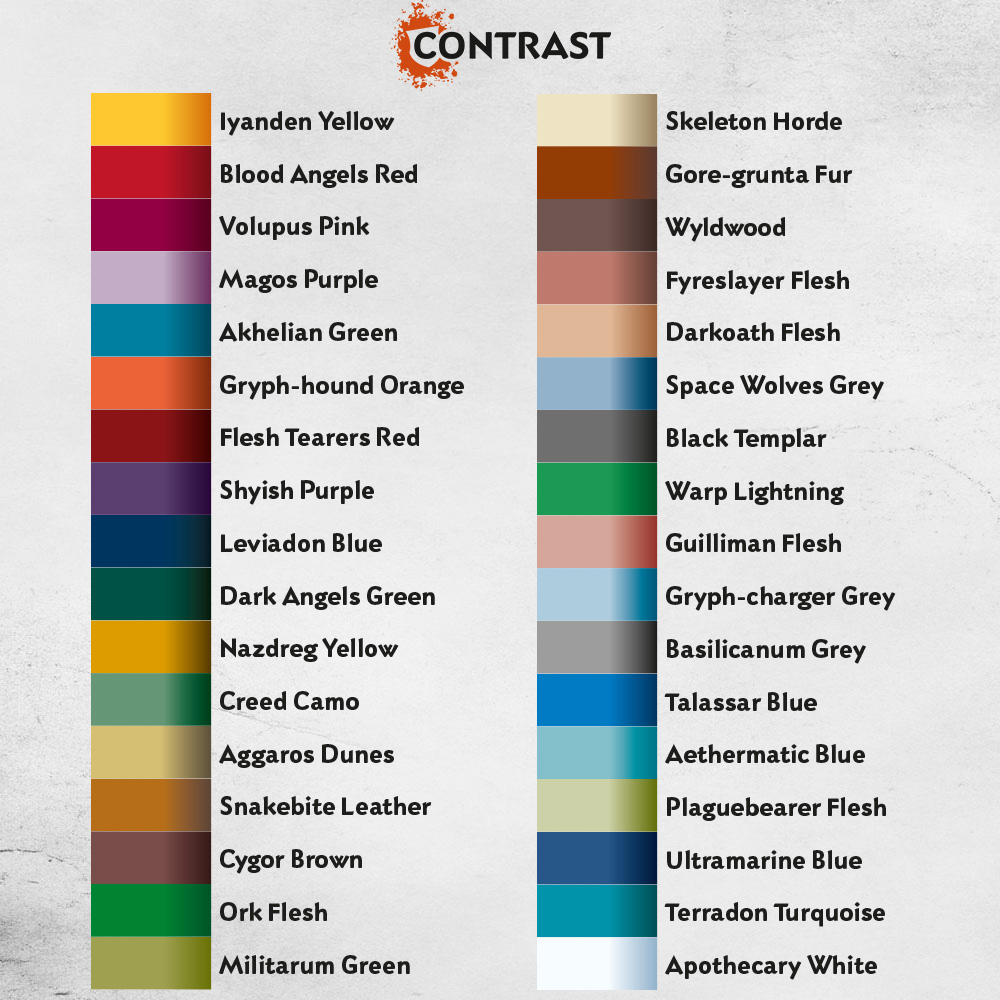
Here is the list of paints:
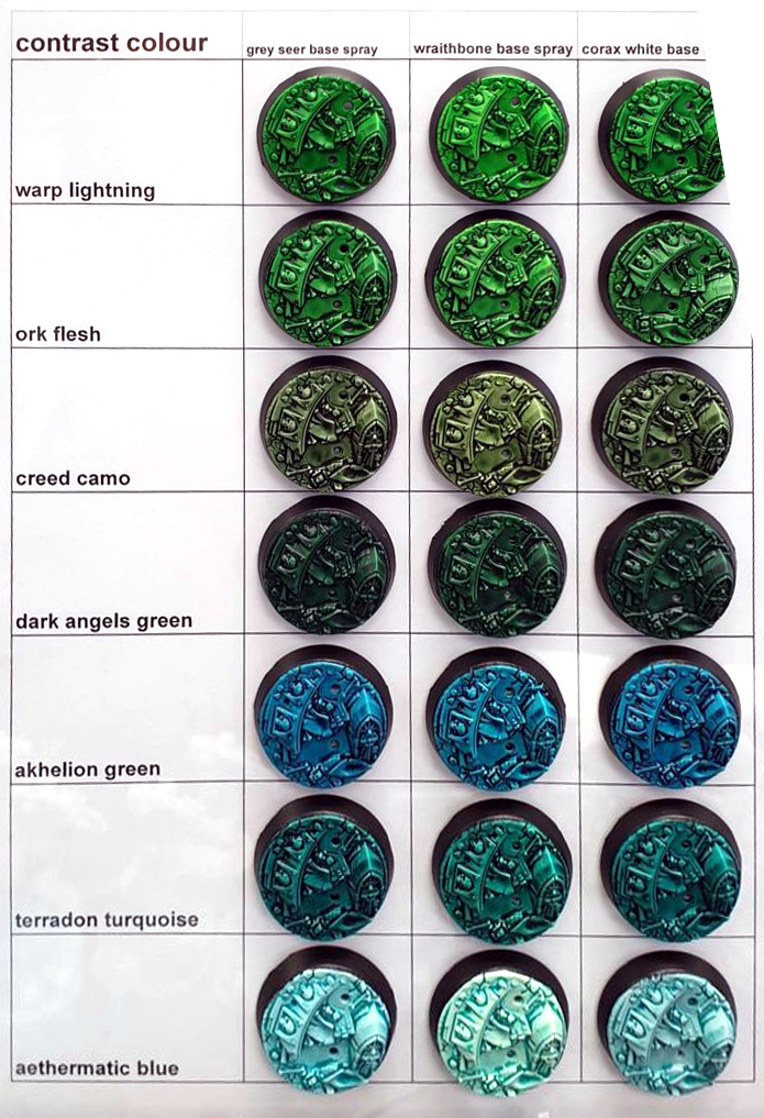
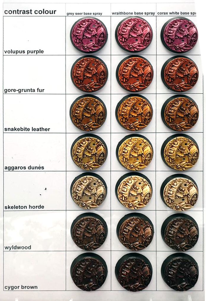
To get a feeling of how these colours look in real life, check out these handy guides, courtesy of Warhammer Chelmsford:
Update 2023: I also have a comparison chart with all major “one coat” paint brands such as Vallejo Xpress Color and The Army Painter Speedpaint:

This hand-painted swatch is available in my Patreon shop for a small donation (or by becoming an Autarch tier member). I also have swatches for Citadel, Vallejo Game and Model Color, Warpaints Fanatic, AK 3rd Gen and more – all cross-compatible with each other so you can compare colours across different brands. Check out my shop for details.
How to use Citadel Contrast
Citadel Contrast paints have a unique formula that is similar to washes like Citadel Shade paints, Army Painter’s Quickshade Inks or Vallejo Game Color Inks – but not exactly the same. Apparently, Games Workshop did a lot of development to come up with a unique composition.
Contrast paints are transparent by nature, even when applying several layers, though the colour will build up with multiple layers. The base colour will always shine through, so you’ll ideally want to apply them over a light basecoat. Don’t apply them too thinly, as the medium won’t be able to do its magic. It’s better to apply more and soak up any excess with a clean brush. Because of the transparent nature, the colour of the basecoat will affect the outcome of the paint – see the guides by Warhammer Chelmsford above.
Actually, you don’t necessarily need Games Workshop’s Grey Seer and Wraithbone primers – in fact, any light basecoat will do. I successfully tested Corax White or Matt White Color Primer from The Army Painter.
You could even experiment with painting the darker Contrast over “medium” base colours, for example, Wyldwood (dark brown) over Baneblade Brown (medium khaki/light brown) for a really deep dark brown. Or mix your Contrast paints with a lot of Contrast Medium or Lahmian Medium to use them as a wash or glaze.
The pigments used for Contrast paints are really strong and vibrant. In comparison to Citadel Shades or other washes, Contrast Paints have a slightly higher viscosity, which means they are not as “runny”. I recommend washing your brushes a lot when using them, as the heavily pigmented paint easily creeps up into the ferrule of your brush, where it might dry and make short work of the bristles.
Like washes, Citadel Contrast paints work best on models with a lot of texture and organic details like fur, hair, scales, muscles, clothes with a lot of creases, segmented armour and the like. These kinds of “textures” allow the pigments to smoothly run into the recesses. On larger flat areas the pigments will gather and pool, resulting in an uneven finish. The darker the Contrast paint, the more noticeable this will be. I also noticed there is a slight variation in consistencies: The lighter colours seem to be a bit thinner and feel more like washes, while the darker colours have a tendency to dry flatter with less visible highlights. Some colours apply smoother, some tend to be more patchy.
Here is a Primaris Imperial Fist for example:
You can even apply them over metallic paints for a cool tinting effect:
It becomes even more apparent when applied on a tank:
These kinds of models and details are better painted with the traditional approach: an even basecoat, selective shading by applying a wash or thinned paint directly into the recesses, then highlights by layering or drybrushing.
Contrast paints can be airbrushed, but, similar to washes or inks, they act more like filters because of their transparent nature:
The Contrast Primers
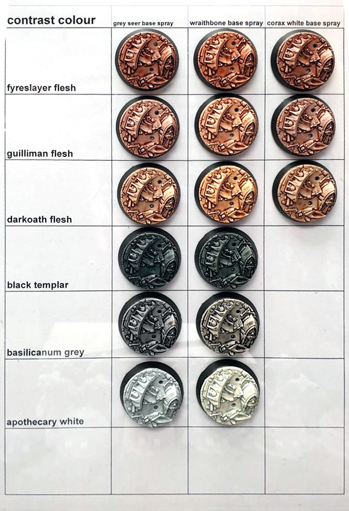
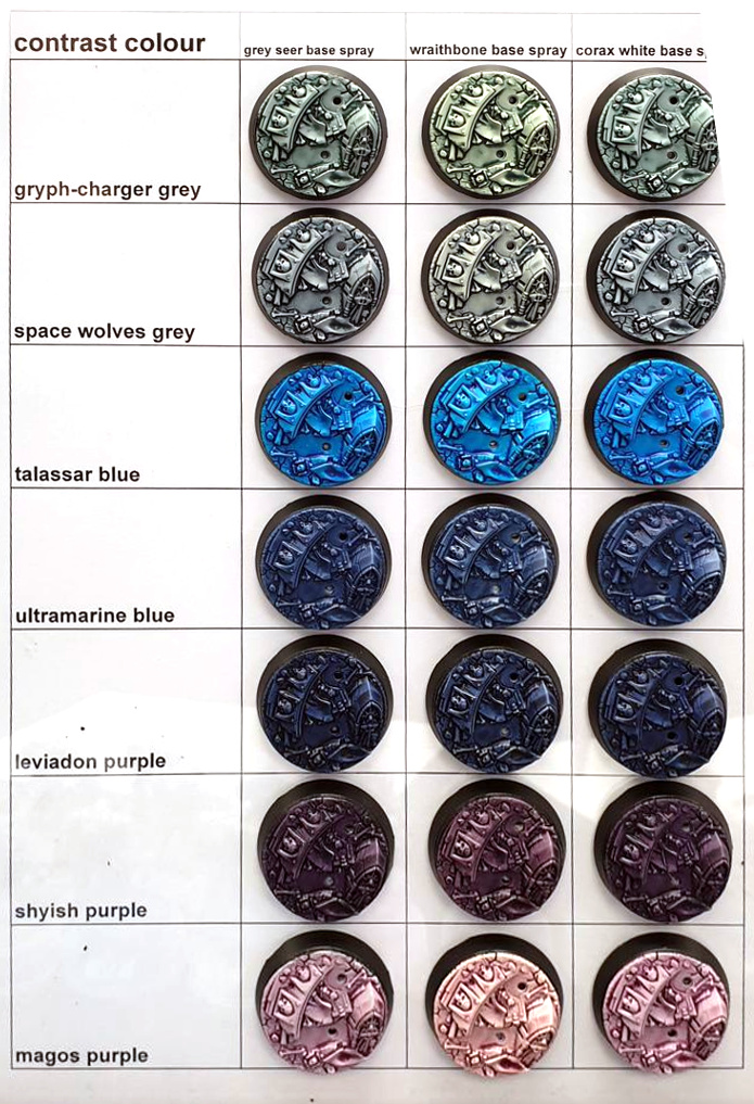
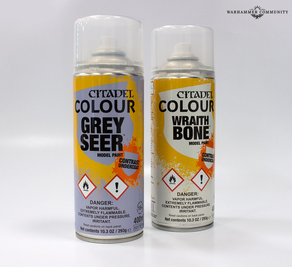
Let’s move on with our Citadel Contrast review. Along with the 34 shades of Contrast Games Workshop also sells two types of spray primers with a matching base paint: Grey Seer, which is a light grey (similar to Ulthuan Grey), and Wraithbone, a light bone colour (similar to Terminatus Stone). Advertised to have a special formula best suitable for Citadel Contrast paints, these primers have a slightly smoother, more satin finish. The smoother finish helps to reduce the surface tension of the paint, so the pigments will better run into the recesses and reduce the amount of pooling (slightly). This effect will also benefit washes like Citadel Shade paints by the way.
Of course, you can apply Citadel Contrast over any paint or primer. I found that Corax White and Matt White Colour Primer from The Army Painter also have a nice finish that works very well with Contrast paints. However, I found that the off-white hues of Citadel’s new Contrast primers will enrich Contrast paints a lot, especially Wraithbone in combination with warm Contrast colours like yellow, orange, red, skin tones, and brown.
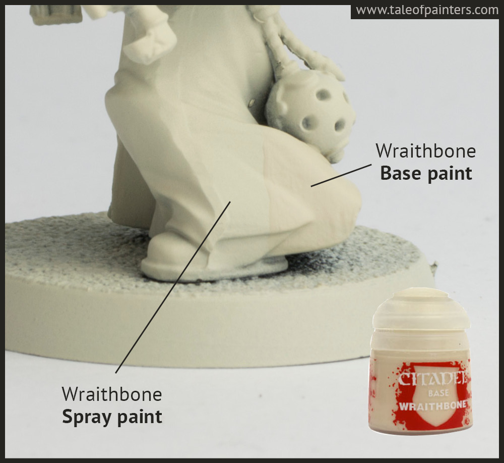
The Contrast spray primers also come with matching base paint versions. I tested Wraithbone and as you can see, the result is pretty close. However, even though Wraithbone is a base paint, the coverage is as you would expect from a light, almost white bone colour – not that great. It took me about 6 or 7 thin layers for perfect coverage over a medium grey primer. Because of the number of layers, I had to apply the result wasn’t perfectly smooth and I noticed the Contrast paint dried noticeably more uneven. Contrast paints really benefit from a perfectly smooth base coat.
Experimenting with Contrast paints & Contrast Medium
On this handy comparison sheet, I demonstrate several different approaches of applying Citadel Contrast paint, straight from the pot or thinned down with Contrast or Lahmian Medium, as well as comparisons with similar washes and inks:
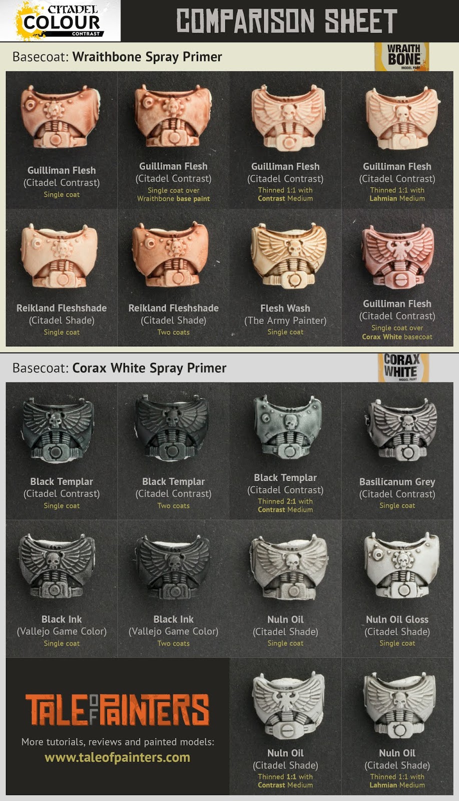
Some comments:
Personally, I feel Guilliman Flesh produces rather stark results (as do the Fyreslayer Flesh and Darkoath Flesh from my experience). Fine for very muscular and animated faces, but I guess I’d prefer Reikland Fleshshade for the softer shading. Two coats of Reikland Fleshshade are pretty close to a single layer of Guilliman Flesh.
Contrast paints really benefit from a smooth primer (as do washes, as you can see). I also applied Guilliman Flesh over Wraithbone base paint. As a lot of layers were needed for perfect coverage, the finish wasn’t as smooth as with Wraithbone spray primer. You can see the Guilliman Flesh dried more uneven because of that. Sealing the surface with a coat of satin varnish might help to reduce this effect.
Contrast paint thinned 1:1 with Contrast or Lahmian Medium essentially turns them into a wash – as the Contrast range has 34 colours there is a lot of potential to create unique washes. I guess I’d use Contrast Medium when you only want to thin down your Contrast paint slightly or want to create a glaze, while using Lahmian Medium when you want to turn your Contrast paint into a wash.
Contrast Medium is basically Contrast Paint without pigments, used to thin down Contrast paints. It’s not recommended to thin Contrast paints with water, as they will lose their unique properties. Compared to Lahmian Medium, Contrast Medium has a slightly higher viscosity and is not as “runny”. I guess I’d use Contrast Medium when you only want to thin down your Contrast paint slightly or want to create a glaze, while using Lahmian Medium when you want to turn your Contrast paint into a wash.
Also, check out this video for a better impression of the differences between Contrast and Lahmian Medium:
Painting with inks is very similar to painting with Contrast paints. You can see the comparison between Black Templar and Vallejo Game Color Black Ink. After two coats of Black Ink, the most pronounced details on the chest aquila stand out more, however, Black Templar is much smoother on the flat areas.
What about touching up mistakes? Because of their transparent nature, you can’t just paint another layer of Contrast paint over any paint spills. You’d need to apply your base colour first, then add another layer of Contrast. However, I found this often creates a “patchy” look. I prefer painting a matching regular acrylic paint over paint spills.
Citadel Contrast – taken a step further
I’ve read a lot of people argue that Contrast paint is a product for “noobs”. I don’t believe that’s true, because actually, you need a lot of brush control so you don’t spill over or let it dry in pools. Instead, Contrast can be a valuable tool for experienced painters to speed up their painting and achieve unique effects, as this Citadel Contrast review demonstrates.
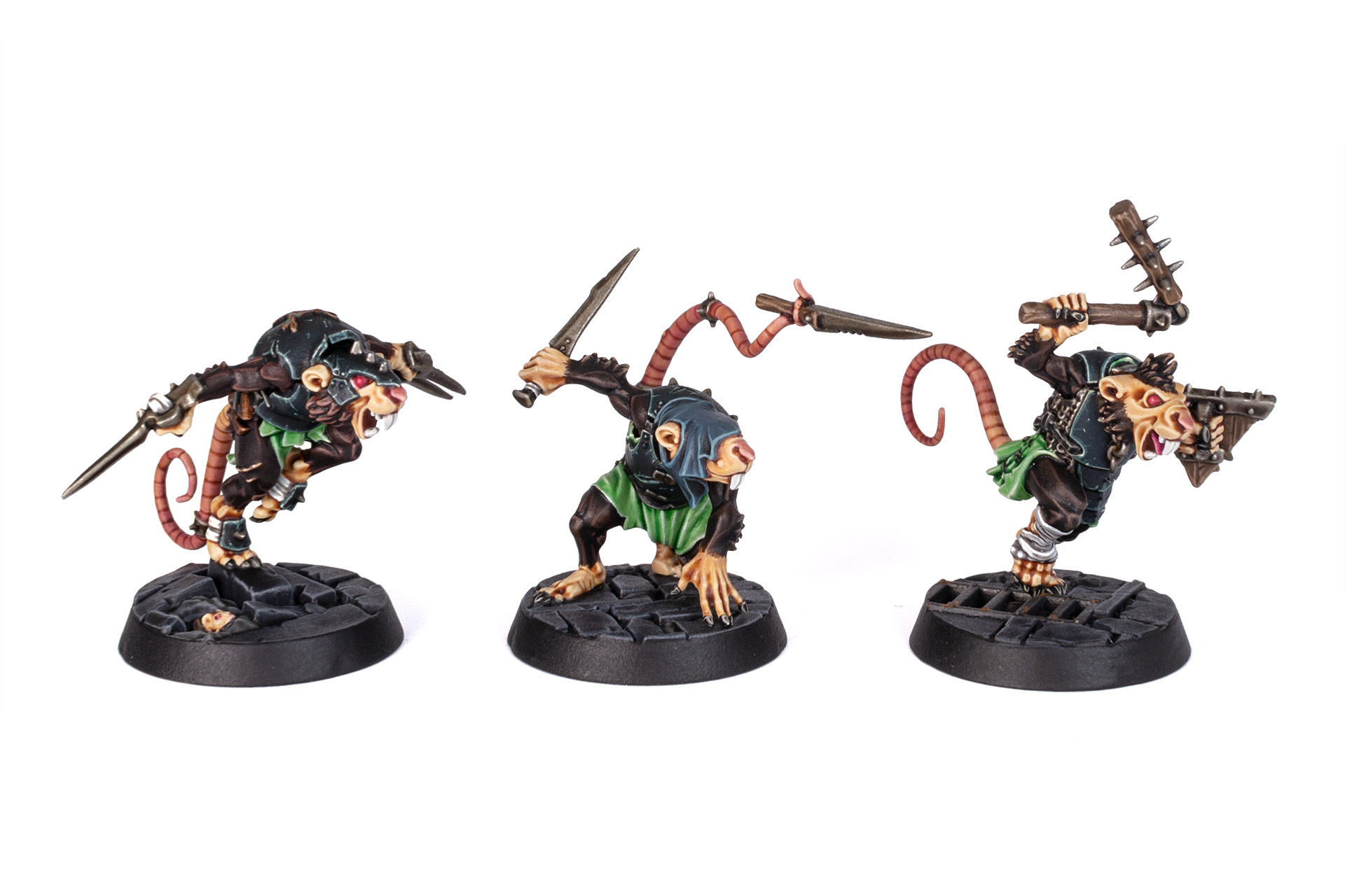
It’s easy to take things one step further by adding more definition with layering and highlighting and/or tidying up pooled areas by painting over with regular acrylic paints. For these Skaven from Spiteclaw’s Swarm I used various Contrast paints, like Darkoath Flesh for the skin, Wyldwood and Cygor Brown for the fur, and Black Templar for the leather, then added a few layers and highlights on top:
You can find a detailed tutorial for painting Skaven skin with Contrast here:
Here is another try of my own for a Genestealer Cults Neophyte Hybrid:

Step 1 is Contrast paint, straight from the pot or slightly thinned with Contrast Medium, over a basecoat of Corax White. Step 2, I applied some quick layers of matching regular acrylic paints to even out the result on flat areas and remove any unwanted pooling. I only did this in the areas marked in blue. Step 3, I added a couple of highlights.
All in all, the results are very nice for the high tabletop standard I usually go for. It also saved me a lot of time by combining base colour and shading in one go, especially on the orange clothes – even over white primer, it takes several layers of achieving an even coat of orange. With Contrast, it’s just a single coat straight from the pot (or two, in my case, to make the colour even richer).
Citadel Contrast review: value
Contrast paint pots contain 18ml of paint, priced at 6.30 €/£4.75 (0.35 €/£0.264 per ml). In comparison, regular Citadel paints are 3.60 €/£2.75 and comprise 12 ml (so 0.30 €/£0.229 per ml), or 6.30 €/£4.75 for 24 ml with their shade paints (0.263 €/£0.198 per ml).
The Army Painter Quickshade Inks comprise 18ml at 2.75 €/£2.25 (0.153 €/£0.125 per ml). Other popular brands like Vallejo paints are 2.75 €/£2.45 for 18 ml (0.153 €/£0.136 per ml), while Formula P3 paints from Privateer Press are priced at 3.30 €/£3.25 for 18 ml (0,183 €/£0.18 per ml).
Citadel Contrast paints are therefore the most expensive miniature paint on the market – by far! The Army Painter and Vallejo paints cost less than half per ml.
Citadel paints are available virtually everywhere, but you can also order them from our partner stores Wayland Games and Element Games at a discount, and support Tale of Painters if you use our links with no extra cost to you at all, a nice little gesture if you liked this review 🙂
Key learnings about Citadel Contrast & verdict
The idea of painting over white primer or a white zenithal highlight with glazes and washes isn’t new but an approach often used by competition level painters. But the real “genius” of Games Workshop was to turn this technique into an easy and satisfying product for the masses.
Used correctly by playing to the strengths of the Contrast formula, Contrast paints can be a real time saver and produce fantastic results. Still, it might not be a product for everyone. If you are used to painting over black or dark primers, it might take a while to get used to this approach of painting.
Here is a handy summary of key learnings when using Contrast paints:
+ Contrast paints have very vibrant pigments and create a lot of “tonal variety”: recesses are suitable dark, pronounced areas lighter. Therefore, with a single layer of Contrast, you can combine basecoating and shading in a single step and will often end up with some basic highlights as well.
+ Not all Contrast paints are created equal. The lighter colours are thinner and feel more like washes, while the darker colours can be a little flat with less visible highlights. Some colours dry smoother, some tend to be more patchy.
+ Don’t apply Contrast paints too thinly or else the medium can’t do its magic. Apply them generously and soak up excess paint instead.
+ Because Contrast paints are transparent, they work best over light basecoats. The colour of the basecoat will affect the result because of the transparency – a warm basecoat like Wraithbone will enrichen warm colours like yellow, orange, red, pink, skin tones, brown, and green, while cool basecoats like Grey Seer or Corax White will benefit cool colours like turquoise, blue, purple, grey, and black.
+ Wraithbone or Grey Seer primer helps but isn’t necessary, so feel free to experiment with other base colours and light primers.
+ Contrast paints mixed 1:1 with Contrast or Lahmian Medium will turn your paint into a wash or glaze – great for creating unique washes that you can’t find anywhere else.
+ Contrast paints need to be thinned with Contrast Medium, as water will make them lose their unique properties. They can be mixed with each other, with washes (or even regular paint, but this will change their properties, too).
+ Contrast paints benefit a lot from a smooth basecoat (as do washes). A coat of varnish might help to smoothen uneven basecoats.
+ When the basecoat is smooth, most Contrast paints will dry with a surprisingly smooth and even finish. However, like washes, Contrast paints still have a tendency to pool on larger flat surfaces. Soak up any excess paint with a clean brush to reduce the amount of pooling.
+ Having said that, like washes, Contrast paints work best on models with a lot of texture, organic details like fur, hair, scales, muscles, clothes with a lot of creases, segmented armour and the like.
+ Because of their transparency, you can’t just apply another layer to cover any mistakes. You need to paint on the base colour first, then apply another layer of Contrast, but even then, the result often will be patchy. I recommend painting over with a matching regular acrylic paint to hide any imperfections.
+ You can easily paint over Contrast paints to tidy up pooled areas, deepen the shading, or add highlights by layering or drybrushing.
+ Contrast paints are great at tinting metallic colours. When applied with an airbrush, they act like transparent filters.
+ Wash your brushes a lot, as the high-pigmented paint will easily creep up into the ferrule of your brush.
Hope you enjoyed my Citadel Contrast review! We’d be glad to hear about your experiences in the comments below.
Since the release of Contrast, other manufacturers have tried their hand at their own “one coat paints”. Read our review of Scale75’s Instant Colors here, and Warcolours’ Antithesis paints here.
Also, stay tuned for more Citadel Contrast coverage and tutorials to get the most out of your Contrast paints!
Thanks for the great article. Quick question, have you ever tried using black templar or any of the blue contrast paints over macragge blue spay/base paint? If so, how'd it turn out?
After reading your article I was amazed. I know that you explain it very well. And I hope that other readers will also experience how I feel after reading your article. חשיפה תקשורתית
Hi, i like the thorough tests you've made, really makes choosing which colours to buy easier. But haven't you accidentally used basillicanum grey where you wrote space wolves grey?
I just reread your AP washes review and I wonder if the ink washes with the quickshade medium give exactly the same effect, for a much lower price.
The Army Painter Washes are like Citadel Shades, while Contrast paints are more pigment heavy. You can acchieve a similar effect with applying several coats of the same wash to build up the colour.
Vallejo Game Colour Inks are more similar to Contrast Paints, but the range is much more limited.
BRAVO!!!! Great review. Thank you.
aa
I think with Tamiya Spray Primers you still get the smoothest finish, possible from a Spraycan…
Great review and break down of Contrast's possible uses, as well as pros&cons.
Thanks for taking the time, and for giving an impartial view.
Awesome Review!
The day i heared that Citadel stops the Glazes, i restocked my Guilliman Blue Glazes to 10 pots… Normaly i diluted them with Lahmian Medium, but after your advise, that Contrast Medium is better for Glazes than Lahmian Medium i give it a try…
Fantastic write up!
If they're not as runny, then they have a higher viscosity, not lower.
Thank you, fixed it 😉
Thanks for sharing such great insights!
awesome review =)Cheers for the great info
This was a fantastic and super helpful review, thank you for putting the time and effort in!
Excellent review. Thank you.
I think something that nobody has explored, is what the best kind of brush is for applying a smooth coat of contrast paint. We know that paint flows differently from natural bristles instead of synthetic, and that the snap or softness of a bristle also affects the application. With most opaque acrylics the difference may be negligible, but with this it might make a difference. I know I have certain brushes that I can't use for priming, or for varnish, as they'll leave a streaky finish.
Could you post it here if you found out? I have exactly that problem. Currently I use a brush, that soaks up paint like crazy, but that makes it difficult to apply, because the paint comes out already a little dried when applied and can't be moved as well as with other bristles…. I don't know, it doesn't matter for clothes, but for skin it does. O.o
Awesome awesome review!
Wow what an incredible review. Thank you for taking the time to write it. Speaking of time, I have a question. How long do they take to dry? One thick coat makes me think they would take ages to dry where as your two thin coats would be a lot faster?
I'd say they take longer to dry than regular paint, but not as long as washes or shade paints. Thin coats would mean more Contrast Medium, and as Lahmian Medium, it increases the drying time.